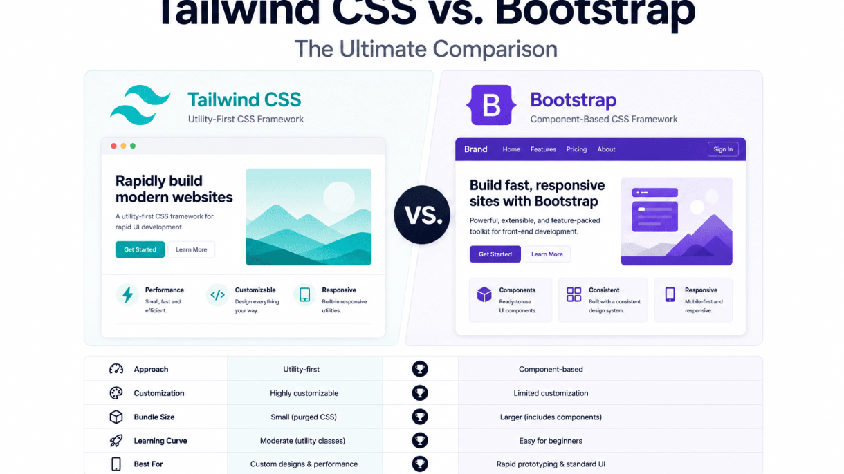

Tailwind CSS vs. Bootstrap: The Ultimate Comparison
In the landscape of modern web development, two CSS frameworks stand as titans: Bootstrap and Tailwind CSS. Each has shaped how developers approach styling, yet they embody fundamentally different philosophies. Bootstrap, launched by Twitter in 2011, revolutionized front-end work by offering a comprehensive library of prebuilt components and a responsive grid system. Tailwind CSS, emerging in 2017 from Adam Wathan and Steve Schoger, countered with a utility-first approach that prioritizes composability over prebuilt design. Developers frequently compare them because both aim to accelerate styling, but they diverge radically in workflow, customization, and output. Understanding their origins and core tenets is essential for choosing the right tool for your project.
What is Bootstrap? A Brief History and Core Philosophy
Bootstrap began as an internal tool at Twitter to standardize design across their team. Its first public release in 2011 offered a 12-column grid, prebuilt components like buttons and navbars, and a consistent visual language. The core philosophy is component-first: developers receive ready-to-use UI elements with minimal configuration. Bootstrap provides a predefined design system—typography, colors, spacing, and components—that ensures consistency out of the box. It relies on classes like btn btn-primary or card to apply complex styles instantly. Over time, Bootstrap evolved through versions 2, 3, 4, and 5, adding theming via Sass variables, customizer tools, and a lightweight rebuild without jQuery. Its philosophy emphasizes speed for teams who want a polished, responsive interface without writing custom CSS. However, this comes at the cost of uniformity: many Bootstrap sites share a recognizable look unless heavily customized.
What is Tailwind CSS? A Brief History and Core Philosophy
Tailwind CSS was created by Adam Wathan and Steve Schoger as a response to the limitations of component frameworks. First released in 2017, it introduced a utility-first approach: instead of prebuilt components, Tailwind offers hundreds of low-level utility classes—like flex, pt-4, text-center, or bg-blue-500—that you combine directly in HTML to build custom designs. Its philosophy is “designing in the browser,” giving developers granular control over every pixel without leaving the markup. Tailwind’s design system is configurable through a tailwind.config.js file, allowing you to define custom colors, spacing scales, breakpoints, and more. It generates only the CSS you use via PurgeCSS (now built-in), resulting in tiny production files. The framework gained rapid adoption for its flexibility, especially among developers who prefer a more bespoke, non-opinionated look. Its mantra: “Build whatever you want, without fighting the framework.”
Why This Comparison Matters for Modern Web Development
Choosing between Bootstrap and Tailwind is not trivial—it directly impacts development speed, maintainability, team collaboration, and final output. Modern web development demands fast iteration, responsive design, and performance. Bootstrap offers immediate familiarity and a lower learning curve for beginners, making it ideal for rapid prototyping, simple sites, or teams that prioritize consistency over originality. Tailwind, conversely, suits projects requiring unique visual identities, complex customizations, or those built with component-based frameworks like React or Vue, where utility classes integrate naturally. The comparison also touches on file size: Bootstrap’s full CSS is larger, while Tailwind’s output is smaller after purging. Additionally, accessibility and customization differ: Bootstrap provides built-in ARIA attributes and component patterns, while Tailwind requires manual implementation. Below is a quick reference of key differences:
| Aspect | Bootstrap | Tailwind CSS |
|---|---|---|
| Philosophy | Component-first | Utility-first |
| Learning curve | Low (prebuilt components) | Medium (utility classes) |
| Customization | Via Sass variables | Via config file |
| File size (production) | ~12-20 KB (minified) | ~10-15 KB (purged) |
| Best for | Quick prototypes, admin panels | Custom designs, component libraries |
Ultimately, this comparison matters because it reflects a broader shift in front-end development: from opinionated frameworks that enforce design decisions to flexible tools that empower developers to craft unique experiences. By understanding both, you can make an informed choice that aligns with your project’s goals, team’s expertise, and long-term maintenance needs.
Core Design Philosophy: Utility-First vs. Component-Based
The foundational distinction between Tailwind CSS and Bootstrap lies in their core design philosophies. Tailwind CSS adopts a utility-first approach, providing hundreds of low-level, single-purpose classes that you compose directly in your HTML to build custom designs. Bootstrap, conversely, is component-based, offering pre-styled, ready-to-use UI components like buttons, navbars, modals, and cards. This fundamental difference shapes every aspect of your workflow, from how you write markup to how you manage scalability and customization.
How Tailwind’s Utility-First Approach Works in Practice
With Tailwind, you rarely write custom CSS. Instead, you apply atomic classes directly to elements to control spacing, typography, color, layout, and responsiveness. For example, creating a styled button involves stacking classes like bg-blue-500 hover:bg-blue-700 text-white font-bold py-2 px-4 rounded. Each class sets a single CSS property, giving you pixel-level control without leaving your HTML file. This approach encourages a highly iterative workflow where you tweak designs by adding or removing classes, not by switching between stylesheets and markup. A practical code example for a simple card in Tailwind:
<div class="max-w-sm rounded overflow-hidden shadow-lg">
  <img class="w-full" src="image.jpg" alt="Card image">
  <div class="px-6 py-4">
    <div class="font-bold text-xl mb-2">Card Title</div>
    <p class="text-gray-700 text-base">Some quick example text.</p>
  </div>
</div>
This method eliminates context-switching and enforces design consistency through a predefined design system (spacing scale, color palette, breakpoints). However, it can lead to verbose HTML with many classes, which some developers find visually cluttered.
How Bootstrap’s Component Library Speeds Up Prototyping
Bootstrap accelerates development by providing polished, pre-built components that you instantiate with simple classes. To create a similar card, you use .card, .card-img-top, .card-body, and .card-title. This abstraction allows you to assemble a functional, responsive interface in minutes, with minimal CSS knowledge. Bootstrap also includes a robust grid system, utility classes, and JavaScript plugins (e.g., modals, tooltips, carousels) that work out of the box. For rapid prototyping or projects with standard UI patterns, this component library drastically reduces time-to-market. A Bootstrap card example:
<div class="card" style="width: 18rem;">
  <img src="image.jpg" class="card-img-top" alt="Card image">
  <div class="card-body">
    <h5 class="card-title">Card Title</h5>
    <p class="card-text">Some quick example text.</p>
  </div>
</div>
The trade-off is that Bootstrap’s components have a distinct visual identity—often called the “Bootstrap look”—which requires significant customization to override. Modifying components typically involves writing custom CSS or using Sass variables, adding complexity.
When Each Philosophy Shines or Falls Short
Tailwind’s utility-first approach shines when you need:
- Unique, custom designs without fighting a framework’s default styles.
- Fine-grained control over every pixel and responsive behavior.
- Design system consistency across large teams, enforced by a shared set of utilities.
- Smaller production CSS (via purging unused utilities) for performance-critical sites.
It falls short when:
- Rapid prototyping is the priority, and pre-built components would save hours.
- Team members lack familiarity with utility classes, leading to steep learning curves.
- Maintaining very large HTML files becomes cumbersome due to class bloat.
Bootstrap’s component-based philosophy shines when:
- Speed is paramount, such as for MVPs, admin panels, or internal tools.
- Standard UI patterns (e.g., navigation, forms, tables) are sufficient.
- Accessibility and cross-browser compatibility are handled by the framework out of the box.
It falls short when:
- Custom branding requires overriding many default styles, increasing CSS weight.
- Design uniqueness is critical, as Bootstrap sites often look similar.
- Performance is a concern, as Bootstrap includes unused CSS and JavaScript unless carefully customized.
Ultimately, your choice depends on project goals: Tailwind offers flexibility and design control; Bootstrap delivers speed and consistency for standard interfaces.
Ease of Learning and Onboarding
Choosing between Tailwind CSS and Bootstrap often hinges on a developer’s background and project goals. For beginners, Bootstrap offers a gentler initial slope, while Tailwind presents a steeper climb that can yield long-term productivity gains. Experienced developers, particularly those already familiar with utility-first concepts, may find Tailwind more intuitive from the start. The documentation quality and community resources for both frameworks are robust, but they cater to different learning styles.
Bootstrap’s Familiarity and Extensive Documentation
Bootstrap’s greatest strength for onboarding is its pre-built, opinionated components. Beginners can copy-paste a button, card, or navbar and see immediate results without writing custom CSS. This “plug-and-play” approach lowers the barrier to entry, as the framework handles layout, responsiveness, and styling out of the box. The official documentation is exhaustive, featuring live code examples, a comprehensive grid system guide, and a dedicated “Bootstrap 5” migration section. For visual learners, the Bootstrap “Examples” page provides complete starter templates (e.g., album, pricing, blog) that demonstrate real-world usage. Community resources are equally abundant: Stack Overflow has over 200,000 tagged questions, and YouTube tutorials often focus on rapid prototyping. However, this ease can lead to “Bootstrap fatigue” when customizing beyond defaults, as overriding styles requires understanding the framework’s specific class overrides and CSS specificity.
Tailwind’s Initial Learning Hurdle and Long-Term Efficiency
Tailwind CSS demands a shift in mindset. Instead of relying on pre-styled components, developers build interfaces by composing utility classes—like flex, p-4, text-center, and bg-blue-500—directly in HTML. For newcomers, the initial learning curve is steeper because there is no “card” or “navbar” class; you must construct these from scratch. The official Tailwind documentation, while excellent, assumes familiarity with CSS properties and responsive design. The “Utility-First Fundamentals” page is essential reading but can overwhelm beginners. Long-term, however, Tailwind’s approach offers efficiency: once the utility classes are memorized, developers can style interfaces faster than writing custom CSS, and the small file sizes (after purging unused utilities) improve performance. Tailwind’s community is active on GitHub, Discord, and TailwindUI (a paid resource for pre-built components), but free tutorials often focus on advanced patterns rather than absolute basics. A key advantage: Tailwind’s consistent naming conventions (e.g., m-4 for margin, p-4 for padding) reduce decision fatigue once learned.
Key Resources and Tutorials for Each Framework
Below is a comparison of essential learning resources for both frameworks:
| Resource Type | Bootstrap | Tailwind CSS |
|---|---|---|
| Official Documentation | Getbootstrap.com/docs – includes live examples, grid system, and utility classes. | Tailwindcss.com/docs – covers utility fundamentals, responsive design, and customization. |
| Free Video Tutorials | FreeCodeCamp’s “Bootstrap 5 Crash Course” (YouTube). | Traversy Media’s “Tailwind CSS Crash Course” (YouTube). |
| Interactive Learning | W3Schools’ Bootstrap 5 tutorial with “Try it Yourself” editors. | Tailwind Play (play.tailwindcss.com) – live code editor for experimentation. |
| Pre-built Components | Bootstrap’s “Examples” page (getbootstrap.com/docs/5.3/examples/). | TailwindUI (paid) and free component libraries like “Tailwind Elements”. |
| Community Forums | Stack Overflow (high volume, broad expertise). | Tailwind CSS Discord server and GitHub discussions. |
For beginners, starting with Bootstrap’s examples and then exploring Tailwind’s utility-first approach after mastering CSS fundamentals is a common path. Experienced developers may jump directly to Tailwind’s documentation and use Tailwind Play to test patterns. Both frameworks offer cheat sheets (Bootstrap’s “Cheatsheet” and Tailwind’s “Cheat Sheet” PDF) to accelerate recall during development.
Customization and Flexibility
When evaluating front-end frameworks, the ability to craft a distinctive visual identity often determines long-term project success. Both Tailwind CSS and Bootstrap offer customization pathways, but they approach developer control from fundamentally different philosophies: Bootstrap provides a structured theming system, while Tailwind offers granular, atomic-level configuration. Understanding these differences is crucial for teams balancing speed against design uniqueness.
Customizing Bootstrap with Sass Variables and Build Tools
Bootstrap’s customization relies on its Sass-based architecture. Developers override default variables before compilation to alter colors, spacing, typography, and component behaviors. The process typically involves:
- Installing Bootstrap via npm and importing only the needed components
- Creating a custom
_variables.scssfile that redefines Bootstrap’s defaults - Using a build tool like Webpack, Vite, or Gulp to compile the final CSS
For example, to change the primary color and enable dark mode, you might write:
// custom/_variables.scss
$primary: #6f42c1; // purple instead of blue
$enable-dark-mode: true;

@import "bootstrap/scss/bootstrap";
This approach gives developers a centralized override point but remains constrained by Bootstrap’s component-level abstractions. Customizing deeply nested elements, such as a card’s inner padding or a button’s hover shadow, often requires additional custom CSS or !important overrides. The theming power is real but bounded by the framework’s predefined component structure.
Tailwind’s Configuration File and Design System Control
Tailwind CSS takes a radically different approach: it provides no pre-styled components, only utility classes. All design decisions are codified in a single JavaScript configuration file (tailwind.config.js). This file acts as the single source of truth for your entire design system, allowing you to:
- Define custom color palettes, spacing scales, and breakpoints
- Add or remove utility classes via variants and plugins
- Extend the default theme without overriding existing values
For instance, to create a custom color and a new spacing value:
// tailwind.config.js
module.exports = {
  theme: {
    extend: {
      colors: {
        brand: { 500: '#6f42c1', 700: '#5a32a3' },
      },
      spacing: {
        '18': '4.5rem',
      },
    },
  },
};
Every utility class generated—bg-brand-500, p-18—then adheres strictly to these definitions. This eliminates cascade conflicts and ensures consistency across the entire codebase. Developers have absolute control over every pixel and color without writing custom CSS, but the trade-off is a steeper initial learning curve and more verbose HTML.
Comparing the Effort to Create a Unique Visual Identity
The effort required to break away from default looks differs significantly between the two frameworks:
| Aspect | Bootstrap | Tailwind CSS |
|---|---|---|
| Initial customization setup | Moderate (requires Sass build pipeline) | Low (edit one config file) |
| Overriding component styles | Often requires custom CSS or deep nesting | Directly via utility classes in HTML |
| Design system consistency | Good, but gaps can appear with heavy overrides | Excellent, as all values originate from config |
| Learning curve for uniqueness | Steeper for deep customization | Steeper for utility-first mindset |
| Risk of “Bootstrap look” | High without thorough theming | Low by default (no pre-built components) |
Bootstrap’s strength lies in rapid prototyping with its ready-made components, but achieving a truly unique brand often demands substantial custom CSS and careful variable management. Tailwind, conversely, forces uniqueness from the start because every element is built from your defined tokens. The developer effort shifts from fighting framework defaults to designing a comprehensive design system upfront. For teams prioritizing long-term maintainability and brand fidelity, Tailwind’s configuration-driven approach offers superior control, while Bootstrap remains a pragmatic choice for projects where speed and component consistency matter more than absolute visual originality.
Tailwind CSS vs. Bootstrap: The Ultimate Comparison
Bootstrap’s CSS Payload and PurgeCSS Integration
Bootstrap’s default compiled CSS file is approximately 200 KB (unminified) and around 150 KB (minified), including all components, utilities, and the grid system. This payload can significantly impact initial page load times, especially on slower networks or mobile devices. To mitigate this, Bootstrap integrates with PurgeCSS during build processes (e.g., via Webpack or PostCSS). PurgeCSS analyzes your HTML, JavaScript, and template files to remove unused CSS classes, reducing the final file size by up to 90% in many projects. However, this requires careful configuration: you must specify content paths correctly and avoid dynamic class construction (e.g., class="btn btn-${variant}") to prevent accidental removal. A typical optimized Bootstrap project might ship 15–30 KB of CSS after purging, but the initial overhead of loading unused styles during development remains a concern.
Tailwind’s JIT Mode and Minimal Production Output
Tailwind CSS addresses file size through its Just-In-Time (JIT) mode, introduced in v3.0. JIT compiles only the utility classes you actually use, generating a CSS file that is often under 10 KB (gzipped) for typical projects. This eliminates the need for manual PurgeCSS configuration—Tailwind automatically scans your templates and produces a minimal stylesheet in real time during development. For example, a landing page using 40–50 unique utilities might result in a 5–8 KB CSS file. Additionally, Tailwind’s production build further optimizes by removing unused keyframes and combining identical declarations. The trade-off is a slightly longer initial build time (usually <500 ms), but subsequent rebuilds are near-instant due to caching. This approach ensures that performance is built into the workflow, not an afterthought.
Real-World Performance Benchmarks and Best Practices
When comparing real-world performance, consider the following factors:
- Initial load: Bootstrap’s full CSS (150 KB) vs. Tailwind’s JIT output (5–10 KB) can mean 100–200 ms slower page rendering on 3G networks for Bootstrap.
- Caching: Both frameworks benefit from HTTP caching, but Tailwind’s smaller files are more cache-friendly for repeat visits.
- Critical CSS: Bootstrap often requires inline critical CSS for above-the-fold content, while Tailwind’s minimal output may not need this.
Best practices for optimization include:
| Practice | Bootstrap | Tailwind |
|---|---|---|
| Purge unused styles | Yes (PurgeCSS) | Built-in (JIT) |
| Minify CSS | Yes | Yes |
| Use HTTP/2 | Beneficial | Beneficial |
| Lazy load components | Possible | Not needed |
| Limit custom builds | Recommended | Automatic |
For most projects, Tailwind’s JIT mode delivers superior performance out of the box. However, if your team relies heavily on Bootstrap’s pre-built components and can dedicate time to PurgeCSS configuration, the performance gap narrows significantly. Ultimately, measure your specific use case with tools like Lighthouse or WebPageTest to make an informed decision.
Responsive Design and Mobile-First Approach
In modern web development, responsive design is non-negotiable. Both Tailwind CSS and Bootstrap embrace a mobile-first philosophy, but they differ significantly in how they implement breakpoints and adaptive layouts. Bootstrap provides a rigid, predefined grid system, while Tailwind offers granular control through utility classes. Understanding these differences is crucial for choosing the right framework for your project.
Bootstrap’s Grid System and Predefined Breakpoints
Bootstrap’s grid is built on a 12-column layout with five predefined breakpoints: xs (<576px), sm (≥576px), md (≥768px), lg (≥992px), and xl (≥1200px). The mobile-first approach means that styles apply by default to small screens, with larger breakpoints overriding them via min-width media queries. For example:
<div class="container">
  <div class="row">
    <div class="col-12 col-md-6 col-lg-4">Column 1</div>
    <div class="col-12 col-md-6 col-lg-4">Column 2</div>
    <div class="col-12 col-md-6 col-lg-4">Column 3</div>
  </div>
</div>
This code creates a single column on mobile (col-12), two columns on medium screens (col-md-6), and three columns on large screens (col-lg-4). Bootstrap’s grid is intuitive for beginners but can become verbose for complex layouts. The predefined breakpoints are fixed, which may require workarounds for custom designs.
Tailwind’s Responsive Utility Classes and Custom Breakpoints
Tailwind CSS uses responsive utility prefixes like sm:, md:, lg:, xl:, and 2xl: to apply styles at specific breakpoints. By default, these correspond to 640px, 768px, 1024px, 1280px, and 1536px respectively—slightly different from Bootstrap’s. Tailwind’s approach is to compose styles directly in the HTML, offering more flexibility. For instance:
<div class="grid grid-cols-1 md:grid-cols-2 lg:grid-cols-3 gap-4">
  <div>Item 1</div>
  <div>Item 2</div>
  <div>Item 3</div>
</div>
This achieves the same responsive layout as the Bootstrap example but uses Tailwind’s grid utilities. Tailwind allows custom breakpoints via the theme.extend.screens configuration in tailwind.config.js, enabling precise control. For example:
module.exports = {
  theme: {
    extend: {
      screens: {
        'tablet': '768px',
        'laptop': '1024px',
      },
    },
  },
};
This customization is a major advantage for projects with unique design requirements. However, the utility-first syntax can make HTML markup dense for complex responsive patterns.
Common Challenges and Solutions for Responsive Workflows
Both frameworks present challenges. With Bootstrap, developers often struggle with the rigid grid when designs require non-standard breakpoints or asymmetrical layouts. A common solution is to override Bootstrap’s grid with custom CSS or use the order utility classes to rearrange columns at different breakpoints. For example, using order-first and order-last can reflow content for mobile without altering the HTML structure.
Tailwind’s main challenge is managing the sheer number of utility classes, which can lead to readability issues. A practical solution is to extract repeated patterns into reusable components using a templating engine like React or Vue, or by using Tailwind’s @apply directive in CSS. Another common issue is ensuring consistent spacing across breakpoints; Tailwind’s gap utilities and space-y/space-x classes help maintain rhythm.
Both frameworks benefit from a structured workflow. For Bootstrap, use Sass variables to customize breakpoints globally. For Tailwind, define a clear design token system in the config file. Testing tools like BrowserStack or Chrome DevTools device emulation are essential for verifying responsive behavior. Below is a comparison of key features:
| Feature | Bootstrap | Tailwind CSS |
|---|---|---|
| Default breakpoints | 5 (xs, sm, md, lg, xl) | 5 (sm, md, lg, xl, 2xl) |
| Mobile-first default | Yes | Yes |
| Custom breakpoints | Via Sass variables | Via config file |
| Grid system | 12-column flexbox grid | CSS Grid utility classes |
| Responsive utilities | Predefined classes (e.g., col-md-6) |
Prefix-based utilities (e.g., md:grid-cols-2) |
Ultimately, Bootstrap offers a faster start with less decision-making, while Tailwind provides finer-grained control for custom responsive workflows. The choice depends on whether you prioritize speed and consistency or flexibility and design precision.
Accessibility and Semantic HTML
Accessibility is not an afterthought in modern web development; it is a fundamental requirement. When comparing Tailwind CSS vs. Bootstrap: The Ultimate Comparison, their approaches to semantic HTML and built-in accessibility features differ significantly. Bootstrap provides a more guided, component-level accessibility framework, while Tailwind adopts a neutral, utility-first stance that places the entire responsibility on the developer.
Bootstrap’s Accessibility Components and Known Limitations
Bootstrap ships with several built-in accessibility features that are intended to help developers create compliant interfaces more easily. These include:
- Pre-defined ARIA roles and attributes on interactive components such as modals, tooltips, and dropdowns.
- Focus management for components like modals and off-canvas menus, which trap focus and restore it upon closure.
- Color contrast ratios that meet WCAG 2.1 AA standards for default themes.
- Keyboard navigation support for carousels, tabs, and accordions.
However, Bootstrap’s component-based architecture also introduces known limitations:
| Limitation | Description |
|---|---|
| Overly complex markup | Some components generate deeply nested <div> structures that can obscure semantic meaning. |
| Inconsistent ARIA usage | Certain components lack dynamic ARIA updates, such as live regions for alerts or progress bars. |
| Limited testing scope | Bootstrap does not guarantee full compliance with WCAG 2.1 AA for all custom configurations. |
Developers must still manually audit and augment Bootstrap’s components to meet specific accessibility standards, especially when overriding default styles.
Tailwind’s Neutral Stance and Developer Responsibility
Tailwind CSS does not provide any built-in components, ARIA attributes, or accessibility logic. This neutrality means that accessibility is entirely managed by the developer. While this approach offers maximum flexibility, it also introduces risks:
- No automatic focus management, keyboard navigation, or ARIA roles are added by the framework.
- Semantic HTML must be explicitly chosen; Tailwind’s utility classes do not enforce or suggest proper element usage.
- Color contrast and visual hierarchy depend entirely on the developer’s custom configuration and design decisions.
Tailwind’s documentation does include a dedicated accessibility guide, but it focuses on general principles rather than framework-specific solutions. The developer must implement every accessibility feature from scratch, including:
- Adding
aria-*attributes manually. - Managing focus states with custom JavaScript or libraries like Focus Trap.
- Ensuring keyboard event handlers for interactive elements.
Best Practices for Maintaining Accessibility with Either Framework
Regardless of which framework you choose, the following practices help ensure accessible, semantic HTML:
- Use semantic HTML elements (e.g.,
<nav>,<main>,<button>) instead of generic<div>or<span>containers. Both frameworks work well with semantic HTML, but Bootstrap’s components may require extra scrutiny. - Test with real assistive technologies such as screen readers (NVDA, VoiceOver) and keyboard-only navigation. Automated tools alone are insufficient.
- Provide visible focus indicators for all interactive elements. In Tailwind, use
focus-visiblevariants; in Bootstrap, override default focus styles if they are too subtle. - Manage ARIA dynamically for components like modals, alerts, and live regions. Bootstrap offers partial support, while Tailwind requires full manual implementation.
- Audit color contrast using tools like WebAIM’s Contrast Checker. Both frameworks allow custom color schemes, so ensure all text meets WCAG AA ratios.
In summary, Bootstrap provides a head start with built-in accessibility features but demands careful auditing to overcome its limitations. Tailwind offers no such assistance, giving developers complete control but also full responsibility. The key to success with either framework lies in rigorous testing, adherence to semantic HTML, and a commitment to inclusive design principles.
Community, Ecosystem, and Third-Party Integrations
The strength of a CSS framework often depends on the community that supports it and the ecosystem of tools, plugins, and integrations available. Bootstrap and Tailwind CSS have taken different paths to building their ecosystems, each with distinct advantages for developers. Bootstrap, with its decade-long head start, boasts a mature, vast ecosystem, while Tailwind CSS has rapidly cultivated a modern, plugin-driven community that emphasizes customization and developer experience.
Bootstrap’s Mature Ecosystem and Extensive Theme Market
Bootstrap’s ecosystem is one of the largest in front-end development, supported by years of community contributions. Its theme market is particularly extensive, with thousands of premium and free themes available from marketplaces like ThemeForest, WrapBootstrap, and BootstrapMade. These themes often include complete page layouts, dashboards, and UI kits that work out of the box.
Key aspects of Bootstrap’s ecosystem include:
- Third-party UI kits and component libraries (e.g., Material Design for Bootstrap, CoreUI) that extend Bootstrap’s default components.
- Robust support for jQuery plugins, though many now offer vanilla JavaScript alternatives.
- Official and community-maintained Sass/CSS variables and mixins for theming.
- Extensive documentation and a large number of tutorials, courses, and books.
- Compatibility with build tools like Webpack, Gulp, and Grunt, often with pre-configured starter templates.
Bootstrap also offers official integrations for React (React Bootstrap), Vue (BootstrapVue), and Angular (ng-bootstrap), which provide native components rather than simple wrappers. These libraries are well-maintained and have dedicated communities, making Bootstrap a reliable choice for teams needing consistent UI across frameworks.
Tailwind’s Growing Plugin Library and Community Components
Tailwind CSS has built a rapidly expanding ecosystem centered around its utility-first philosophy. Its plugin library, though smaller than Bootstrap’s, is highly modular and purpose-built. The official Tailwind CSS plugin registry includes tools for forms, typography, containers, and aspect ratios, all designed to work seamlessly with the core framework.
Community-driven components have flourished, with platforms like Tailwind UI, Flowbite, and Meraki UI offering pre-designed, customizable components. These are often provided as HTML snippets or Vue/React components, emphasizing flexibility over monolithic themes.
Notable elements of Tailwind’s ecosystem include:
- Tailwind UI (official premium component library) and Headless UI (unstyled, accessible components for React and Vue).
- Community UI kits like DaisyUI, Preline, and HyperUI that layer component classes on top of Tailwind’s utilities.
- Plugin ecosystem for custom utilities, animations, and design tokens.
- Integration with modern build tools like Vite, PostCSS, and Next.js through first-party packages.
- Active community on GitHub, Discord, and Tailwind Play for sharing and testing components.
Tailwind’s ecosystem is particularly strong for developers who prefer to compose custom designs rather than override pre-built themes. Its integration with modern frameworks is often more direct, as it relies on utility classes rather than framework-specific component wrappers.
Integration Examples with React, Vue, and Angular
Both frameworks offer robust integration paths for popular JavaScript frameworks, though their approaches differ. Below is a comparison of how each framework integrates with React, Vue, and Angular.
| Framework | Bootstrap Integration | Tailwind CSS Integration |
|---|---|---|
| React | React Bootstrap (official) or reactstrap; uses Bootstrap components as React components with state management. | Use Tailwind classes directly in JSX; Headless UI for accessible, unstyled components; Tailwind UI for pre-built components. |
| Vue | BootstrapVue (community-maintained) provides Vue-specific components; less active maintenance recently. | Tailwind classes work directly in Vue templates; Headless UI Vue version; community components like Flowbite Vue. |
| Angular | ng-bootstrap (official) offers Angular-native components; also NG Bootstrap for modals, tooltips, etc. | Tailwind classes used directly in Angular templates; no official Angular-specific library, but works via PostCSS. |
For React, Bootstrap’s React Bootstrap provides a mature, component-based API, while Tailwind’s approach is more lightweight and class-driven. For Vue, BootstrapVue has seen declining updates, making Tailwind’s direct class usage a more stable option. For Angular, ng-bootstrap remains a strong choice for Bootstrap users, while Tailwind integrates cleanly via Angular CLI and PostCSS configuration, though without dedicated component wrappers.
Real-World Use Cases and Project Suitability
Choosing between Tailwind CSS and Bootstrap is less about which is “better” in the abstract and more about matching each framework’s strengths to your project’s specific constraints, team dynamics, and long-term goals. The right choice can accelerate development, reduce technical debt, and simplify maintenance. Below, we break down the scenarios where each framework excels, along with practical advice for hybrid approaches and migrations.
When to Choose Bootstrap: Rapid Prototyping and Legacy Projects
Bootstrap is the pragmatic choice when speed of delivery and predictable, pre-styled components are the top priority. It shines in the following situations:
- Rapid prototyping: With its extensive library of ready-made components (modals, navbars, cards, forms), you can assemble a functional UI in hours rather than days. No custom CSS is needed for standard layouts.
- Legacy project maintenance: Many older web applications are built on Bootstrap 3 or 4. Sticking with Bootstrap for updates avoids the cost and risk of a full rewrite, especially if the design system is already established.
- Small teams or solo developers: When you lack dedicated design resources, Bootstrap’s opinionated defaults produce a consistent, professional look with minimal effort.
- Admin panels and internal tools: These projects prioritize functionality over unique branding. Bootstrap’s grid system and utility classes handle data tables, dashboards, and form-heavy interfaces efficiently.
For example, to quickly add a responsive navbar in Bootstrap, you use pre-built HTML classes:
<nav class="navbar navbar-expand-lg navbar-light bg-light">
  <a class="navbar-brand" href="#">Brand</a>
  <button class="navbar-toggler" type="button" data-bs-toggle="collapse" data-bs-target="#navbarNav">
    <span class="navbar-toggler-icon"></span>
  </button>
  <div class="collapse navbar-collapse" id="navbarNav">
    <ul class="navbar-nav">
      <li class="nav-item active"><a class="nav-link" href="#">Home</a></li>
    </ul>
  </div>
</nav>
When to Choose Tailwind CSS: Custom Designs and Large Teams
Tailwind CSS is the superior option for projects that demand unique visual identities, high design fidelity, and scalable teamwork. It excels in these scenarios:
- Custom, branded designs: Tailwind’s utility-first approach gives you pixel-level control over every aspect of the UI, making it ideal for marketing sites, SaaS products, or any application where the design must stand out.
- Large teams with clear design systems: Tailwind enforces consistency through a centralized configuration file (
tailwind.config.js). Teams can define a shared color palette, spacing scale, and typography, reducing style drift across components. - Component-based frameworks (React, Vue, Angular): Tailwind pairs naturally with JavaScript frameworks. You compose small, reusable components with utility classes, avoiding the cascade and specificity wars that often plague large CSS codebases.
- Long-term maintainability: Because Tailwind generates only the CSS you use (via PurgeCSS), the production bundle is tiny. The lack of pre-built components means you avoid overriding default styles, which can become a maintenance burden in Bootstrap over time.
A Tailwind equivalent of the Bootstrap navbar above would be built from utilities:
<nav class="flex items-center justify-between flex-wrap bg-gray-100 p-6">
  <span class="font-bold text-xl">Brand</span>
  <button class="block lg:hidden">
    <svg class="w-6 h-6" fill="none" stroke="currentColor" viewBox="0 0 24 24">
      <path stroke-linecap="round" stroke-linejoin="round" stroke-width="2" d="M4 6h16M4 12h16M4 18h16"></path>
    </svg>
  </button>
  <ul class="hidden lg:flex lg:items-center lg:w-auto w-full">
    <li><a href="#" class="block mt-4 lg:inline-block lg:mt-0 text-gray-900 hover:text-blue-500 mr-4">Home</a></li>
  </ul>
</nav>
Hybrid Approaches and Migrating Between Frameworks
In practice, many teams adopt hybrid strategies or migrate gradually. Consider these approaches:
| Approach | Description | Best For |
|---|---|---|
| Bootstrap + Tailwind | Use Bootstrap for layout (grid) and components, but add Tailwind for custom spacing, colors, or hover states. This avoids overriding Bootstrap’s CSS while gaining Tailwind’s utility flexibility. | Projects with existing Bootstrap codebases that need incremental design improvements. |
| Tailwind + Bootstrap components via CDN | Include Bootstrap’s compiled CSS/JS for a few complex components (e.g., carousels, modals) while building the rest of the UI with Tailwind. | Rapid prototypes that may later be converted fully to Tailwind. |
| Migrating from Bootstrap to Tailwind | Start by replacing Bootstrap utility classes (e.g., mt-3 → mt-4) in a single component or page. Use Tailwind’s @apply directive to extract repeated patterns into custom classes, easing the transition. |
Teams migrating a legacy app piece by piece without a full rewrite. |
When migrating, a practical first step is to run both frameworks side by side. For example, you might keep Bootstrap’s grid (.container, .row, .col-*) while replacing all other styling with Tailwind utilities. Over time, you can replace the grid with Tailwind’s flexbox or grid utilities. This incremental approach reduces risk and allows the team to adapt gradually.
Conclusion: Making the Right Choice for Your Next Project
The decision between Tailwind CSS and Bootstrap ultimately hinges on your specific project needs, team expertise, and long-term maintenance goals. Tailwind CSS offers a utility-first approach that gives you granular control over every pixel, while Bootstrap provides a comprehensive component library that speeds up initial development. Understanding the trade-offs in total cost of ownership and developer productivity is essential for making an informed choice.
Comparing Total Cost of Ownership and Developer Productivity
When evaluating total cost of ownership, consider both initial build time and long-term maintenance. The table below highlights key differences:
| Factor | Tailwind CSS | Bootstrap |
|---|---|---|
| Initial development speed | Slower due to custom utility classes | Faster with prebuilt components |
| Learning curve for beginners | Steeper; requires understanding design systems | Gentler; intuitive class names and documentation |
| Customization effort | Low; utilities are inherently customizable | Medium; requires overriding Sass variables or CSS |
| File size (production, minified + gzipped) | Smaller after purging unused utilities | Larger even after tree-shaking |
| Maintenance over time | Easier; no global style conflicts | Harder; upgrades may break custom overrides |
| Developer productivity (long-term) | High; consistent naming reduces context switching | Moderate; depends on team familiarity |
For teams prioritizing rapid prototyping, Bootstrap often wins on day-one productivity. For projects that demand unique designs or scale over years, Tailwind CSS tends to reduce technical debt. Both frameworks benefit from active communities and regular updates, but Tailwind’s utility-first paradigm aligns better with modern component-based architectures.
Final Recommendations for Beginners, Freelancers, and Enterprises
Your choice should align with your role and project scope:
- Beginners: Start with Bootstrap. Its prebuilt components (navbars, modals, cards) let you build a functional interface quickly without needing deep CSS knowledge. This builds confidence and foundational skills.
- Freelancers: Choose Tailwind CSS for client projects that require custom branding. Its utility classes enable pixel-perfect designs without writing custom CSS, and you can deliver a unique look that stands out from Bootstrap-based templates.
- Enterprises: Evaluate based on team size and design system maturity. Large teams with dedicated designers often prefer Tailwind CSS for consistency across microservices. Organizations with existing Bootstrap expertise should stick with it to avoid retraining costs, but consider Tailwind for new greenfield projects where design flexibility is critical.
Next Steps: Trying Both Frameworks with Sample Projects
The best way to decide is hands-on experimentation. Follow these steps:
- Set up a simple layout using each framework. For Bootstrap, create a landing page with a hero, cards, and a navbar using only its classes. For Tailwind CSS, replicate the same layout using utility classes like
flex,grid,p-4, andbg-blue-500. - Customize a component in both frameworks. In Bootstrap, override a button’s color using Sass variables. In Tailwind, extend the default theme in
tailwind.config.jsto add a custom color palette. Note the effort required. - Build a small interactive feature, such as a modal or dropdown. Compare how each framework handles JavaScript interactions (Bootstrap’s jQuery-based plugins vs. Tailwind’s headless approach that requires Alpine.js or vanilla JS).
- Measure production output by running build tools and checking file sizes. Use PurgeCSS with Tailwind and tree-shaking with Bootstrap to see real-world differences.
By the end of these experiments, you’ll have a clear sense of which framework feels more natural for your workflow. Remember that neither is universally superior—the right choice is the one that empowers you to build maintainable, performant interfaces efficiently.
Frequently Asked Questions
What is the main difference between Tailwind CSS and Bootstrap?
Tailwind CSS is a utility-first framework that provides low-level utility classes (e.g., `flex`, `text-center`, `m-4`) to build custom designs directly in HTML. Bootstrap is a component-based framework offering pre-built components like buttons, navbars, and modals with predefined styles. Tailwind offers more design flexibility but requires more manual styling, while Bootstrap speeds up development with ready-made components but can lead to similar-looking websites.
Which is faster for prototyping: Tailwind or Bootstrap?
Bootstrap is generally faster for prototyping because its pre-built components (e.g., cards, forms, alerts) can be combined quickly to create a functional layout. Tailwind requires writing more utility classes from scratch, but experienced users can also prototype rapidly using its intuitive naming conventions and responsive prefixes. For developers already familiar with Tailwind, it can be equally fast.
How do Tailwind and Bootstrap compare in terms of file size and performance?
Unpurged, Bootstrap's CSS is around 200 KB (minified), while Tailwind's default output is about 3-4 MB. However, Tailwind uses PurgeCSS by default to remove unused classes, resulting in production files often under 10 KB. Bootstrap can also be customized and purged, but its component nature means more unused CSS if you don't use all components. Both can be optimized for performance.
Which framework offers better customization options?
Tailwind CSS excels in customization. It uses a configuration file (`tailwind.config.js`) where you can define your own design system (colors, spacing, fonts) and extend or override defaults. Bootstrap also allows customization via Sass variables, but it's more complex and less granular. Tailwind's utility-first approach makes it easier to create unique designs without fighting framework defaults.
Is Tailwind CSS or Bootstrap better for large-scale projects?
Both can work for large-scale projects. Tailwind's utility classes keep HTML files verbose but make styling predictable and easy to maintain with consistent design tokens. Bootstrap's components enforce consistency but may require more overrides for custom designs. Tailwind is often preferred for design systems and projects requiring high customization, while Bootstrap is good for teams wanting rapid, consistent UI.
What is the learning curve like for Tailwind vs. Bootstrap?
Bootstrap has a gentler learning curve for beginners because it uses familiar CSS class names (e.g., `btn`, `card`) and provides extensive documentation and examples. Tailwind requires learning its utility class naming system (e.g., `p-4`, `bg-blue-500`), which can be overwhelming initially. However, once learned, Tailwind's approach can be more intuitive and faster for building custom designs.
Can I use Tailwind CSS and Bootstrap together in the same project?
Technically yes, but it's not recommended because both frameworks have overlapping and conflicting styles (e.g., reset, typography, grid). Mixing them can lead to specificity wars, larger file sizes, and maintenance headaches. It's better to choose one framework and stick with it, or use Tailwind as a utility layer on top of a minimal custom design system.
Which framework has better community support and resources?
Both have large, active communities. Bootstrap, being older (since 2011), has more third-party themes, templates, and tutorials. Tailwind has grown rapidly since 2017 and now offers extensive plugins, a vibrant community on GitHub and Discord, and many learning resources like Tailwind UI. Both have excellent official documentation.
Sources and further reading
- Tailwind CSS Official Documentation
- Bootstrap Official Documentation
- Bootstrap: The World's Most Popular Frontend Framework
- How Tailwind CSS Handles PurgeCSS for Production
- Bootstrap 5 Customization with Sass
- Bootstrap 5 Grid System Documentation
- Tailwind CSS Responsive Design Guide
- Tailwind CSS GitHub Repository
- Bootstrap GitHub Repository
- W3C CSS Specifications
Need help with this topic?
Send us your details and we will contact you.