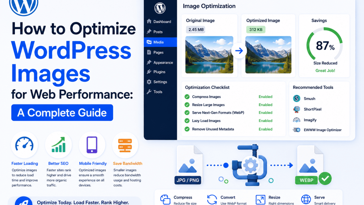

Introduction: Why Image Optimization Matters for WordPress Performance
Images are the backbone of visual storytelling on the web, but they are also the leading culprit behind sluggish WordPress sites. Every photograph, illustration, or graphic you upload adds weight to your pages. When images are not optimized, they can consume up to 60% of a page’s total bytes. This directly impacts how quickly your content appears on a visitor’s screen. In the world of web performance, every millisecond counts. A delay of even one second can reduce page views by 11%, decrease customer satisfaction by 16%, and lower conversion rates by 7%. For WordPress site owners—whether running a blog, an e-commerce store, or a portfolio—image optimization is not a nice-to-have; it is a fundamental requirement for delivering a fast, engaging, and successful website.
The Impact of Unoptimized Images on Load Times
Unoptimized images are the single largest contributor to slow load times. A typical high-resolution photo from a modern smartphone can be 3-5 MB or more. When you multiply that by the number of images on a page, the cumulative effect is staggering. Consider the following breakdown of how unoptimized images degrade performance:
- Increased bandwidth consumption: Large files force browsers to download more data, especially on mobile networks. This leads to longer wait times and higher data costs for users.
- Delayed page rendering: Images are often “render-blocking” resources. The browser must download and decode them before it can fully display the page layout, causing a blank or partially loaded screen.
- Higher bounce rates: Visitors expect pages to load in under three seconds. If your images cause a delay, users will abandon your site for a faster competitor. Studies show that 53% of mobile users leave a page that takes longer than three seconds to load.
- Server strain: Hosting large images consumes storage and increases server load during peak traffic. This can lead to downtime or throttled performance for all visitors.
Without optimization, even a well-coded WordPress theme will struggle to deliver acceptable speed. The result is a poor user experience that undermines your site’s credibility and effectiveness.
How Image Optimization Boosts Core Web Vitals
Google’s Core Web Vitals are a set of real-world metrics that measure user experience on the web. Image optimization directly improves three key metrics:
| Core Web Vital | How Image Optimization Helps | Impact on User Experience |
|---|---|---|
| Largest Contentful Paint (LCP) | Reduces the size of the largest image on the page (often a hero or banner). Smaller files load faster, decreasing LCP to under 2.5 seconds. | Visitors see the main content sooner, reducing perceived waiting time. |
| First Input Delay (FID) | Optimized images free up browser resources for JavaScript and interactivity. Less processing time for large images means the page becomes responsive quicker. | Users can click, tap, or scroll without lag, improving engagement. |
| Cumulative Layout Shift (CLS) | Using proper image dimensions and lazy loading prevents layout shifts. Optimized images load in their reserved space, without pushing content down. | No unexpected jumps during reading, which reduces frustration and accidental clicks. |
By optimizing images, you align your WordPress site with Google’s performance standards. This not only improves user satisfaction but also positively influences search rankings, as page experience is a confirmed ranking factor.
Balancing Quality and File Size: The Key Goal
The central challenge of image optimization is finding the sweet spot between visual fidelity and file size. You want images that look crisp and professional, yet load instantly. Achieving this balance requires a methodical approach:
- Understand image formats: Use modern formats like WebP or AVIF, which offer superior compression without visible quality loss. JPEG is still acceptable for photographs, while PNG is best for graphics with transparency. Avoid BMP or TIFF for web use.
- Apply smart compression: Lossy compression reduces file size by discarding non-essential data. The key is to apply a compression level where the human eye cannot detect the difference. Aim for 70-85% quality for JPEGs and comparable settings for WebP.
- Resize to exact display dimensions: Never upload a 4000-pixel-wide image to display at 800 pixels. Use image editing tools or WordPress plugins to scale images to the maximum width they will appear on your site.
- Test and iterate: Use tools like PageSpeed Insights or GTmetrix to measure your images’ impact. Adjust compression levels and dimensions until you achieve a balance where visual quality is maintained, but file size is minimized (ideally under 100 KB for most content images).
When you master this balance, your WordPress site will deliver rich visuals without sacrificing speed. This optimization is the foundation for a fast, user-friendly, and search-engine-optimized website that keeps visitors engaged and drives conversions.
Understanding Common Image Formats and Their Use Cases
Choosing the right image format is a foundational step in learning how to optimize WordPress images for web performance. Each format balances file size, visual quality, and feature support differently. Using the wrong format can bloat your pages with unnecessary kilobytes, slowing load times and harming user experience. This section breaks down the most common formats—JPEG, PNG, GIF, WebP, and AVIF—and explains when to use each for optimal results in WordPress.
JPEG vs. PNG: Compression and Transparency Trade-offs
JPEG and PNG are the two most widely used formats on the web, but they serve very different purposes.
- JPEG (Joint Photographic Experts Group): Uses lossy compression, which discards some image data to reduce file size. It excels with photographs and complex gradients where minor quality loss is imperceptible. JPEG does not support transparency.
- PNG (Portable Network Graphics): Uses lossless compression, preserving every pixel exactly. It supports full transparency (alpha channel), making it ideal for logos, icons, screenshots, and graphics with sharp edges or text. File sizes are typically much larger than JPEG for photographic content.
| Feature | JPEG | PNG |
|---|---|---|
| Compression type | Lossy | Lossless |
| Transparency support | No | Yes (alpha channel) |
| Best for | Photos, complex scenes | Graphics, logos, screenshots |
| File size (typical) | Small to medium | Large |
Practical rule: Use JPEG for all photographic content in your WordPress media library. Use PNG only when you need transparency—for example, a logo that sits over a colored background. For photographs with no transparency needs, PNG can increase file size by 200–300% without visible quality gains.
Next-Gen Formats: WebP and AVIF Benefits
Modern formats like WebP and AVIF offer superior compression and features compared to JPEG and PNG. Both are supported in all major browsers as of 2024, making them safe choices for WordPress optimization.
- WebP: Developed by Google, WebP supports both lossy and lossless compression, as well as transparency and animation. Lossy WebP can reduce file sizes by 25–35% compared to JPEG at equivalent quality. Lossless WebP is typically 20–30% smaller than PNG. WordPress has native WebP support since version 5.8.
- AVIF: Based on the AV1 video codec, AVIF offers even better compression than WebP—often 50% smaller than JPEG with similar perceptual quality. It supports HDR and wide color gamut. However, encoding is slower, and some older browsers (e.g., Safari before version 16) lack support.
Practical code example for WordPress: To serve WebP or AVIF images with fallbacks, add this to your theme’s functions.php file (requires a plugin like WebP Express or Imagify for automatic conversion):
add_filter('wp_get_attachment_image_attributes', function($attr, $attachment, $size) {
    if (isset($attr['src']) && strpos($attr['src'], '.webp') !== false) {
        $attr['data-src-fallback'] = str_replace('.webp', '.jpg', $attr['src']);
    }
    return $attr;
}, 10, 3);
This code adds a fallback data attribute for browsers that do not support WebP. In practice, most WordPress optimization plugins handle this automatically by using <picture> elements with multiple sources.
When to Use GIFs and SVG for Specific Needs
GIF and SVG are specialized formats that serve narrow but important use cases.
- GIF (Graphics Interchange Format): Supports animation and transparency (binary, not alpha). It is limited to 256 colors, making it unsuitable for photographs or complex gradients. File sizes can become very large for long or high-resolution animations. Use GIF only for simple, short animations like loading spinners or small memes. For complex animations, consider video formats (MP4) or animated WebP, which offer better compression.
- SVG (Scalable Vector Graphics): An XML-based vector format that scales infinitely without quality loss. It is ideal for logos, icons, charts, and illustrations. SVG files are typically tiny (a few kilobytes) and can be styled with CSS or manipulated with JavaScript. WordPress does not support SVG uploads by default for security reasons, but you can enable it via a plugin like Safe SVG.
When to choose each: Use GIF for tiny, low-color animations where file size is not critical. Use SVG for any graphic that needs to scale across devices—logos, icons, and infographics. Avoid using GIF for photographs or large animations; instead, use animated WebP or a short MP4 video loop. For static graphics with transparency, prefer SVG over PNG when possible, as SVG files are often 90% smaller.
Choosing the Right Image Dimensions and Aspect Ratios
Selecting the correct image dimensions for each context on your WordPress site is a foundational step in optimizing for web performance. When you upload an image that is larger than the display area, the browser must scale it down, consuming unnecessary bandwidth and processing power. Conversely, an image that is too small will appear pixelated or stretched. To avoid this, you must match image dimensions to their intended use—whether as a thumbnail in a grid, a featured image on a blog roll, or a full-width hero banner. This section explains how to leverage WordPress’s built-in tools and customize them for precise control.
Using WordPress’s Built-In Image Sizes Effectively
WordPress automatically generates multiple versions of every uploaded image, based on predefined sizes set in your theme or via the Media Settings screen. By default, these include “Thumbnail” (150×150 pixels, cropped), “Medium” (300×300 pixels), “Large” (1024×1024 pixels), and “Full” (the original dimensions). To use these effectively:
- Thumbnails: Ideal for grid layouts, product catalogs, or gallery widgets. Always use the exact size to avoid cropping surprises.
- Medium: Suitable for inline images within posts or sidebars. Keep below 300px width for consistent alignment.
- Large: Best for featured images on single post pages or content areas where high resolution is needed.
- Full: Avoid using this for standard content. Reserve it for lightbox views or downloadable assets.
To verify which sizes your theme supports, navigate to Settings > Media in your WordPress dashboard. Here, you can adjust the default dimensions, but be aware that changes only apply to newly uploaded images—not existing ones. For optimal performance, always select the smallest available size that matches your layout’s display width.
Customizing Thumbnail Dimensions via Functions.php
When your theme’s default sizes don’t align with your design, you can add custom image dimensions by editing your child theme’s functions.php file. This gives you granular control over aspect ratios and cropping behavior. Use the add_image_size() function with the following syntax:
add_image_size( 'custom-thumb', 400, 300, true );
The parameters are: name, width, height, and crop mode. Setting the fourth parameter to true enables hard cropping, which cuts the image to exact dimensions (useful for uniform grid thumbnails). Setting it to false (or omitting it) uses proportional scaling, which maintains the aspect ratio but may leave uneven edges. After adding the code:
- Regenerate thumbnails using a plugin like Regenerate Thumbnails or Force Regenerate Thumbnails to apply the new size to existing images.
- Reference the new size in your theme templates using
the_post_thumbnail( 'custom-thumb' );. - Test on various devices to ensure the crop aligns with your design (e.g., faces or key elements are not cut off).
This approach is particularly useful for e-commerce sites where product images must fit a specific grid, or for portfolio sites requiring consistent aspect ratios across galleries.
Responsive Images with srcset and sizes Attributes
Modern WordPress automatically adds srcset and sizes attributes to images, enabling browsers to choose the best resolution based on screen size and pixel density. However, you can optimize this further by defining explicit sizes attributes in your theme. The srcset attribute lists multiple image URLs (e.g., 300w, 600w, 1200w), while the sizes attribute tells the browser how much space the image will occupy at different breakpoints. For example:
<img src="image-300x200.jpg" srcset="image-300x200.jpg 300w, image-600x400.jpg 600w, image-1200x800.jpg 1200w" sizes="(max-width: 768px) 100vw, (max-width: 1200px) 50vw, 33vw" alt="Optimized image">
To implement this effectively in WordPress, use the wp_get_attachment_image() function with a sizes parameter in your theme files. For instance:
echo wp_get_attachment_image( $attachment_id, 'large', false, array( 'sizes' => '(max-width: 768px) 100vw, 50vw' ) );
This ensures that on mobile devices, the browser loads a smaller image file, while on desktops, it selects a higher resolution version. To see which sizes are generated, inspect the HTML output in your browser’s developer tools.
| Image Size | Typical Use Case | Recommended Dimensions | Crop Behavior |
|---|---|---|---|
| Thumbnail | Grid galleries, post listings | 150×150 px | Hard cropped (exact) |
| Medium | Inline content, sidebar images | 300×300 px | Proportional (no crop) |
| Large | Featured images, single posts | 1024×1024 px | Proportional (no crop) |
| Full | Lightbox, high-res downloads | Original upload size | No scaling |
By combining proper dimension selection, custom thumbnail sizes, and responsive attributes, you ensure that every image on your WordPress site loads at the optimal size for its context—reducing page weight and improving user experience across devices.
Compressing Images Before Uploading to WordPress
Optimizing images before they ever reach your WordPress media library is the most effective way to improve site speed without sacrificing visual quality. Pre-upload compression reduces file sizes by 40–80%, which directly decreases page load times and bandwidth usage. By processing images on your local machine or through a web service, you maintain full control over compression levels and avoid relying on server-side plugins that may conflict with your theme. The key is to use tools that apply lossy or lossless compression intelligently—removing metadata, reducing color palettes, and optimizing encoding—while preserving the visual integrity needed for web display.
Desktop Tools: Photoshop, GIMP, and ImageOptim
Desktop applications offer the most granular control over compression settings, making them ideal for photographers, designers, or anyone handling high-resolution images. Here are the leading options:
- Adobe Photoshop: Use “Save for Web (Legacy)” (File > Export > Save for Web). Set quality between 50–70% for JPEGs; for PNGs, reduce colors to 256 or fewer. The “Optimized” option yields smaller files by optimizing Huffman coding.
- GIMP: Export as JPEG with a quality slider (typically 75–85% for web). For PNGs, use the “PNG8” format with dithering disabled to drastically reduce size. GIMP also strips EXIF data via “Export” > “Advanced Options.”
- ImageOptim (macOS): Drag and drop images for lossless compression. It removes metadata, recompresses JPEGs, and optimizes PNGs using pngcrush and advpng. A practical command-line alternative for batch processing is
pngquantorjpegoptimon Linux.
For a quick reference, the table below compares common settings:
| Tool | Best For | Typical Reduction | Key Setting |
|---|---|---|---|
| Photoshop | JPEG/PNG | 50–70% | Quality 60, Progressive |
| GIMP | JPEG/PNG | 40–60% | Quality 75, No EXIF |
| ImageOptim | All formats | 30–50% | Lossless mode |
Online Compressors: TinyPNG, Squoosh, and Kraken
When you need quick compression without installing software, online tools are fast and accessible. They automatically handle format conversion and metadata stripping. The most reliable options include:
- TinyPNG (tinypng.com): Compresses PNGs and JPEGs using smart lossy algorithms. It reduces file sizes by up to 70% while preserving transparency. The free tier handles up to 20 images (5 MB each) per batch.
- Squoosh (squoosh.app): An open-source tool by Google that offers real-time comparison between original and compressed versions. You can adjust quality, resize dimensions, and choose between MozJPEG, WebP, or AVIF formats. Ideal for precise control.
- Kraken (kraken.io): Provides both lossy and lossless modes, plus an API for automated workflows. The free plan compresses images up to 1 MB each, but the web interface is clean and supports batch uploads.
For a command-line approach using a tool like cwebp (from Google’s WebP library), you can run this in your terminal to convert and compress a JPEG to WebP:
cwebp -q 80 input.jpg -o output.webp
This reduces file size by 25–35% compared to JPEG at equivalent quality, and WebP is natively supported in modern WordPress installations.
Batch Processing for Large Image Libraries
If you manage hundreds or thousands of images—common for e-commerce stores, portfolios, or blogs with galleries—batch processing is essential. Manual compression becomes impractical, so use tools that automate the workflow:
- Adobe Photoshop Actions: Record a compression action (e.g., “Save for Web” with your preferred settings) and run it on an entire folder via File > Automate > Batch.
- XnConvert (free, cross-platform): Supports batch resizing, format conversion, and compression. Add all images, set output to JPEG at 80% quality, and process in one click.
- Command-line tools: Use
findwithjpegoptimon Linux/macOS. For example, to compress all JPEGs in a directory recursively:
find /path/to/images -name "*.jpg" -exec jpegoptim --strip-all --max=80 {} ;
This command strips metadata and sets quality to 80%, reducing total library size by 30–50%. For PNGs, replace with optipng or pngquant. After batch processing, upload the optimized files to WordPress via the Media Library or FTP to ensure no further server-side compression is needed. This approach saves bandwidth and speeds up your site from the moment images are served.
Using WordPress Plugins for Automated Image Optimization
Automated image optimization plugins are the most efficient way to implement performance best practices without manual intervention. These tools compress, resize, and convert images on upload or in bulk, saving server resources and improving page load times. Below is a detailed comparison of the most popular options, along with specialized plugins for WebP conversion and lazy loading.
Smush vs. ShortPixel vs. Imagify: Feature Comparison
Three plugins dominate the WordPress image optimization space. The table below highlights their core differences:
| Feature | Smush | ShortPixel | Imagify |
|---|---|---|---|
| Free tier compression | Unlimited (lossy only) | 100 images/month | 25 MB/month (approx. 200 images) |
| Compression modes | Lossy (basic), Super Smush (lossless+) | Lossy, Glossy, Lossless | Normal, Aggressive, Ultra |
| Bulk optimization | Yes (unlimited on free) | Yes (paid credits) | Yes (limited on free) |
| WebP conversion | Paid add-on ($3/month) | Built-in (paid) | Built-in (paid) |
| Resizing on upload | Yes | Yes | Yes |
| CDN integration | Paid Smush CDN | None built-in | None built-in |
| Pricing (annual) | $69 (pro) | From $4.99/month | From $4.99/month |
Smush is ideal for beginners and sites with tight budgets due to its unlimited free compression. However, its lossy-only free mode may not suit photographers requiring lossless quality. ShortPixel offers granular control with three compression levels and supports PNG, GIF, and PDF optimization. Its credit-based system works well for small to medium sites. Imagify excels in speed—it processes images faster than competitors—and its “Ultra” mode delivers aggressive compression. All three support bulk optimization, but Smush’s free bulk feature is unmatched.
WebP Conversion Plugins: WebP Express and EWWW
WebP format can reduce image file sizes by 25–35% compared to JPEG or PNG, with no perceptible quality loss. Two dedicated plugins simplify conversion:
- WebP Express: This lightweight plugin converts images to WebP using either the GD library or Imagick. It serves WebP to browsers that support it (Chrome, Edge, Firefox) and falls back to original formats for others. Key features include automated conversion on upload, bulk conversion, and optional CDN support. Pro: Minimal server overhead and no external API dependencies. Con: Requires manual configuration for advanced settings like quality thresholds.
- EWWW Image Optimizer: A full-featured plugin that includes WebP conversion alongside standard compression. It supports all major image formats and can convert existing media library images. EWWW offers both local and cloud-based processing (the latter requires a paid subscription). Pro: One-click conversion for entire libraries and built-in lazy loading. Con: Free local conversion can be slow on large sites; cloud mode costs $7/month.
Both plugins handle browser detection automatically, but EWWW is better for users who want an all-in-one solution, while WebP Express is preferred for minimalist setups.
Lazy Loading Plugins and Their Performance Impact
Lazy loading delays loading of off-screen images until the user scrolls near them. This reduces initial page weight and improves time to interactive. Native lazy loading (loading=”lazy” attribute) is now supported in most browsers, but plugins add advanced features:
- a3 Lazy Load: Replaces all images, iframes, and videos with placeholders. It uses JavaScript for fallback support in older browsers. Performance impact: Reduces initial data transfer by 40–60% on image-heavy pages. Con: Can cause layout shifts if placeholder dimensions are not set.
- Lazy Load by WP Rocket: Built into the WP Rocket caching plugin, it applies lazy loading to images, thumbnails, and iframes with minimal configuration. Performance impact: Works seamlessly with caching and CDN, reducing server requests by up to 50%. Con: Only available as part of the premium WP Rocket package ($59/year).
- Jetpack Lazy Load: Part of Jetpack’s free module, it uses Intersection Observer for modern browsers and JavaScript fallback. Performance impact: Lightweight (under 10 KB) and does not break existing layouts. Con: Limited customization—no option to exclude specific images.
For most sites, combining a compression plugin (like ShortPixel) with a dedicated lazy loader (such as a3 Lazy Load) yields the best results. Avoid stacking multiple lazy loading plugins, as they can conflict and cause visual glitches. Test with tools like Google PageSpeed Insights to verify performance gains before and after implementation.
Implementing Lazy Loading for Images
Lazy loading is a performance optimization technique that defers the loading of images until they are about to enter the viewport. By delaying off-screen images, you reduce the initial page weight, cut down on HTTP requests, and improve perceived performance—especially on content-heavy WordPress sites. This guide walks you through three effective approaches, from native browser support to advanced JavaScript libraries and theme-level configuration.
Native Lazy Loading with the loading=’lazy’ Attribute
The simplest method is using the HTML loading="lazy" attribute, supported by all modern browsers. When added to <img> or <iframe> tags, it tells the browser to load the resource only when it nears the viewport. This requires no JavaScript and works out of the box. To implement it in WordPress, you can add the attribute manually in your theme’s template files or via a filter in your theme’s functions.php file.
Example code to add native lazy loading to all images in WordPress content:
add_filter( 'wp_get_attachment_image_attributes', function( $attr ) {
    if ( ! isset( $attr['loading'] ) ) {
        $attr['loading'] = 'lazy';
    }
    return $attr;
} );
Benefits of native lazy loading:
- Zero external dependencies or scripts.
- Works immediately with modern browsers (Chrome, Firefox, Edge, Safari 15.4+).
- Automatically respects user preferences (e.g., reduced data mode).
Limitations:
- Not supported in older browsers (e.g., Internet Explorer, Safari versions before 15.4).
- Limited control over loading thresholds compared to JavaScript libraries.
For best results, combine native lazy loading with explicit width and height attributes to prevent layout shifts.
JavaScript-Based Lazy Loading Libraries (e.g., lazysizes)
When you need more granular control or broader browser support, JavaScript libraries like lazysizes are a reliable choice. Lazysizes is a lightweight, SEO-friendly script that automatically detects images, iframes, and videos and loads them as users scroll. It uses a data-src or data-srcset attribute instead of the standard src, preventing the browser from fetching the resource until triggered.
To integrate lazysizes in WordPress:
- Download the library from GitHub or install via a plugin like WP Rocket that includes it.
- Enqueue the script in your theme’s
functions.php:
function enqueue_lazysizes() {
    wp_enqueue_script( 'lazysizes', 'https://cdnjs.cloudflare.com/ajax/libs/lazysizes/5.3.2/lazysizes.min.js', array(), '5.3.2', true );
}
add_action( 'wp_enqueue_scripts', 'enqueue_lazysizes' );
- Modify your image markup to use
data-srcand add thelazyloadclass:
<img class="lazyload" data-src="image.jpg" alt="Description" width="800" height="600" />
Key advantages of lazysizes:
- Supports responsive images (
data-srcsetanddata-sizes). - Works with older browsers (IE9+).
- Includes built-in features like automatic
IntersectionObserverdetection and low-quality image placeholders (LQIP).
Note that JavaScript-based libraries add a small script overhead, but the performance gains from deferred loading typically outweigh this cost.
Configuring Lazy Loading in WordPress Themes and Plugins
Many WordPress themes and performance plugins offer built-in lazy loading options, saving you from manual code edits. Here’s how to configure them effectively:
| Method | Where to Configure | Notes |
|---|---|---|
| Block themes (FSE) | Global styles or block settings | Some themes add loading="lazy" automatically; check under “Performance” settings. |
| Cache/performance plugins | WP Rocket, W3 Total Cache, LiteSpeed Cache | Enable lazy loading in their “Media” or “Optimization” tabs. WP Rocket also offers native and JS-based options. |
| Dedicated lazy load plugins | Lazy Load by WP Rocket, a3 Lazy Load | These replace native functionality with custom scripts; test for conflicts with your theme. |
| Custom theme implementation | functions.php or template files |
Use filters (like the native example above) or enqueue a library (like lazysizes). |
Best practices for configuration:
- Always test on staging first—some plugins may break lazy loading for carousels or sliders.
- Exclude critical above-the-fold images (e.g., hero banners) to avoid delays in loading the first screen.
- For WooCommerce sites, ensure product gallery images still load correctly when lazy loading is active.
By choosing the right lazy loading approach—native, JavaScript, or plugin-based—you can significantly reduce initial page weight and create a faster, more responsive WordPress site. Combine it with image compression and proper sizing for maximum performance gains.
Leveraging a Content Delivery Network (CDN) for Images
A Content Delivery Network (CDN) is a geographically distributed group of servers that work together to deliver internet content quickly. For WordPress image optimization, a CDN stores copies of your images on multiple servers around the world. When a visitor accesses your site, the CDN serves the image from the server closest to them, drastically reducing load times. This is particularly critical for image-heavy sites, where large file sizes can stall page rendering. By offloading image delivery from your origin server, a CDN also reduces bandwidth consumption and hosting costs, making it a cornerstone of modern web performance.
How CDNs Reduce Latency and Bandwidth Costs
Latency—the delay before data transfer begins—is primarily caused by the physical distance between a user and your hosting server. A CDN mitigates this by caching your images at edge servers in multiple geographic locations. For example, a visitor in Tokyo will receive an image from a nearby CDN server in Japan rather than from your origin server in the United States. This can cut latency by 50% or more. Bandwidth costs are also lowered because the CDN handles the bulk of image delivery, reducing the load on your hosting plan. Many CDNs offer tiered pricing or flat rates that are more economical than scaling your own server resources. Additionally, CDNs often include features like automatic image compression, WebP conversion, and lazy loading, further optimizing performance without manual effort.
Popular CDN Options: Cloudflare, KeyCDN, and Bunny.net
Choosing the right CDN for your WordPress site depends on your budget, technical comfort, and specific needs. Below is a comparison of three widely used options:
| CDN | Best For | Key Features | Pricing Model | WordPress Integration |
|---|---|---|---|---|
| Cloudflare | Free tier, security, and global reach | Automatic image optimization, WebP, Mirage (lazy loading), DDoS protection | Free plan available; paid plans from $20/month | Plugin (Cloudflare) or direct DNS setup |
| KeyCDN | High performance, image processing, and simple pricing | Image optimization API, WebP conversion, real-time purging, HTTP/2 | Pay-as-you-go (e.g., $0.04/GB) | Plugin (CDN Enabler) or manual URL rewrite |
| Bunny.net | Affordable, fast, and user-friendly | Global edge network, image optimizer, automatic compression, WebP, Brotli | Pay-as-you-go (e.g., $0.01/GB) with low minimums | Plugin (BunnyCDN) or pull zone setup |
Cloudflare is ideal for beginners due to its free tier and built-in security, while KeyCDN offers granular control and an image processing API for advanced users. Bunny.net stands out for its low cost and straightforward setup, making it a favorite for budget-conscious WordPress site owners.
Integrating a CDN with WordPress via Plugins
Integrating a CDN with WordPress is streamlined through dedicated plugins, which automate URL rewriting and cache purging. Follow these steps for a typical setup:
- Choose a CDN plugin such as CDN Enabler, W3 Total Cache, or WP Rocket (premium). These plugins allow you to enter your CDN URL and automatically rewrite image paths.
- Configure your CDN service by creating a pull zone (e.g., with Bunny.net) or enabling the CDN in your Cloudflare dashboard. For Cloudflare, simply point your DNS to Cloudflare nameservers; the CDN activates automatically.
- Set up the plugin: In your WordPress admin, go to the plugin’s settings. For CDN Enabler, paste your CDN zone URL (e.g.,
https://yourzone.b-cdn.net) and specify which file types to include (e.g., .jpg, .png, .webp). - Enable image optimization features if your CDN offers them—like automatic WebP conversion or compression. In Cloudflare, enable “Polish” in the Speed settings; in Bunny.net, activate “Image Optimizer” in your pull zone.
- Test and purge: Clear your site cache and use a tool like GTmetrix to confirm images are served from the CDN. If you update an image, purge the CDN cache via the plugin or CDN dashboard.
For image-heavy sites, consider also using a plugin like ShortPixel or Imagify to compress images before they are cached by the CDN, maximizing performance gains. Once integrated, your WordPress images will load faster for global audiences, reduce server strain, and lower bandwidth costs—making CDN investment a high-impact optimization step.
Optimizing Image Delivery with Caching and Headers
After you have compressed and resized your WordPress images, the next critical step for web performance is ensuring those images are delivered to returning visitors as quickly as possible. This is where browser caching and proper HTTP headers come into play. By instructing a user’s browser to store image files locally for a defined period, you eliminate redundant HTTP requests, reduce server load, and dramatically improve page load times for repeat visits. The key mechanisms for this are Expires headers, Cache-Control directives, and ETags. Implementing these correctly can reduce image load times by up to 50% for returning users, directly supporting your goal to optimize WordPress images for web performance.
Setting Expires Headers for Image Files
Expires headers provide an explicit date and time after which a cached resource is considered stale. For image files—such as JPEG, PNG, GIF, and WebP—you typically want a far-future Expires header because these assets rarely change. A common best practice is to set the Expires header to one year from the request time. This tells the browser: “Do not even ask the server for this image again for a full year; use the local copy.”
To set this in WordPress, you can add rules to your site’s .htaccess file (on Apache servers) or use a plugin. A typical .htaccess snippet looks like this:
<IfModule mod_expires.c>
  ExpiresActive On
  ExpiresByType image/jpg "access plus 1 year"
  ExpiresByType image/jpeg "access plus 1 year"
  ExpiresByType image/gif "access plus 1 year"
  ExpiresByType image/png "access plus 1 year"
  ExpiresByType image/webp "access plus 1 year"
</IfModule>
If you use a CDN or caching plugin, these headers are often configured automatically. Always verify your headers using browser developer tools (Network tab) to ensure the Expires header is present and set correctly.
Using Cache-Control Directives for Maximum Caching
While Expires headers are still widely supported, the modern and more flexible approach is the Cache-Control header. This directive gives you granular control over caching behavior. For images, the optimal Cache-Control configuration is:
- public: Allows the image to be cached by any intermediary (e.g., CDN, proxy) and the browser.
- max-age: Specifies the freshness lifetime in seconds. One year equals 31536000 seconds.
- immutable: A newer directive that tells the browser the resource will never change during its max-age. This prevents revalidation requests on page reloads.
A complete example for images would be: Cache-Control: public, max-age=31536000, immutable. This combination ensures that once a visitor downloads an image, their browser will never re-check with the server for updates during the cache period, drastically reducing latency.
Below is a comparison table showing the key differences between Expires and Cache-Control headers for image optimization:
| Header Type | Precision | Flexibility | Best Use Case for Images |
|---|---|---|---|
| Expires | Absolute date/time | Low (fixed date) | Legacy support; simple one-year caching |
| Cache-Control | Relative seconds (max-age) | High (directives like public, immutable) | Modern caching; avoids clock skew issues |
For maximum performance, use Cache-Control with a long max-age and the immutable directive. You can set this via your server configuration or through a WordPress caching plugin.
Leveraging WordPress Caching Plugins (e.g., W3 Total Cache)
Manually editing server files is effective but can be error-prone, especially for non-developers. WordPress caching plugins automate the process of setting proper headers and managing browser caching for images. W3 Total Cache is a popular and powerful option. To configure it for image caching:
- Install and activate the W3 Total Cache plugin.
- Navigate to Performance > Browser Cache.
- Under the General section, enable “Set expires header” and “Set cache control header.”
- Scroll to the CSS & JS and Media & Other Files sections. Set the “Expires header lifetime” to 31536000 seconds (one year) for images.
- Check the box for “Set cache control header” and select “public” with max-age set to 31536000. Enable “Set immutable header” if available.
- Save all settings and purge the cache.
Other plugins like WP Super Cache and WP Rocket offer similar functionality. The key is to ensure that your plugin is actually sending the correct headers for image file types. After configuration, test your images using a tool like GTmetrix or Pingdom to confirm that “Leverage browser caching” warnings are resolved. This automated approach ensures consistent, error-free implementation, directly contributing to your goal to optimize WordPress images for web performance.
Auditing Existing Images and Cleaning Up Your Media Library
Before you can optimize your WordPress images for web performance, you need to understand what you are working with. Most WordPress sites accumulate hundreds or thousands of images over time, many of which are oversized, incorrectly formatted, or completely unused. A thorough audit and cleanup of your media library is the first concrete step in any optimization workflow. This process reduces server storage, lowers bandwidth usage, and directly improves page load times.
Running a Performance Audit with GTmetrix or PageSpeed Insights
The most objective way to identify problematic images is to run a performance audit using tools like GTmetrix or Google PageSpeed Insights. These tools analyze your site’s actual loading behavior and provide specific recommendations for image optimization.
To perform an effective audit:
- Visit your site’s most image-heavy pages (e.g., homepage, product galleries, blog posts with featured images).
- Enter the URL into GTmetrix or PageSpeed Insights and run the test.
- Look for the “Serve properly sized images” and “Efficiently encode images” recommendations.
- Note the exact image URLs, file sizes, and dimensions that the tool flags as problematic.
For example, PageSpeed Insights might report that a 2400×1600 pixel image is being displayed at 800×533 pixels on mobile devices. This indicates the image is three times larger than needed, wasting bandwidth and slowing load time. Use this data to create a prioritized list of images to resize or replace.
A practical command-line approach for auditing local image files before uploading them to WordPress is using ImageMagick’s `identify` command:
identify -format "%f: %wx%h, %b bytesn" /path/to/your/images/*.jpg | sort -k3 -rn | head -20
This command lists the 20 largest JPG files in a directory, showing their dimensions and file sizes, helping you preemptively identify oversized uploads.
Finding and Deleting Unused Media Attachments
WordPress’s media library often contains orphaned images—files uploaded for a post or page that was later deleted, or images that were replaced but never removed. These unused attachments bloat your database and consume storage without providing any value to visitors.
To systematically find and delete unused media:
- Use a plugin like Media Cleaner: This tool scans your entire site for media files not attached to any post, page, or widget. It provides a list of orphaned images and allows you to delete them in bulk.
- Check the Media Library manually: Sort by “Date” and look for files older than six months that are not linked to any content. Right-click and select “Delete Permanently” after confirming they are unused.
- Remove thumbnails for deleted images: When you delete an image, WordPress may leave behind generated thumbnail sizes. Plugins like “Remove Thumbnails” can clean these up.
Before deleting any file, export a backup of your media library. This precaution ensures you can recover a file if it is mistakenly removed.
Bulk Resizing and Recompression with Media Library Tools
After identifying and removing unused images, the next step is to resize and recompress the remaining files. This process reduces file size without visibly degrading quality, directly addressing the recommendations from your performance audit.
Use one of the following tools for bulk optimization:
| Tool | Key Feature | Best For |
|---|---|---|
| Smush | Lossless compression and lazy loading | Simple one-click optimization |
| ShortPixel | Lossy and glossy compression options | High-quality, small file sizes |
| Imagify | Three compression levels (normal, aggressive, ultra) | Flexible control over quality |
| EWWW Image Optimizer | Server-side processing, no API limits | Large media libraries |
To bulk resize images to a maximum width (e.g., 1920 pixels for desktop views):
- Install and activate a plugin like “Imsanity” or “Bulk Resize Media”.
- Go to Settings > Media and set the maximum image width and height (e.g., 1920×1920).
- Run the bulk resize tool, which scans your library and resizes all images exceeding these dimensions.
- After resizing, run a bulk recompression pass with your chosen optimizer (e.g., Smush) to squeeze out additional bytes.
This two-step process ensures every image in your library is both properly dimensioned and efficiently compressed, directly improving your PageSpeed and GTmetrix scores. Remember to re-run your performance audit after cleanup to confirm the improvements.
Advanced Techniques: Image Sprites, SVGs, and Critical CSS
While basic compression and lazy loading address many performance issues, truly optimizing WordPress images requires advanced techniques. These methods reduce HTTP requests, shrink file sizes further, and improve perceived load times. Implementing CSS image sprites, optimizing SVGs, and leveraging critical CSS with background image optimization can yield significant gains, particularly for sites with many icons or decorative graphics.
Creating and Using CSS Image Sprites for Icons
CSS image sprites consolidate multiple small images—such as icons, buttons, or logos—into a single composite image file. This drastically reduces the number of HTTP requests, as the browser downloads one file instead of many. To implement sprites in WordPress:
- Combine images manually using tools like SpritePad or online generators. Arrange them in a grid, ensuring consistent spacing.
- Upload the sprite to your WordPress media library or theme’s assets folder.
- Define CSS rules for each icon using
background-image,background-position, and fixedwidthandheightdimensions. - Use background-position offsets to display the correct portion of the sprite. For example,
background-position: -20px 0;shifts the visible area left by 20 pixels.
Best practices for sprites include grouping icons with similar color palettes to avoid banding, using PNG-8 for fewer colors, and limiting sprite dimensions to avoid large file sizes. Avoid spriting images that change frequently, as updating the composite file requires re-caching.
Optimizing SVG Files and Inlining for Performance
SVGs (Scalable Vector Graphics) are ideal for logos, icons, and illustrations due to their small file sizes and crisp rendering at any resolution. However, unoptimized SVGs can contain unnecessary metadata, editor cruft, and redundant paths. To optimize SVGs for WordPress:
- Clean the SVG code using tools like SVGO or SVGOMG. Remove comments, empty groups, and unused definitions.
- Minify the SVG by compressing whitespace and reducing decimal precision (e.g., from 6 to 2 decimal places).
- Inline small SVGs (under 2 KB) directly into your theme’s HTML or PHP templates. This eliminates HTTP requests entirely. For larger SVGs, use external files with proper caching headers.
- Ensure accessibility by adding
role="img"and descriptive<title>and<desc>elements within the SVG tag.
Inlining SVGs also allows CSS control over fill colors and animations, reducing the need for additional images. However, avoid inlining very large SVGs, as they bloat the HTML and delay rendering.
Combining Critical CSS with Background Image Optimization
Critical CSS extracts the styles needed for above-the-fold content, allowing the browser to render the visible portion faster. When combined with background image optimization, this technique improves perceived load times and reduces render-blocking resources. Follow these steps:
| Step | Action | Performance Benefit |
|---|---|---|
| 1 | Identify above-the-fold background images using browser DevTools. | Focuses optimization on visible assets. |
| 2 | Extract critical CSS for those background images, including background-image URLs and positioning. |
Eliminates render-blocking for background styles. |
| 3 | Inline the critical CSS in the <head> of your WordPress theme. |
Reduces HTTP requests for style sheets. |
| 4 | Preload background images using <link rel="preload"> with as="image". |
Ensures images start loading early. |
| 5 | Defer non-critical styles and background images using lazy loading or asynchronous loading. | Prevents blocking of below-the-fold content. |
For WordPress, plugins like Autoptimize or WP Rocket can automate critical CSS generation. Manually, you can use tools like Critical CSS Generator to extract styles and then paste them into your theme’s header.php file. Always test with real user monitoring to confirm improvements in Largest Contentful Paint (LCP) and First Contentful Paint (FCP). Avoid over-inlining, which can increase HTML size and negate gains.
By mastering these advanced techniques, you can significantly reduce image-related HTTP requests and deliver a faster, smoother experience for your WordPress visitors.
Frequently Asked Questions
Why is image optimization important for WordPress sites?
Image optimization is crucial for WordPress sites because it directly impacts page load speed, user experience, and SEO. Large, unoptimized images increase page weight, leading to slower loading times, higher bounce rates, and lower search engine rankings. Optimized images reduce bandwidth usage, improve Core Web Vitals (like LCP), and enhance accessibility through proper alt text. Since images often account for the majority of a page's size, compressing them without sacrificing quality is one of the most effective ways to boost site performance, especially for mobile users and those with slower connections.
What are the best image formats for WordPress?
The best image formats for WordPress are WebP, JPEG, and PNG. WebP is recommended for its superior compression and quality, offering up to 30% smaller file sizes than JPEG without visible loss. JPEG is ideal for photographs and complex images with many colors, while PNG is best for graphics with transparency or sharp edges, like logos and icons. Use modern formats like AVIF for further compression if browser support allows. Avoid BMP and TIFF for web use. WordPress now supports WebP natively, and plugins can convert images automatically. Always consider the image's purpose and content type to choose the most efficient format.
How can I compress images in WordPress without losing quality?
You can compress images in WordPress without losing quality using lossless compression techniques. For lossless compression, use plugins like Smush (lossless mode), EWWW Image Optimizer, or ShortPixel (lossless option). These tools remove unnecessary metadata (like EXIF data) and apply algorithms that reduce file size while keeping all pixel data intact. For even smaller sizes with minimal visible difference, lossy compression (e.g., 80-90% quality) is often acceptable. Alternatively, use external tools like TinyPNG or Squoosh before uploading. Always test images after compression to ensure quality meets your standards, especially for high-resolution displays.
What is lazy loading and how does it help WordPress performance?
Lazy loading is a technique that defers loading of images until they are about to enter the viewport, meaning images below the fold are not loaded initially. This reduces initial page weight, speeds up the first paint and time to interactive, and saves bandwidth for users who don't scroll all the way down. WordPress has built-in lazy loading since version 5.5, which adds loading='lazy' attributes to images. You can enhance it with plugins like a3 Lazy Load or Lazy Load by WP Rocket. Lazy loading is especially beneficial for pages with many images, like galleries or long-form articles, and improves Core Web Vitals metrics like LCP and CLS.
Should I use a CDN for WordPress images?
Yes, using a CDN (Content Delivery Network) for WordPress images is highly recommended for performance. A CDN stores copies of your images on multiple servers worldwide, delivering them from the server closest to the user. This reduces latency, speeds up load times, and offloads traffic from your hosting server. Many CDNs also offer automatic image optimization, resizing, and WebP conversion. Popular options include Cloudflare (with Polish feature), Bunny.net, and KeyCDN. For WordPress, plugins like WP Rocket or Jetpack (with Site Accelerator) integrate CDN services. While not strictly necessary for small sites, a CDN is essential for global audiences and high-traffic websites.
How do I create responsive images in WordPress?
WordPress automatically creates responsive images by generating multiple sizes (thumbnail, medium, large) for each uploaded image and using the srcset and sizes attributes in HTML. This allows browsers to select the best image size based on viewport width and device pixel ratio. To ensure optimal responsive images, upload images at the largest size needed (e.g., 1920px wide for full-width), and use themes that properly implement srcset. You can further enhance with plugins like Flying Images or by adding image breakpoints in your theme. Avoid serving oversized images on mobile devices, and always test with browser developer tools to verify correct image selection.
What is the role of image alt text in SEO?
Image alt text (alternative text) plays a critical role in SEO by helping search engines understand the content of images, which they cannot 'see'. It improves accessibility for visually impaired users using screen readers, and can appear in image search results, driving additional traffic. Alt text should be descriptive, concise, and include relevant keywords naturally, but avoid keyword stuffing. For example, 'red apple on wooden table' is better than 'apple image'. WordPress allows you to add alt text when inserting images or via the media library. Well-written alt text contributes to overall page relevance and can improve rankings in both web and image searches.
How can I automate image optimization in WordPress?
Automating image optimization in WordPress saves time and ensures consistency. Use plugins like Smush, ShortPixel, or Imagify that automatically compress and resize images upon upload. Configure settings to choose compression level (lossy/lossless), convert to WebP, and optionally remove EXIF data. For bulk optimization, these plugins can process existing images in your media library. Advanced solutions like WP Rocket or Jetpack offer automatic optimization and CDN delivery. For developers, tools like ImageMagick or server-level optimization (e.g., mod_pagespeed) can be used. Always test automated settings to ensure quality meets your needs, and consider a backup before bulk processing.
Sources and further reading
- Google Developers: Image Optimization
- WebP Image Format (Google)
- Mozilla MDN: Lazy Loading
- W3C: Responsive Images (srcset)
- Google PageSpeed Insights: Image Optimization
- Web Almanac: Image Optimization Stats
- Smush WordPress Plugin
- ShortPixel Image Optimizer
- Imagify Image Optimizer
- EWWW Image Optimizer
Need help with this topic?
Send us your details and we will contact you.