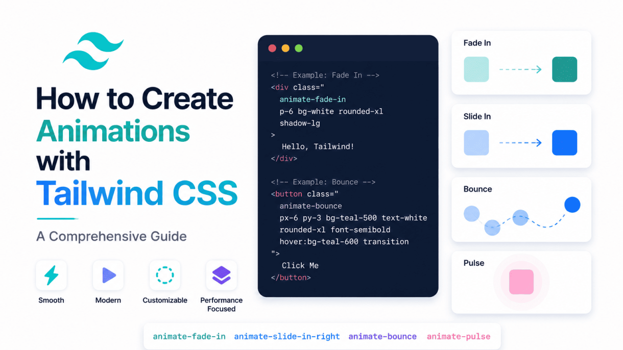

Introduction to Tailwind CSS Animations
Tailwind CSS offers a robust set of built-in animation utilities that allow developers to add motion to web projects quickly and efficiently, without writing custom CSS keyframes or transitions. These utilities are designed to work seamlessly with Tailwind’s utility-first approach, enabling you to apply animations directly in your HTML by adding simple classes. This guide explores how to create animations with Tailwind CSS, starting with an overview of the core concepts and benefits.
What Are Tailwind CSS Animations?
Tailwind CSS animations are pre-defined utility classes that correspond to standard CSS animation properties. They include classes for common effects like spinning, pulsing, bouncing, and fading, as well as the ability to customize animation duration, timing functions, delay, and iteration count. Each animation class maps to a specific set of CSS keyframes and properties, abstracting away the need to write complex CSS. For example, the class animate-spin applies a linear rotation animation, while animate-pulse creates a gentle opacity fade. Tailwind also provides the animate-none utility to disable animations when needed. The core animations available by default include:
animate-spin– continuous 360-degree rotationanimate-ping– scale and fade out effectanimate-pulse– subtle opacity oscillationanimate-bounce– vertical bouncing motionanimate-fade-in(customizable via configuration) – opacity transition from 0 to 1
These utilities are designed to be composable, meaning you can combine them with other Tailwind classes for layout, spacing, and colors to create rich, interactive interfaces.
Key Benefits of Using Tailwind for Animations
Using Tailwind CSS for animations offers several distinct advantages over traditional custom CSS approaches. Below is a summary of the primary benefits:
| Benefit | Description |
|---|---|
| Rapid development | Apply animations with single utility classes directly in HTML, eliminating the need to write separate CSS files. |
| Consistent naming | All animation utilities follow Tailwind’s predictable naming conventions, making them easy to learn and remember. |
| Responsive and state variants | Use responsive prefixes (e.g., md:animate-spin) and state variants (e.g., hover:animate-pulse) for conditional animations. |
| Customizable via config | Extend or override default animations in tailwind.config.js to match project-specific needs. |
| Reduced bundle size | Only the animation utilities you use are included in the final CSS, thanks to Tailwind’s purge mechanism. |
| No CSS conflicts | Utility classes are scoped and avoid specificity wars common with hand-written animation CSS. |
Additionally, Tailwind’s animation utilities integrate smoothly with frameworks like React, Vue, and Alpine.js, making them ideal for modern component-based architectures.
Prerequisites: Tailwind Setup and Configuration
Before you can start creating animations with Tailwind CSS, ensure your project meets the following requirements. First, you must have Tailwind CSS installed and configured. The recommended method is via npm or yarn:
npm install tailwindcss @tailwindcss/cli
After installation, generate a tailwind.config.js file and include Tailwind directives in your CSS file (typically style.css):
@import "tailwindcss";
For the animations to work, ensure your Tailwind configuration includes the necessary content paths so that the utility classes are detected. In tailwind.config.js, set the content array to point to your template files:
module.exports = {
  content: ["./src/**/*.{html,js}"],
  theme: {
    extend: {
      animation: {
        // custom animations can be added here
      }
    }
  },
  plugins: []
}
If you are using a framework like Next.js or Vite, Tailwind integrates automatically via PostCSS. For a basic HTML project, you can also use the CDN version for testing, but for production, the npm setup is recommended to enable customizations and tree-shaking. Once configured, you can immediately apply animation classes to any element in your HTML. No additional CSS imports or keyframe definitions are needed for the default animations.
Understanding Tailwind’s Animation Utility Classes
Tailwind CSS simplifies motion design by offering a set of pre-built animation utility classes. These classes allow you to add common, performant animations directly in your HTML without writing custom CSS keyframes. Each utility maps to a specific animation that can be further customized using Tailwind’s modifier system, making it easy to control timing, repetition, and easing.
The Built-in Animation Classes: animate-spin, animate-ping, animate-pulse, animate-bounce
Tailwind provides four default animation utilities, each designed for a distinct visual purpose. These classes are applied directly to an element using the animate-{name} syntax.
- animate-spin: Rotates the element 360 degrees linearly. Commonly used for loading spinners or progress indicators. Example:
<div class="animate-spin">...</div>. - animate-ping: Creates a scaling and fading effect, like a radar ping. Ideal for notification badges or location markers. The element scales up while its opacity drops to zero.
- animate-pulse: Gently fades the element in and out. Often used for skeleton loaders or subtle attention-grabbing elements.
- animate-bounce: Makes the element bounce up and down with a natural, spring-like motion. Useful for call-to-action buttons or playful UI elements.
These classes are optimized for performance using CSS transform and opacity properties, which are GPU-accelerated in modern browsers.
How Tailwind Maps Utility Classes to CSS Keyframes
Each Tailwind animation utility is backed by a corresponding CSS @keyframes rule defined in your configuration. For example, the animate-spin class maps to the following keyframe:
@keyframes spin {
  to { transform: rotate(360deg); }
}
Similarly, animate-ping uses a scale and opacity keyframe, animate-pulse uses opacity changes, and animate-bounce uses a series of translateY steps. When you add animate-spin to an element, Tailwind generates the equivalent CSS rule with a default duration of 1 second, infinite iteration, and linear easing. You can inspect these defaults in your browser’s developer tools or by extending the theme in your tailwind.config.js file.
Customizing Animation Duration, Delay, and Easing with Tailwind
Tailwind makes it straightforward to override the default timing of any animation using its built-in utility modifiers. You can adjust duration, delay, and easing without writing custom CSS.
- Duration: Use
duration-{value}classes likeduration-500(500ms) orduration-1000(1 second). Example:<div class="animate-spin duration-2000">...</div>slows the spin to 2 seconds. - Delay: Use
delay-{value}classes such asdelay-300(300ms delay before animation starts). Example:<div class="animate-bounce delay-500">...</div>. - Easing: Use
ease-{type}classes likeease-linear,ease-in,ease-out, orease-in-out. Default isease-linearfor spin and ping; pulse and bounce use custom easings. Example:<div class="animate-pulse ease-in-out">...</div>.
You can also combine these modifiers. For a practical example, a button with a delayed, slower bounce:
<button class="animate-bounce duration-1500 delay-200 ease-out">Click Me</button>
This code applies a bounce animation that lasts 1.5 seconds, starts after a 200ms delay, and uses an easing-out curve for a smooth deceleration. Tailwind’s utility-first approach ensures that all timing values remain consistent with your design system.
Creating Custom Animations with Tailwind’s Configuration
Tailwind CSS provides a robust set of built-in animation utilities, but real-world projects often require unique motion designs. By extending Tailwind’s theme configuration in tailwind.config.js, you can define custom keyframes and map them to reusable utility classes. This approach keeps your animations consistent, maintainable, and directly accessible through HTML classes. Below is a step-by-step guide to crafting your own animations.
Adding New Keyframes in the Extend Section
Begin by opening your tailwind.config.js file and locating the theme.extend object. Inside this object, add a keyframes property where you define each animation’s stages using percentage-based or from/to syntax. For example, to create a subtle “float” effect that moves an element upward and back:
module.exports = {
  theme: {
    extend: {
      keyframes: {
        float: {
          '0%, 100%': { transform: 'translateY(0)' },
          '50%': { transform: 'translateY(-10px)' },
        },
      },
    },
  },
};
Each keyframe name (e.g., float) becomes a reference for the animation utility. You can define multiple keyframes sets, each with its own sequence of transforms, opacity changes, or other CSS properties. Tailwind merges these with its default keyframes, so you retain access to built-in animations like spin or pulse.
Mapping Keyframes to Custom Animation Utilities
After defining keyframes, you must map them to animation utilities within the same extend block. Add an animation property that pairs a utility name with keyframe details, including duration, timing function, and iteration count. For instance:
module.exports = {
  theme: {
    extend: {
      keyframes: {
        float: { /* ... */ },
      },
      animation: {
        'float-slow': 'float 3s ease-in-out infinite',
        'float-fast': 'float 1.5s ease-in-out infinite',
      },
    },
  },
};
Here, float-slow and float-fast become new utility classes. The syntax follows: 'utility-name': 'keyframe-name duration timing-function iteration-count'. You can also add other properties like delay or direction by appending them (e.g., 'float 3s ease-in-out infinite 1s'). This mapping allows you to reuse the same keyframes with different timings, giving you flexibility without duplicating motion definitions.
Using Custom Animations in Your HTML Templates
Once configured, apply your custom animations directly in HTML using the utility class names. For example, to animate a card with the slow float effect:
<div class="animate-float-slow bg-white p-6 rounded-lg shadow-md">
  <p>This card gently floats upward and back.</p>
</div>
You can combine animations with other Tailwind utilities like hover: or motion-safe: to control behavior. For instance, hover:animate-float-fast triggers a faster float on mouse hover. Tailwind’s responsive prefixes also work: md:animate-float-slow applies the animation only on medium screens and above. This modular approach ensures your animations remain performant and accessible.
The table below compares key differences between built-in and custom animations in Tailwind CSS:
| Feature | Built-in Animations | Custom Animations |
|---|---|---|
| Configuration | Predefined in Tailwind’s default theme | Defined manually in tailwind.config.js |
| Flexibility | Limited to provided keyframes (e.g., spin, ping) | Unlimited; supports any CSS keyframe sequence |
| Reusability | Accessible via classes like animate-spin |
Accessible via custom class names (e.g., animate-float-slow) |
| Performance | Optimized for common use cases | Equally performant when using GPU-accelerated properties |
By mastering these configuration steps, you can create tailored animations that align with your design system. Custom animations reduce redundant CSS, improve collaboration through consistent naming, and allow precise control over motion timing—all within Tailwind’s utility-first workflow.
Combining Animations with Tailwind’s Variants and States
Tailwind CSS provides a powerful system of variants and states that let you control when animations occur. By combining animation utilities with these conditional triggers, you can create interactive, responsive, and context-aware motion effects without writing custom CSS. This approach keeps your code declarative and maintainable while delivering polished user experiences.
Applying Animations on Hover and Focus
The most common way to trigger animations conditionally is through hover and focus states. Tailwind’s hover: and focus: prefixes work with any animation utility class, such as animate-pulse, animate-bounce, or your custom animate-* classes defined in the tailwind.config.js file.
For example, you might want a button to pulse when hovered or a form input to shake on focus. Here is a practical code example:
<button class="bg-blue-500 text-white px-4 py-2 rounded hover:animate-pulse focus:animate-bounce">
  Submit
</button>
Key considerations when using state-based animations:
- Performance: Use lightweight animations like
animate-pulseoranimate-spinfor hover/focus to avoid jank. Heavy animations may cause re-layouts. - Accessibility: Respect the
prefers-reduced-motionmedia query. Tailwind’smotion-safe:andmotion-reduce:variants let you disable animations for users who prefer less motion. - Specificity: State variants override base animations. If a class has
animate-bounceandhover:animate-pulse, hovering will show the pulse, not the bounce. - Duration: Consider adding
duration-*utilities (e.g.,duration-300) to control animation speed on state changes.
Using Group Variants for Parent-Child Animations
Tailwind’s group variants enable parent-triggered animations on child elements. When you add the group class to a parent container, you can use group-hover:, group-focus:, or group-active: on child elements to animate them when the parent state changes. This is ideal for cards, navigation items, or any component where a child should react to interactions on its container.
Example: a card that rotates an icon when the card itself is hovered:
<div class="group p-4 border rounded-lg hover:shadow-lg">
  <svg class="w-6 h-6 group-hover:animate-spin transition-transform">
    <!-- icon path -->
  </svg>
  <p class="mt-2">Hover the card to spin the icon</p>
</div>
Best practices for group animations:
- Use
group-focus:for keyboard accessibility—animations trigger when the parent receives focus. - Combine with
transition-*utilities for smooth state changes, especially when animating transforms or opacity alongside Tailwind’s built-in animations. - Nest groups carefully; only one level of
groupis supported per parent-child relationship. - Test with
group-active:for momentary feedback on click or tap events.
Animating with Dark Mode and Responsive Breakpoints
Tailwind’s dark mode and responsive variants (sm:, md:, lg:, xl:) let you control animations based on system preferences or viewport size. This is useful for adapting motion to different contexts without duplicating code.
For dark mode, use the dark: variant to apply animations only when the user’s system is in dark mode. Example: a subtle glow animation on a dark theme button:
<button class="dark:animate-pulse bg-gray-200 dark:bg-gray-800 text-black dark:text-white px-4 py-2 rounded">
  Dark Mode Pulse
</button>
For responsive breakpoints, you can enable animations on larger screens while disabling them on mobile to conserve battery or reduce visual clutter. Example: a spinning loader that only appears on desktop:
<div class="hidden lg:block lg:animate-spin">Loading...</div>
Key points for combining variants:
- Stack variants in order:
dark:lg:hover:animate-pulsemeans the animation applies only in dark mode, on large screens, and when hovered. - Use
motion-safe:andmotion-reduce:as base or variant prefixes to respect user accessibility settings across all breakpoints. - Avoid animating layout properties (like
widthorheight) on responsive variants—stick to transforms, opacity, or Tailwind’s pre-built animations for best performance. - Test each combination in browser DevTools to ensure animations trigger as expected, especially when multiple states (hover + dark mode + responsive) overlap.
Animating Transitions with Tailwind’s Transition Utilities
Tailwind CSS offers a robust set of utility classes for creating smooth, performant transitions between property states. Unlike keyframe-based animations, transitions are triggered by state changes (such as hover, focus, or class toggling) and animate property modifications over a specified duration. This approach is ideal for subtle UI interactions, feedback cues, and polished micro-interactions that enhance user experience without the complexity of custom keyframes.
Setting Up Transitions: transition, duration-*, delay-*, ease-*
To enable a transition, add the transition class to an element. This class applies a default transition effect to all animatable properties. From there, you control the timing and behavior using companion utilities:
- duration-{value}: Sets the animation duration. Available values include 75, 100, 150, 200, 300, 500, 700, and 1000 (milliseconds). For example,
duration-300creates a 300ms transition. - delay-{value}: Adds a delay before the transition starts. Same value range as duration, e.g.,
delay-150adds 150ms delay. - ease-{value}: Controls the acceleration curve. Options are
ease-linear,ease-in,ease-out, andease-in-out(default).
Combine these utilities to fine-tune transitions. For instance, a button with transition duration-200 ease-out will have a 200ms transition with a smooth deceleration. The table below summarizes common configurations:
| Utility | Example Class | Effect |
|---|---|---|
| Base transition | transition |
Enables transitions for all properties |
| Duration | duration-500 |
500ms transition length |
| Delay | delay-200 |
200ms start delay |
| Ease | ease-in |
Accelerates at start |
Animating Specific Properties: transition-all vs. transition-colors
Tailwind provides property-specific transition classes to optimize performance and prevent unintended animations. The key distinction is between broad and narrow property targeting:
- transition-all: Animates every changeable CSS property. Convenient but can cause performance issues with layout-triggering properties like
widthormargin. Use sparingly. - transition-colors: Animates only color-related properties (
color,background-color,border-color, etc.). Other property-specific options includetransition-opacity,transition-shadow,transition-transform, andtransition-spacing.
For most UI interactions, prefer property-specific transitions. For example, to animate only background color changes: transition-colors duration-300. This avoids animating other properties like padding or font-size, which could cause layout shifts. Use transition-all only when you need multiple properties to animate together (e.g., a card that scales and changes shadow simultaneously).
Practical Examples: Button Hover Effects and Panel Slides
Button Hover Effects: Create a primary button that smoothly changes background and text color on hover. Apply transition-colors duration-200 ease-in-out to a button with classes bg-blue-500 and text-white. On hover, use hover:bg-blue-700 and hover:text-gray-200. The color transition will be smooth over 200ms.
For a more dynamic effect, add a transform with transition-transform duration-200 and hover:scale-105. This scales the button slightly while colors change. The combined classes would be: transition-colors transition-transform duration-200 hover:bg-blue-700 hover:text-gray-200 hover:scale-105.
Panel Slides: For a collapsible panel, use transition-all duration-300 ease-in-out on the panel container. Toggle a class like max-h-0 to max-h-96 (or a specific pixel value) to animate height. Pair with overflow-hidden to prevent content overflow during collapse. The transition will smoothly expand or collapse the panel. For slide-in effects, combine transition-transform duration-400 with translate-x-full (hidden) and translate-x-0 (visible) states. Toggle the visibility class to slide the panel in from the right edge.
Advanced Animation Techniques with Tailwind CSS
Moving beyond basic transitions and simple keyframe animations, Tailwind CSS provides a robust utility-first approach for creating sophisticated motion designs. Advanced techniques such as staggered animations, infinite loops, and multi-step sequences allow developers to craft engaging user interfaces without leaving the HTML. This section explores how to leverage Tailwind’s built-in utilities and custom configurations to implement these complex patterns efficiently.
Creating Staggered Animations with Animation Delay
Staggered animations—where multiple elements animate sequentially rather than simultaneously—add a polished, professional feel to page loads, list appearances, or gallery reveals. Tailwind does not include a default animation-delay utility, but you can easily extend the theme configuration to add delay variants. Here is a practical example for a list of three items that fade in one after another.
First, add custom delay values to your tailwind.config.js file:
// tailwind.config.js
module.exports = {
  theme: {
    extend: {
      animationDelay: {
        '100': '100ms',
        '200': '200ms',
        '300': '300ms',
        '400': '400ms',
        '500': '500ms',
      },
    },
  },
  plugins: [],
}
Then, in your HTML, apply the animate-fadeIn class (assuming you have defined a fadeIn keyframe) along with animation-delay-100, animation-delay-200, and animation-delay-300 to consecutive elements. This creates a cascading entrance effect. For example:
- First item:
class="animate-fadeIn animation-delay-100" - Second item:
class="animate-fadeIn animation-delay-200" - Third item:
class="animate-fadeIn animation-delay-300"
You can also use Tailwind’s arbitrary value syntax directly in the class: class="animate-fadeIn [animation-delay:200ms]" for one-off delays without configuration changes. This approach keeps your code declarative and maintainable.
Implementing Infinite and Looping Animations
Tailwind’s animate-spin, animate-ping, animate-pulse, and animate-bounce classes are preconfigured to loop infinitely by default. For custom animations, you can add the infinite keyword to the animation property. In your configuration, define a custom keyframe and set its iteration count to infinite. For instance, a slow, continuous rotation effect can be created as follows:
// tailwind.config.js
module.exports = {
  theme: {
    extend: {
      keyframes: {
        'slow-spin': {
          '0%': { transform: 'rotate(0deg)' },
          '100%': { transform: 'rotate(360deg)' },
        },
      },
      animation: {
        'slow-spin': 'slow-spin 3s linear infinite',
      },
    },
  },
}
Apply animate-slow-spin to any element. For finer control, you can use the arbitrary value syntax to adjust duration or iteration count on the fly: class="animate-spin [animation-duration:4s] [animation-iteration-count:infinite]". This is especially useful for loading indicators, attention-grabbing icons, or decorative elements that require persistent motion.
Building Multi-Step Animations with Custom Keyframes
Multi-step animations involve sequences of state changes—such as scaling, rotating, and translating—within a single animation cycle. Tailwind’s keyframe configuration supports multiple percentage stops, enabling complex choreography. Below is an example of a “bounce-in and shake” animation for a button or notification badge.
// tailwind.config.js
module.exports = {
  theme: {
    extend: {
      keyframes: {
        'bounce-shake': {
          '0%': { transform: 'scale(0) rotate(0deg)', opacity: '0' },
          '50%': { transform: 'scale(1.2) rotate(10deg)', opacity: '1' },
          '70%': { transform: 'scale(0.9) rotate(-10deg)' },
          '100%': { transform: 'scale(1) rotate(0deg)', opacity: '1' },
        },
      },
      animation: {
        'bounce-shake': 'bounce-shake 0.6s ease-in-out 1',
      },
    },
  },
}
Use animate-bounce-shake to trigger the full sequence. For more advanced needs, combine multiple keyframes by chaining animations in the animation property—for example, animation: 'bounce-shake 0.6s, fadeIn 0.3s'—to run sequences in parallel or series. This technique is ideal for micro-interactions, such as form submission confirmations or card hover effects, where multiple visual changes must feel cohesive.
To summarize these advanced techniques, refer to the table below for quick comparison:
| Technique | Key Utility | Common Use Case |
|---|---|---|
| Staggered animations | animation-delay (custom or arbitrary) |
List entries, gallery grids |
| Infinite loops | infinite keyword in animation config |
Loading spinners, pulsing buttons |
| Multi-step sequences | Custom keyframes with multiple stops | Micro-interactions, notification alerts |
By mastering these patterns, you can create rich, performant animations that enhance user experience without sacrificing code clarity or relying on external libraries.
Integrating Tailwind Animations with JavaScript Frameworks
Tailwind CSS animations become significantly more powerful when combined with JavaScript frameworks, enabling dynamic, state-driven motion. This integration allows you to trigger animations based on user interactions, data changes, or lifecycle events, moving beyond simple static classes. Below, we explore how to achieve this in React, Vue, and Alpine.js, focusing on practical implementation patterns.
Animating with React: Conditional Classes and Framer Motion
In React, the most straightforward approach is to conditionally apply Tailwind animation classes using state or props. For example, toggling a animate-pulse class on a button when loading:
- State-driven classes: Use
className={`${isLoading ? 'animate-pulse' : ''}`}to control animations via boolean state. - CSS transitions: Combine Tailwind’s
transitionutilities with React’suseStatefor simple enter/leave effects, like fading a modal in withopacity-0andopacity-100. - Framer Motion integration: For complex sequences, use Framer Motion’s
motioncomponents while keeping Tailwind for base styling. Example:<motion.div initial={{ opacity: 0 }} animate={{ opacity: 1 }} className="bg-blue-500 p-4">. This preserves Tailwind’s utility classes while leveraging Framer’s animation engine.
Framer Motion excels at orchestrating staggered animations or gesture-based interactions, but Tailwind handles the visual design layer. For instance, a list item can slide in using initial={{ x: -100 }} while retaining Tailwind’s rounded-lg shadow classes.
Vue.js Transition Components and Tailwind Classes
Vue.js provides built-in <Transition> and <TransitionGroup> components that pair seamlessly with Tailwind’s animation utilities. The key is to define custom transition classes that map to Tailwind’s naming:
| Vue Transition Hook | Tailwind Class Example | Effect |
|---|---|---|
enter-from |
opacity-0 scale-95 |
Start state (invisible, slightly scaled down) |
enter-active |
transition duration-300 ease-out |
Transition properties during entry |
leave-to |
opacity-0 scale-95 |
End state for leaving animation |
leave-active |
transition duration-200 ease-in |
Transition properties during exit |
Implementation example: <Transition enter-from-class="opacity-0" enter-active-class="transition duration-300" leave-to-class="opacity-0">. This keeps your JavaScript clean while using Tailwind for all motion styling.
Alpine.js x-transition and Tailwind Integration
Alpine.js offers a declarative x-transition directive that directly accepts Tailwind classes without extra configuration. This makes it ideal for rapid prototyping. Common patterns include:
- Basic fade:
x-transition:enter="transition ease-out duration-300" x-transition:enter-start="opacity-0" x-transition:enter-end="opacity-100" - Slide and scale: Combine
transformutilities:x-transition:enter-start="opacity-0 translate-y-4 scale-95" - Conditional animations: Use
x-showwithx-transitionto animate elements based on Alpine state, like toggling a dropdown withx-data="{ open: false }".
Alpine’s approach eliminates the need for JavaScript logic, as x-transition automatically applies enter/leave classes. This is especially useful for simple UI elements like tooltips, modals, or accordions where Tailwind’s animation utilities are sufficient.
Performance Optimization for Tailwind Animations
Creating animations with Tailwind CSS that remain smooth across devices requires deliberate performance optimization. Without proper care, even simple animations can cause jank, stuttering, or excessive battery drain. The key is to leverage GPU acceleration, avoid costly property changes, and systematically test your work. Below are three essential practices to ensure your Tailwind animations run efficiently.
Using will-change and Transform for GPU Acceleration
Modern browsers can offload certain rendering tasks to the GPU, which significantly improves animation smoothness. To enable this in Tailwind, use the will-change utility class to hint at which properties will animate. For example, class="will-change-transform" tells the browser to prepare for transform-based animations. Combine this with Tailwind’s transform utilities (like scale-110, translate-x-5, or rotate-45) to animate only properties that trigger compositing—not layout or paint. This approach keeps the main thread free and avoids layout thrashing.
Best practice: Apply will-change sparingly and only to elements that will animate continuously (e.g., hover effects, loading spinners). Overusing it can consume memory and actually degrade performance. For discrete, one-time animations (like fade-ins on page load), you may omit will-change entirely.
Avoiding Animations on Expensive Properties (e.g., width, height)
Animating properties like width, height, margin, padding, or top/left forces the browser to recalculate layout and repaint each frame—a process known as reflow. This is computationally expensive and causes visible jank, especially on mobile devices. Instead, animate only transform and opacity, which are compositor-only properties. For example, to create a “grow” effect, use scale() rather than changing width from 100px to 200px. The following table compares performance characteristics of common CSS properties:
| Property | Triggers Layout/Reflow | Triggers Paint | Performance Recommendation |
|---|---|---|---|
transform |
No | No | Use for all position, scale, rotation animations |
opacity |
No | Yes (but cheap) | Safe for fade effects |
width, height |
Yes | Yes | Avoid; use scale() instead |
margin, padding |
Yes | Yes | Avoid; use translate() instead |
In Tailwind, this means preferring classes like hover:scale-110 over hover:w-48 for size changes, and hover:translate-x-2 over hover:ml-4 for position shifts.
Testing and Profiling Animation Performance in the Browser
Even with best practices, real-world performance varies. Use browser developer tools to verify your animations run at 60 frames per second (fps) without dropped frames. In Chrome or Edge, open the Performance panel (Ctrl+Shift+I, then “Performance” tab) and record while the animation runs. Look for long tasks (over 50ms) and areas highlighted in red under “Rendering” or “Painting.” For Tailwind-specific debugging, inspect the animated element to confirm only transform and opacity are changing—not width or height. The “Layers” panel (in Chrome’s Rendering tab) can also show if the element is promoted to a compositor layer. If you see frequent layout recalculations, refactor the animation to use GPU-friendly properties. A simple test: if the animation stutters on a mid-range smartphone, it likely needs optimization.
Common Pitfalls and Troubleshooting Tailwind Animations
Even with Tailwind CSS’s streamlined utility classes, animations can sometimes fail to behave as expected. Most issues stem from CSS specificity, class ordering, or unintended interactions with other properties. Below are the most frequent problems and their solutions, helping you debug and refine your animated interfaces.
Animations Not Playing: Check Class Order and Specificity
If your animation class appears to be applied but the element remains static, the culprit is often class order or specificity conflicts. Tailwind applies styles based on the cascade; if a utility like animate-spin is placed before a static utility like opacity-100 in the same HTML element, the later class might override the animation. More commonly, custom CSS defined elsewhere—or even Tailwind’s own transition utilities—can block animation properties.
To fix this, follow these checks:
- Ensure the animation class is listed last among conflicting utilities on the same element. For example, use
class="opacity-50 hover:opacity-100 animate-pulse"rather than placinganimate-pulsefirst. - Inspect computed styles in your browser’s DevTools to verify that
animation-nameis not crossed out or overridden. - Avoid mixing
transitionandanimate-*on the same property (e.g.,transition-opacitywithanimate-pulse). If needed, usetransition-noneto disable transitions on that element.
For a practical example, here is a corrected button that animates without interference:
<button class="bg-blue-500 text-white px-4 py-2 rounded hover:bg-blue-700 transition-colors animate-bounce">
  Click Me
</button>
Note that transition-colors is safe here because it targets background-color, while animate-bounce affects transform. If both targeted transform, the transition would override the animation.
Dealing with Overlapping Animations and Transitions
When an element has both a Tailwind animation (e.g., animate-spin) and a transition (e.g., transition-transform), they can compete for control of the same CSS properties. This often results in jittery behavior, incomplete animations, or one effect completely suppressing the other.
To manage this conflict:
- Separate properties deliberately. Use animations for continuous, keyframe-driven motion (e.g., rotation, pulsing) and transitions for user-initiated state changes (e.g., hover, focus).
- Disable transitions on animated elements by adding
transition-nonewhen an animation is active. You can toggle this with JavaScript or Tailwind’sgroupandpeermodifiers. - Use Tailwind’s
motion-*variants to conditionally apply animations only when motion is preferred, reducing conflicts with static transitions.
If you must combine both, ensure the transition targets a different property than the animation. For example, animate opacity with animate-pulse while transitioning background-color with transition-colors.
Ensuring Accessibility: Respecting Reduced Motion Preferences
Animations can cause discomfort or vestibular issues for users with motion sensitivities. Tailwind provides built-in support for the prefers-reduced-motion media query through the motion-safe and motion-reduce variants. Ignoring this is a common pitfall that makes animations inaccessible.
Follow these guidelines to respect user preferences:
- Apply animations with
motion-safe:prefix to ensure they only play when the user has no motion preference. Example:class="motion-safe:animate-spin". - Use
motion-reduce:to define fallback styles, such as a static visual cue or a subtle opacity change, for users who prefer reduced motion. - Test your animations by enabling “Reduce motion” in your operating system or browser DevTools (e.g., Chrome’s Rendering tab).
Here is a table summarizing the recommended approach:
| User Preference | Tailwind Variant | Example Usage |
|---|---|---|
| No preference (default) | motion-safe: |
class="motion-safe:animate-bounce" |
| Reduce motion enabled | motion-reduce: |
class="motion-reduce:opacity-80" |
By consistently using these variants, you ensure your animations enhance the experience without excluding users who need a calmer interface.
Real-World Examples and Use Cases
This section demonstrates how to apply Tailwind CSS animation utilities to common interface elements. Each example is production-ready and requires only standard Tailwind classes—no custom CSS. Focus on the core patterns: utility-first timing, color customization, and responsive control.
Building a Spinner Loader with animate-spin and Custom Colors
The animate-spin utility provides a continuous 360-degree rotation. To create a branded loader, combine it with border-based shapes and color classes. The following example uses a circular spinner with a transparent border and a colored top edge.
- Base structure: Apply
animate-spinto a square element withrounded-fullandborder-4. - Color customization: Use
border-t-blue-600for the active segment andborder-gray-200for the rest. - Sizing: Control dimensions with
h-8 w-8(small),h-12 w-12(medium), orh-16 w-16(large). - Accessibility: Add
aria-label="Loading"androle="status"for screen readers.
Example markup pattern:
<div class="animate-spin rounded-full border-4 border-gray-200 border-t-blue-600 h-12 w-12" role="status" aria-label="Loading"></div>
For a branded variant, replace border-t-blue-600 with your brand color (e.g., border-t-emerald-500). The animation speed is fixed, but you can override it in a Tailwind config if needed.
Creating a Slide-In Notification Toast
Notification toasts benefit from smooth slide-in and fade-in effects. Tailwind’s transition and animation utilities handle this without JavaScript for the visual layer—only a class toggle is needed for triggering.
| Property | Tailwind Classes | Purpose |
|---|---|---|
| Initial state | opacity-0 -translate-y-4 |
Hidden above viewport |
| Visible state | opacity-100 translate-y-0 |
Slides down and becomes opaque |
| Timing | transition-all duration-500 ease-out |
Smooth 500ms easing |
| Dismiss | opacity-0 translate-x-full |
Slides out to the right |
Implementation steps:
- Wrap the toast in a container with
fixed top-4 right-4 z-50. - Apply
transition-all duration-500 ease-outto the toast element. - Toggle a class like
translate-y-0 opacity-100to show, andtranslate-x-full opacity-0to hide. - Use
bg-white shadow-lg rounded-lg p-4for visual styling.
This pattern works for success, error, or info toasts. Adapt the background color with utilities like bg-green-50 border-l-4 border-green-500 for semantic feedback.
Subtle Page Entry Animations for Landing Sections
Landing pages benefit from staggered entry animations that guide the user’s eye. Tailwind’s animate-fade-in and animate-slide-up (from the default theme) can be combined with custom delays using delay-[*] utilities.
- Fade-in effect: Use
animate-fade-inon section containers. This provides a 500ms opacity transition from 0 to 1. - Slide-up variant: Combine
animate-slide-upwithtranslate-y-0for elements that rise into place. - Staggered delays: Apply
delay-100,delay-200,delay-300to child elements for sequential reveals. - Responsive control: Use
motion-safe:animate-fade-into respect user motion preferences.
Practical layout example: For a hero section with a headline, subtext, and button, apply animate-fade-in to the parent container, then add delay-100 to the headline, delay-200 to the subtext, and delay-300 to the button. This creates a natural reading flow.
Always test animations on slower connections and devices. Use motion-reduce:animate-none on the parent to disable all child animations for users who prefer reduced motion. These snippets integrate directly into any Tailwind project and require no extra configuration beyond the default theme.
Frequently Asked Questions
What is Tailwind CSS and how does it handle animations?
Tailwind CSS is a utility-first CSS framework that provides low-level utility classes for rapid UI development. For animations, it offers built-in classes like `animate-spin`, `animate-ping`, `animate-pulse`, and `animate-bounce`. You can also create custom animations using the `animation` property in your Tailwind config file, defining keyframes and durations. This approach keeps your CSS small and reusable while allowing fine-grained control over timing, easing, and iteration.
How do I add a basic fade-in animation with Tailwind?
To add a fade-in animation, first define a custom animation in `tailwind.config.js` under `theme.extend.animation` and `keyframes`. For example: `fadeIn: { '0%': { opacity: '0' }, '100%': { opacity: '1' } }`. Then use the class `animate-fadeIn` on your element. You can control duration and delay with utility classes like `duration-500` (500ms) or `delay-200`. For a simple hover fade, use `transition-opacity duration-300` and `hover:opacity-100`.
Can I combine multiple animations on one element?
Yes, you can combine multiple animations by using Tailwind's arbitrary value syntax or by defining a single animation that includes multiple keyframe sequences. For example, use `animate-[fadeIn_1s_ease-in-out,slideUp_0.5s_ease-out]` in the class attribute. Alternatively, define a compound animation in your config that applies both transforms and opacity changes. Note that performance may degrade with many simultaneous animations, so test on target devices.
How do I create a scroll-triggered animation with Tailwind?
Tailwind does not include scroll-triggered animations natively, but you can combine it with Intersection Observer API or libraries like AOS (Animate On Scroll). For a custom solution, add a JavaScript observer that toggles a Tailwind class like `opacity-0 translate-y-4` to `opacity-100 translate-y-0` when an element enters the viewport. Use `transition-all duration-700` for smooth animation. Tailwind's `motion-safe:` variant can respect user preferences.
What are the best practices for animation performance in Tailwind?
To optimize animation performance, prefer animating `transform` and `opacity` properties as they are GPU-accelerated. Avoid animating `width`, `height`, or `margin` which trigger layout recalculations. Use `will-change` sparingly (e.g., `will-change-transform`) to hint at changes. Tailwind's `duration-`, `ease-`, and `delay-` utilities let you fine-tune timing. Always test on low-end devices and respect `prefers-reduced-motion` using Tailwind's `motion-reduce:` variant to disable or simplify animations.
How do I create a loading spinner with Tailwind?
Tailwind includes a built-in `animate-spin` class for linear rotation. Use it on an SVG or a div with a border: “. Customize speed by adding `duration-1000` (1 second) or using arbitrary values like `animate-[spin_2s_linear_infinite]`. For a pulsing spinner, combine `animate-pulse` with opacity transitions.
Can I use Tailwind animations with React or Vue?
Yes, Tailwind animations work seamlessly with React, Vue, and other frameworks because they are just CSS classes. In React, you can conditionally apply animation classes using state and libraries like `framer-motion` for complex sequences. For Vue, use `:class` binding with reactive data. Tailwind's purge feature ensures only used animation classes are included in production. Both frameworks support transition groups for enter/leave animations.
How do I create a custom keyframe animation in Tailwind?
In your `tailwind.config.js`, add a `keyframes` object under `theme.extend` and an `animation` object referencing it. For example: `keyframes: { wiggle: { '0%, 100%': { transform: 'rotate(-3deg)' }, '50%': { transform: 'rotate(3deg)' } } }, animation: { wiggle: 'wiggle 1s ease-in-out infinite' }`. Then use `animate-wiggle` in HTML. You can also use arbitrary values: `animate-[wiggle_1s_ease-in-out]` without defining it in config.
Sources and further reading
- Tailwind CSS Documentation: Animation
- MDN Web Docs: CSS Animations
- MDN Web Docs: CSS Transitions
- MDN Web Docs: prefers-reduced-motion
- Tailwind CSS Documentation: Customizing Animations
- Web.dev: Animations and Performance
- CSS-Tricks: A Complete Guide to CSS Animations
- Tailwind CSS Documentation: Transition Utility
- W3C CSS Animations Specification
- Tailwind CSS GitHub Repository
Need help with this topic?
Send us your details and we will contact you.