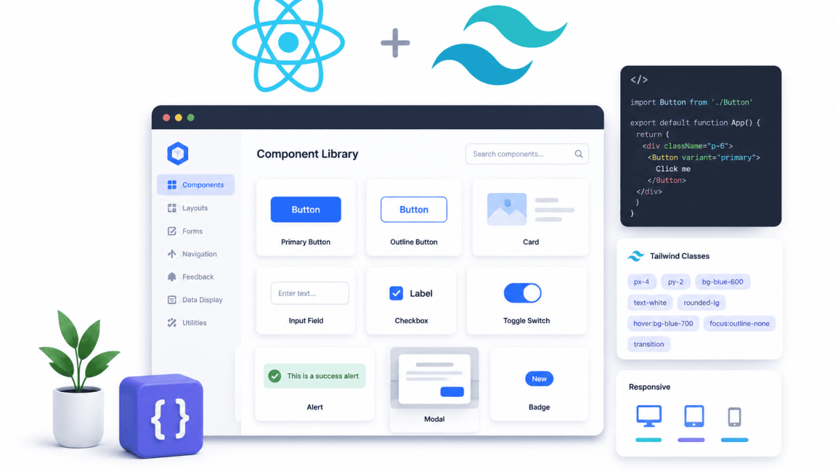

Introduction: Why Build a Component Library with React and Tailwind
In modern web development, teams face a persistent tension between speed and consistency. A component library built with React and Tailwind CSS offers a pragmatic resolution: a centralized collection of reusable UI elements that enforce design standards while accelerating development velocity. By combining React’s declarative, composable architecture with Tailwind’s utility-first methodology, developers can create a library that is both scalable and maintainable. This introduction explores the foundational benefits of such a library, focusing on design consistency, faster iteration, and simplified long-term maintenance.
The Case for a Component Library in Modern Web Development
Without a component library, projects often devolve into spaghetti code—duplicated styles, inconsistent spacing, and mismatched color palettes. A component library addresses these pain points by centralizing UI logic and presentation. Key advantages include:
- Design consistency: Every button, modal, or input follows the same visual rules, eliminating drift across pages or teams.
- Faster development: Developers can assemble interfaces from pre-built blocks rather than writing custom CSS and markup for each instance.
- Easier maintenance: Updates to a single component propagate across the entire application, reducing technical debt and bug fixes.
- Better collaboration: Designers and developers share a common language, with components serving as the single source of truth for UI patterns.
For organizations scaling from a single app to a product suite, a component library becomes the backbone of efficient, cohesive user experiences.
How React and Tailwind Solve Common UI Challenges
React and Tailwind complement each other uniquely, addressing two perennial challenges: state management and styling overhead. React’s component model excels at encapsulating behavior—handling clicks, form inputs, or animations—while Tailwind’s utility classes manage presentation without cascading specificity wars. Consider these synergies:
| Challenge | React Solution | Tailwind Solution |
|---|---|---|
| Inconsistent spacing | Props for margin/padding variants | Utility classes like p-4 and m-2 |
| Theme propagation | Context API or props drilling | Configurable tailwind.config.js tokens |
| Responsive design | Conditional rendering based on breakpoints | Responsive prefixes like md:flex |
| Dark mode support | State toggling via hooks | Dark variant classes like dark:bg-gray-800 |
This pairing reduces boilerplate: React handles logic, Tailwind handles looks. The result is a library where components are both highly customizable (via props) and visually predictable (via a constrained design system).
Key Considerations Before Starting Your Library
Building a component library requires upfront planning to avoid common pitfalls. Before writing code, evaluate these factors:
- Scope and granularity: Determine which components are truly reusable versus one-off. Start with primitives (buttons, inputs, cards) before composing complex patterns (data tables, modals).
- Design tokens: Define a shared vocabulary for colors, typography, and spacing in Tailwind’s config. This ensures every component references the same palette, not arbitrary hex codes.
- Documentation: Plan for a companion site or storybook-style viewer. Without clear usage examples and prop tables, adoption will stall.
- Versioning and distribution: Decide whether to publish to npm, a private registry, or a monorepo. Semver discipline prevents breaking changes from derailing consuming projects.
- Testing strategy: Components must be resilient. Include unit tests for logic and visual regression tests for styling to catch regressions during updates.
A deliberate start avoids rework. By aligning React’s composability with Tailwind’s utility-first approach, you lay the groundwork for a library that serves both immediate needs and long-term growth.
Setting Up the Project Foundation
Building a component library with React and Tailwind begins with a solid project foundation. This phase involves selecting the right framework, integrating Tailwind CSS, and configuring tooling that supports both development and distribution. A well-structured foundation ensures scalability, performance, and a smooth developer experience as your library grows.
Choosing the Right React Framework (Vite vs. Next.js vs. CRA)
The choice of framework impacts build speed, development workflow, and deployment flexibility. Below is a comparison of the three most common options:
| Framework | Best For | Key Considerations |
|---|---|---|
| Vite | Fast development and lightweight component libraries | Instant HMR, minimal configuration, excellent for isolated component work |
| Next.js | Full-featured applications with SSR/SSG needs | Built-in routing and data fetching; overkill for pure component libraries |
| Create React App (CRA) | Legacy projects or simple setups | Slower build times, less active maintenance; not recommended for new libraries |
For most component libraries, Vite is the recommended starting point due to its speed and simplicity. Next.js is suitable only if your library will be consumed within a Next.js application that requires server-side rendering. CRA is now considered outdated for new projects.
Installing and Configuring Tailwind CSS
Once your React project is initialized (for example, with Vite), integrate Tailwind CSS by running the following commands in your project root:
npm install -D tailwindcss @tailwindcss/vite
npx tailwindcss init -p
This installs Tailwind and generates a tailwind.config.js file. Configure it to scan your component files:
export default {
  content: [
    "./src/**/*.{js,jsx,ts,tsx}",
    "./stories/**/*.{js,jsx,ts,tsx}"
  ],
  theme: {
    extend: {},
  },
  plugins: [],
}
Add the @tailwindcss/vite plugin to your Vite configuration:
import tailwindcss from '@tailwindcss/vite'

export default {
  plugins: [tailwindcss()]
}
Finally, import Tailwind’s base styles in your main CSS file (e.g., src/index.css):
@import "tailwindcss";
Setting Up a Monorepo with Storybook and Rollup
A monorepo structure keeps your component library, documentation, and build tools in one repository. Use a tool like pnpm or npm workspaces to manage multiple packages. Run the following to initialize a monorepo:
mkdir my-component-library && cd my-component-library
npm init -w packages/components -w packages/docs
Integrate Storybook for visual development and testing. Install it in the packages/docs directory:
cd packages/docs
npx storybook@latest init --type react
Storybook will auto-detect your framework and create a .storybook folder. Configure it to use Tailwind by importing your main CSS file in .storybook/preview.js:
import '../src/index.css';
For bundling your library components, use Rollup with the @rollup/plugin-node-resolve and @rollup/plugin-commonjs plugins. Create a rollup.config.js in packages/components:
import resolve from '@rollup/plugin-node-resolve';
import commonjs from '@rollup/plugin-commonjs';
import postcss from 'rollup-plugin-postcss';
import tailwindcss from 'tailwindcss';

export default {
  input: 'src/index.js',
  output: {
    dir: 'dist',
    format: 'esm'
  },
  plugins: [
    resolve(),
    commonjs(),
    postcss({
      plugins: [tailwindcss()],
      extract: true
    })
  ]
};
This configuration ensures your Tailwind styles are compiled and bundled alongside your React components. With the monorepo, Storybook, and Rollup in place, you have a complete development environment for building and distributing your component library.
Designing a Scalable Component Architecture
When building a component library with React and Tailwind, the architecture you choose determines whether the library thrives or frays under real-world use. A scalable design must balance reusability against flexibility, ensuring that each piece—from a simple button to a complex page layout—can be composed, extended, and maintained without cascading breakage. Three foundational pillars support this: atomic design principles, disciplined props management, and deliberate state handling.
Atomic Design: Atoms, Molecules, Organisms, and Templates
Atomic design provides a clear hierarchy for organizing components. This pattern, originally proposed by Brad Frost, maps naturally to React’s composable nature. In a Tailwind context, it also helps you manage utility class duplication across levels.
- Atoms are the smallest, indivisible UI elements: buttons, inputs, labels, icons. They accept only essential props and rarely manage state beyond controlled inputs.
- Molecules combine two or more atoms into a functional unit: a search bar (input + button), a form field (label + input + error message). Molecules own simple state like focus or validation.
- Organisms assemble molecules and atoms into distinct sections: a header (logo atom + navigation molecule + search molecule), a product card (image atom + title atom + price atom + add-to-cart button). Organisms often coordinate state across child components.
- Templates arrange organisms into a page layout, defining grid structures and content regions without specific data. In a library, templates serve as reference layouts or starter kits for developers.
This hierarchy prevents bloated components and makes testing straightforward: atoms require minimal tests, while organisms focus on integration behavior.
Props Best Practices: Defaults, Variants, and Composition
Props are the public API of your components. Poorly designed props lead to confusion and breakage. Follow these guidelines:
- Defaults: Every prop should have a sensible default that represents the most common use case. For example, a
Buttoncomponent defaults tovariant="primary"andsize="md". UsedefaultPropsor destructuring defaults. - Variants: Limit variant props to a small, consistent set (e.g.,
variant,size,colorScheme). Use TypeScript union types to enforce valid values. For Tailwind, map variants to predefined utility classes via a config object. - Composition: Favor composition over configuration. Instead of a prop that controls every possible layout, allow children and wrapper props (e.g.,
className,asfor polymorphic elements). This keeps your library flexible without exploding the prop surface.
The table below compares two common prop strategies for variant management:
| Strategy | How It Works | Best For | Trade-off |
|---|---|---|---|
| Boolean props | Each variant is a separate boolean (e.g., isPrimary, isLarge) |
Small libraries with few variants | Becomes unwieldy with many variants; conflicts possible |
| Single variant prop | One prop with string values (e.g., variant="primary") |
Libraries with multiple, mutually exclusive variants | Requires a central mapping; harder to combine styles |
For most libraries, the single variant prop approach scales better, especially when combined with Tailwind’s utility-first system.
State Management Strategies for Library Components
Library components should minimize internal state to avoid surprising consumers. Three strategies work well:
- Controlled components: The parent manages state and passes it via props. This is the default for form elements and interactive components like modals or accordions. It gives full control to the consumer.
- Uncontrolled with refs: For simple behaviors (toggle, tooltip visibility), use
useStateinternally and expose a ref or callback for imperative access. This reduces boilerplate for common use cases. - State machines: For complex components (multi-step forms, wizards), model state as a finite state machine. Libraries like
XStateor simple reducer patterns ensure predictable transitions and prevent invalid states.
Whichever strategy you choose, document the state ownership clearly in your component’s storybook or documentation. A component that silently manages state can break when a consumer tries to control it externally.
Creating Core UI Components with Tailwind
When building a component library with React and Tailwind, the core UI components form the foundation of your design system. These elements—buttons, form inputs, and layout containers—must be flexible, accessible, and consistent. Tailwind’s utility-first approach accelerates this process by providing low-level styling primitives that you compose into reusable patterns. The key is to design components that accept props for variant control while keeping the markup clean and the styling predictable.
Building a Flexible Button Component with Variants
Buttons are the most interactive element in any UI. A robust button component should support multiple visual variants (primary, secondary, outline, ghost), sizes (sm, md, lg), and states (disabled, loading). Tailwind’s utility classes make this straightforward by composing classes conditionally based on props.
Here is a practical code example of a button component using React and Tailwind:
import React from 'react';

const Button = ({ variant = 'primary', size = 'md', children, disabled, ...props }) => {
  const baseClasses = 'inline-flex items-center justify-center font-medium rounded-md transition-colors focus:outline-none focus:ring-2 focus:ring-offset-2';

  const variantClasses = {
    primary: 'bg-blue-600 text-white hover:bg-blue-700 focus:ring-blue-500',
    secondary: 'bg-gray-200 text-gray-900 hover:bg-gray-300 focus:ring-gray-400',
    outline: 'border border-gray-300 text-gray-700 hover:bg-gray-50 focus:ring-blue-500',
    ghost: 'text-gray-700 hover:bg-gray-100 focus:ring-gray-400',
  };

  const sizeClasses = {
    sm: 'px-3 py-1.5 text-sm',
    md: 'px-4 py-2 text-base',
    lg: 'px-6 py-3 text-lg',
  };

  const disabledClasses = disabled ? 'opacity-50 cursor-not-allowed' : 'cursor-pointer';

  return (
    <button
      className={`${baseClasses} ${variantClasses[variant]} ${sizeClasses[size]} ${disabledClasses}`}
      disabled={disabled}
      {...props}
    >
      {children}
    </button>
  );
};

export default Button;
This pattern allows consumers to use the button with minimal effort while maintaining full control over appearance. The focus:ring-2 and focus:ring-offset-2 utilities ensure keyboard accessibility out of the box.
Designing Accessible Form Elements (Inputs, Selects, Checkboxes)
Form elements require careful attention to accessibility, including proper labeling, focus states, error handling, and keyboard navigation. Tailwind simplifies the visual styling, but you must pair it with semantic HTML and ARIA attributes.
For a text input component, follow these guidelines:
- Wrap the input in a
<label>element or usehtmlForandidfor explicit association. - Apply Tailwind classes for border, padding, and focus ring:
border border-gray-300 rounded-md px-3 py-2 focus:border-blue-500 focus:ring-1 focus:ring-blue-500. - Add an
aria-describedbyattribute linked to a help text or error message element. - Use
aria-invalid="true"when validation fails, and style accordingly withborder-red-500.
For selects and checkboxes, the same principles apply. A select element can use Tailwind’s appearance-none class to remove default browser styling, then add custom padding and a background arrow icon using a pseudo-element or inline SVG. Checkboxes should remain natively interactive but can be visually enhanced with Tailwind’s form-checkbox (if using the official forms plugin) or custom utility classes that preserve accessibility.
Key accessibility checks for form elements:
| Element | Required Attribute | Tailwind Utility Example |
|---|---|---|
| Input | id, aria-label or <label> |
focus:ring-blue-500 focus:border-blue-500 |
| Select | id, <label> |
appearance-none bg-white border border-gray-300 |
| Checkbox | id, <label>, type="checkbox" |
h-4 w-4 text-blue-600 focus:ring-blue-500 |
Crafting Reusable Cards and Layout Containers
Cards and layout containers are the workhorses of content presentation. A reusable card component should accept props for padding, shadow depth, border radius, and optional header/footer slots. Tailwind’s utility classes allow you to compose these variations without writing custom CSS.
Build a card component with these considerations:
- Use
rounded-lgfor consistent border radius,shadow-smorshadow-mdfor depth, andbg-whitefor the background. - Make padding configurable via a
paddingprop that maps to classes likep-4,p-6, orp-8. - For layout containers, leverage Tailwind’s responsive grid utilities:
grid grid-cols-1 md:grid-cols-2 lg:grid-cols-3 gap-6. - Combine with
max-w-*andmx-autofor centered, constrained layouts.
By designing cards and containers with Tailwind’s spacing and responsive prefixes, you ensure they adapt gracefully from mobile to desktop. The component can expose a className prop for consumers to extend styles, while keeping the core structure intact. This approach maintains consistency across your library while allowing flexibility for edge cases.
Implementing Theming and Customization
When building a component library with React and Tailwind, theming and customization are critical for adoption. Consumers need to adapt your components to their brand without forking your code. Tailwind’s utility-first approach, combined with CSS custom properties and React’s context, provides a robust foundation for dark mode, custom color schemes, and component-level overrides. The key is to design your library so that consumers can inject their own design tokens while keeping your components predictable and maintainable.
Using Tailwind’s Dark Mode and Custom Theme Config
Tailwind’s built-in dark mode support is the first layer of theming. In your tailwind.config.js, set darkMode: 'class' to toggle dark mode via a CSS class on a parent element. Then, define your dark mode colors in the theme.extend.colors section. For example:
module.exports = {
  darkMode: 'class',
  theme: {
    extend: {
      colors: {
        primary: {
          50: '#eff6ff',
          500: '#3b82f6',
          900: '#1e3a5f',
        },
        'primary-dark': {
          50: '#1e293b',
          500: '#60a5fa',
          900: '#bfdbfe',
        },
      },
    },
  },
};
Then, in your component classes, use the dark: prefix:
<button class="bg-primary-500 dark:bg-primary-dark-500 text-white">Click</button>
To allow consumers to override colors globally, expose your theme as CSS custom properties in your base styles:
@layer base {
  :root {
    --color-primary: theme('colors.primary.500');
    --color-primary-dark: theme('colors.primary-dark.500');
  }
  .dark {
    --color-primary: var(--color-primary-dark);
  }
}
This lets consumers redefine --color-primary in their own CSS without touching your configuration.
Providing Theme Context with React Context API
For runtime theme switching (e.g., user toggles dark mode), use React Context. Create a ThemeProvider that stores the current theme and applies the dark class to the <html> element:
const ThemeContext = React.createContext();

export function ThemeProvider({ children, defaultTheme = 'light' }) {
  const [theme, setTheme] = React.useState(defaultTheme);

  React.useEffect(() => {
    document.documentElement.classList.toggle('dark', theme === 'dark');
  }, [theme]);

  return (
    <ThemeContext.Provider value={{ theme, setTheme }}>
      {children}
    </ThemeContext.Provider>
  );
}
Consumers wrap their app with <ThemeProvider> and use useContext(ThemeContext) to toggle themes. For advanced customization, extend the context to include a colors object that maps to CSS custom properties. You can then update those properties dynamically:
function setCSSVariables(colors) {
  Object.entries(colors).forEach(([key, value]) => {
    document.documentElement.style.setProperty(`--color-${key}`, value);
  });
}
This gives consumers full control over the palette without rebuilding your components.
Allowing Consumer Overrides via Tailwind’s `@apply` and Plugins
For component-level overrides, avoid hardcoding utilities in your components. Instead, compose them using @apply in your CSS, then expose those classes as props. For example, a button component might accept a className prop that merges with internal styles:
function Button({ className, children }) {
  return (
    <button className={cn('btn-base', className)}>
      {children}
    </button>
  );
}
Define .btn-base in your stylesheet:
.btn-base {
  @apply px-4 py-2 rounded font-semibold focus:outline-none focus:ring-2;
  @apply bg-primary-500 text-white hover:bg-primary-600;
  @apply dark:bg-primary-dark-500 dark:hover:bg-primary-dark-600;
}
Consumers can then pass className="bg-red-500 hover:bg-red-600" to override colors for a specific instance. For more systematic overrides, create a Tailwind plugin that registers new utilities based on consumer configuration:
const plugin = require('tailwindcss/plugin');

module.exports = plugin(function({ addUtilities, theme }) {
  const newUtilities = {
    '.btn-custom': {
      backgroundColor: theme('colors.custom.btn-bg', '#000'),
      color: theme('colors.custom.btn-text', '#fff'),
    },
  };
  addUtilities(newUtilities, ['responsive', 'hover']);
});
This approach keeps your library flexible while maintaining a consistent API. The combination of CSS custom properties, React context, and plugin-based overrides ensures that your component library can adapt to any design system.
Ensuring Accessibility and Performance
An inclusive component library must balance strict accessibility compliance with fast rendering. Every component should function for keyboard-only users, screen reader users, and those on low-powered devices. By embedding ARIA attributes, supporting keyboard navigation, and optimizing load performance, you create a library that meets WCAG 2.1 AA standards and delivers a smooth user experience.
Adding ARIA Roles, States, and Keyboard Support
Each interactive component requires explicit ARIA roles, states, and properties to communicate its purpose to assistive technology. For a custom toggle switch, for example, you must add role="switch", manage aria-checked dynamically, and ensure the component is focusable via tabindex="0". Keyboard support means handling Space and Enter to activate the toggle, and Tab to move focus into and out of the component. The following table outlines common patterns:
| Component | ARIA Role | Key States | Keyboard Interaction |
|---|---|---|---|
| Modal | dialog | aria-modal=”true”, aria-labelledby | Escape closes; focus trapped inside |
| Accordion | button (for trigger), region (for panel) | aria-expanded, aria-controls | Enter/Space toggles panel; Arrow keys if single open |
| Tooltip | tooltip | aria-describedby on trigger | Escape dismisses; focus stays on trigger |
Always test that every interactive element can be reached and operated using only the keyboard. Use onKeyDown handlers with event.key checks to avoid conflicts with browser defaults.
Lazy Loading and Code Splitting for Library Components
A large component library can bloat initial bundle size. Use React’s lazy and Suspense to split components by route or by usage. For example, if a heavy data table component is only used on an admin page, lazy load it:
import React, { lazy, Suspense } from 'react';
const DataTable = lazy(() => import('./DataTable'));

function AdminPage() {
  return (
    <Suspense fallback={<div>Loading table...</div>}>
      <DataTable />
    </Suspense>
  );
}
Additionally, configure your bundler (Webpack or Vite) to split vendor chunks for commonly used utilities like date pickers or chart libraries. For Tailwind CSS, purge unused styles in production to keep the CSS payload under 10KB. Avoid importing entire icon sets; instead, import individual SVG icons as components to prevent bloat.
Testing Accessibility with axe and React Testing Library
Automated testing catches common WCAG failures before they reach production. Integrate the jest-axe library into your test suite to run axe-core assertions on rendered components. A practical test for a button component looks like this:
import { render } from '@testing-library/react';
import { axe, toHaveNoViolations } from 'jest-axe';
import Button from './Button';

expect.extend(toHaveNoViolations);

it('should have no accessibility violations', async () => {
  const { container } = render(<Button>Click me</Button>);
  const results = await axe(container);
  expect(results).toHaveNoViolations();
});
Combine this with React Testing Library’s user-event to simulate keyboard interactions. For example, test that a dropdown opens on Enter and that focus moves to the first option. Create a checklist for manual review: verify color contrast ratios (minimum 4.5:1 for normal text), ensure focus indicators are visible (a 2px outline with good contrast), and confirm that all images in components have meaningful alt text. Run these tests in CI to block pull requests that introduce accessibility regressions.
Documenting and Testing Your Component Library
Once you begin building a component library with React and Tailwind, the long-term success of the project hinges on two critical pillars: comprehensive documentation and robust testing. Without clear documentation, even the most elegant components become unusable for other developers. Without thorough testing, updates to your library risk breaking existing implementations. This section outlines strategies for setting up Storybook with Tailwind integration, writing effective unit and integration tests, and automating visual regression testing to maintain a high-quality, collaborative library.
Setting Up Storybook with Tailwind Integration
Storybook serves as the ideal environment for developing and showcasing your components in isolation. To integrate it with Tailwind CSS, follow these steps:
- Initialize Storybook: Run
npx storybook@latest initin your project root. This creates the necessary configuration and example stories. - Import Tailwind styles: In your
.storybook/preview.jsfile, import your main CSS file (e.g.,import '../src/index.css') where Tailwind directives (@tailwind base; @tailwind components; @tailwind utilities;) are defined. This ensures all stories render with Tailwind classes applied. - Configure PostCSS: Storybook uses its own Webpack build. Ensure your
postcss.config.jsincludes the Tailwind plugin and any requiredtailwind.config.jsis present in the root. - Write stories for every component: Use the Component Story Format (CSF) to document each component’s props, states (loading, error, empty), and edge cases. Include controls and actions to allow interactive testing in the browser.
- Add addons for enhanced documentation: Install
@storybook/addon-essentials(often included by default) and@storybook/addon-a11yto surface accessibility issues directly in your stories.
This setup allows your team to see every component in a controlled environment, with Tailwind styling intact, making it a single source of truth for the library’s visual appearance.
Writing Unit Tests with Jest and React Testing Library
Unit tests verify that individual components render correctly and behave as expected. Jest, combined with React Testing Library (RTL), provides a robust testing framework that encourages testing from the user’s perspective. Key practices include:
- Test component rendering: Use
renderfrom RTL to mount a component with required props. Assert that key elements exist usingscreen.getByRole,screen.getByText, orscreen.getByTestId. - Simulate user interactions: Use
fireEventoruserEvent(preferred for realistic interactions) to test click handlers, form submissions, and keyboard navigation. - Test Tailwind-specific behavior: While you do not test CSS classes directly, verify that conditional styling renders correctly. For example, test that a
disabledprop adds thearia-disabledattribute and that avariantprop changes the text content or visible label. - Organize tests by component: Place test files next to their components (e.g.,
Button.test.jsx). Usedescribeblocks to group related tests anditblocks for individual assertions.
A typical test for a button component might look like:
import { render, screen } from '@testing-library/react';
import Button from './Button';

describe('Button component', () => {
  it('renders with default variant', () => {
    render(<Button>Click me</Button>);
    expect(screen.getByRole('button', { name: /click me/i })).toBeInTheDocument();
  });

  it('applies disabled state', () => {
    render(<Button disabled>Disabled</Button>);
    expect(screen.getByRole('button')).toBeDisabled();
  });
});
Automating Visual Regression Testing with Chromatic
Visual regression testing catches unintended visual changes that unit tests cannot detect, such as spacing shifts, color changes, or layout breakage. Chromatic integrates seamlessly with Storybook to automate this process. Follow this workflow:
- Publish your Storybook to Chromatic: Use the Chromatic CLI (
npx chromatic --project-token=YOUR_TOKEN) to upload a snapshot of every story. This creates a baseline for your library’s visual appearance. - Review changes in pull requests: Chromatic compares new snapshots against the baseline. Any visual difference triggers a review request. Developers can approve, reject, or accept changes as the new baseline.
- Configure thresholds for dynamic content: For components with animations or data-driven content (e.g., charts), set an
--only-changedflag or use Chromatic’sdiffThresholdto prevent false positives. - Integrate with CI/CD: Add Chromatic as a step in your GitHub Actions or other CI pipeline. This ensures every commit to the library is automatically checked for visual regressions before merging.
By combining unit tests for logic and interaction with visual regression tests for appearance, your component library maintains a high bar for quality, making it reliable for the entire team to use and contribute to.
Packaging and Publishing the Library
After building a cohesive set of components with React and Tailwind, the next critical step is packaging and publishing the library so other projects or teams can consume it. This involves configuring a bundler, managing peer dependencies carefully, and publishing to a registry such as npm or GitHub Packages. A well-packaged library ensures consumers can install it with a single command and integrate it without configuration headaches.
Configuring Rollup or Vite for Library Bundling
For library bundling, Rollup and Vite are the two most common choices, each with distinct strengths. Rollup is the traditional choice for library bundling because it produces smaller, tree-shakeable output and supports multiple output formats (ESM, CJS, UMD) out of the box. Vite, while primarily a development server and build tool for applications, can be configured for library mode using its library build option, which leverages Rollup under the hood for production builds. Below is a comparison to help you decide.
| Feature | Rollup | Vite (Library Mode) |
|---|---|---|
| Primary use case | Library bundling | Application development (with library support) |
| Output formats | ESM, CJS, UMD, IIFE | ESM, CJS, UMD |
| Tree-shaking | Native, excellent | Excellent (via Rollup) |
| Plugin ecosystem | Mature, dedicated | Rich, but many plugins are for apps |
| Configuration complexity | Moderate (manual plugin setup) | Low to moderate (preset for library) |
| CSS handling (Tailwind) | Requires postcss plugin | Built-in PostCSS support |
To configure Rollup, install rollup, @rollup/plugin-node-resolve, @rollup/plugin-commonjs, and rollup-plugin-postcss for Tailwind. In your rollup.config.js, set input to your library entry point (e.g., src/index.js) and output to an array with { file: 'dist/index.mjs', format: 'es' } and { file: 'dist/index.cjs', format: 'cjs' }. For Vite, create a vite.config.js with build.lib options: set entry, name, and formats: ['es', 'cjs']. Both tools require the external option to exclude React and ReactDOM from the bundle.
Managing Peer Dependencies and Versioning
Peer dependencies are critical for a component library because they prevent bundling duplicate copies of React or Tailwind. In package.json, list react, react-dom, and tailwindcss under peerDependencies with a range that matches your library’s compatibility (e.g., "react": "^18.0.0"). For versioning, use semantic versioning (semver): bump the major version for breaking API changes, minor for new features, and patch for bug fixes. Include a peerDependenciesMeta field to mark optional peers, such as tailwindcss if your library works without it. Always test your library with the minimum and maximum versions of each peer dependency to avoid runtime errors.
Publishing to npm and GitHub Packages
Publishing to npm requires an npm account and the npm publish command. Before publishing, ensure your package.json has correct main (pointing to CJS entry), module (pointing to ESM entry), types (if using TypeScript), and files (to include only the dist folder and any required CSS). For a private registry like GitHub Packages, add "publishConfig": { "registry": "https://npm.pkg.github.com/" } to package.json and authenticate via a personal access token. To publish to both registries, use npm dist-tags and separate publish commands: npm publish --registry=https://registry.npmjs.org for public and npm publish --registry=https://npm.pkg.github.com for private. After publishing, consumers can install your library with npm install @your-scope/your-library and import components directly.
Integrating the Library into Real Projects
After building and packaging your component library, the true test lies in seamless integration within a real application. This section demonstrates how to consume a React and Tailwind component library in a Next.js project, handle style overrides, and resolve common pitfalls that arise during integration.
Importing and Using Components in a Next.js App
To use your library in a Next.js application, first install it via npm or yarn:
npm install @your-org/component-library
Next, import and use components directly in your pages or components. Ensure your Next.js project is configured to process the library’s Tailwind classes. Add the library’s path to the content array in your tailwind.config.js:
// tailwind.config.js
module.exports = {
  content: [
    './pages/**/*.{js,ts,jsx,tsx}',
    './components/**/*.{js,ts,jsx,tsx}',
    './node_modules/@your-org/component-library/**/*.{js,ts,jsx,tsx}',
  ],
  // ...
};
Now you can use components like any other React element:
import { Button, Card } from '@your-org/component-library';

export default function HomePage() {
  return (
    <Card className="max-w-md mx-auto mt-10">
      <h2 className="text-xl font-semibold">Welcome</h2>
      <Button variant="primary" onClick={() => alert('Clicked!')}>
        Get Started
      </Button>
    </Card>
  );
}
Common integration tasks include:
- Verify Tailwind generation: Run
npx tailwindcss -i ./src/input.css -o ./dist/output.css --watchto ensure all classes from the library are compiled. - Check for missing styles: If a component renders without styling, confirm the library’s CSS is being imported (usually via a global stylesheet or
@importin your app’s CSS). - Use dynamic imports: For larger libraries, consider lazy-loading components with
next/dynamicto reduce initial bundle size.
Overriding Styles with Tailwind’s important and @layer
When you need to override a component’s default styles, Tailwind provides two primary mechanisms: the important directive and the @layer system. Use the important directive sparingly, as it increases specificity and can lead to maintenance challenges. For targeted overrides, apply it in your global CSS:
/* global.css */
@tailwind base;
@tailwind components;
@tailwind utilities;

@layer components {
  .btn-custom {
    @apply bg-red-500 text-white font-bold py-2 px-4 rounded;
  }
}

/* Override a utility class with !important */
.bg-primary {
  background-color: #1d4ed8 !important;
}
The @layer directive organizes custom styles within Tailwind’s cascade, allowing you to override library styles without resorting to !important. For example, to change a button’s padding in your app:
// In your app's tailwind.config.js
module.exports = {
  theme: {
    extend: {
      padding: {
        'button': '0.75rem 1.5rem',
      },
    },
  },
};
Then apply the custom padding using the component’s className prop:
<Button className="px-button py-button">Custom Padding</Button>
For more granular control, use Tailwind’s @apply directive in a @layer block to create a composite override that respects the utility-first hierarchy.
Debugging Common Issues (CSS Conflicts, Missing Classes)
Integration problems often stem from CSS conflicts or missing Tailwind classes. Use this checklist to diagnose and resolve them:
| Issue | Cause | Solution |
|---|---|---|
| Component renders unstyled | Library’s CSS not imported or Tailwind content path missing | Add library path to content array; import library’s CSS file in _app.js or layout |
| Styles applied incorrectly | CSS specificity conflict from third-party libraries or custom styles | Use browser DevTools to inspect; add !important only as last resort; wrap overrides in @layer |
| Missing classes in production build | Tree-shaking removes unused classes from library | Ensure library exports are properly bundled; use purge safelist in tailwind.config.js |
| Class names not generated | Dynamic class construction (e.g., text-${color}) not caught by Tailwind |
Use full class names; or list all possible values in safelist |
For persistent issues, verify your Tailwind configuration by running npx tailwindcss -i ./src/input.css -o ./dist/output.css --watch and checking the generated CSS for your library classes. If classes are missing, add them to a safelist pattern in your config. Finally, test in an isolated environment—such as a minimal Next.js app—to rule out project-specific interference.
Maintaining and Evolving Your Library Over Time
A component library is a living artifact. Without deliberate stewardship, it accumulates technical debt, inconsistent patterns, and unused components that confuse developers. To keep your library valuable, establish clear processes for versioning, deprecation, and continuous improvement. This section covers the core practices that ensure your library remains a trusted foundation for your team as requirements and the React and Tailwind ecosystem evolve.
Semantic Versioning and Changelog Automation
Adopt Semantic Versioning (SemVer) from day one. This communicates the impact of each release to consumers without requiring them to inspect every commit. Follow the MAJOR.MINOR.PATCH format:
- MAJOR: Breaking changes (e.g., removed props, altered component API, Tailwind utility class restructuring that requires markup changes).
- MINOR: New features or components added without breaking existing functionality.
- PATCH: Bug fixes, performance improvements, or documentation corrections.
Automate changelog generation using tools like Changesets or semantic-release. Integrate this into your CI/CD pipeline so each merged pull request triggers a version bump and updates a CHANGELOG.md file. Structure each changelog entry with clear categories:
| Category | Example |
|---|---|
| Added | New DatePicker component with keyboard navigation support |
| Changed | Updated Button primary color to match Tailwind v4 palette |
| Deprecated | Mark variant="outline" on Card as deprecated in favor of variant="bordered" |
| Removed | Drop support for React 17 |
| Fixed | Resolved focus ring clipping in Modal on Safari |
| Security | Upgraded tailwind-merge to patch CVE-2024-XXXX |
Automation reduces human error and ensures that every release is documented consistently, making it easy for consumers to assess upgrade risk.
Deprecating and Removing Components Gracefully
Removing a component is inevitable but must be handled with empathy for existing users. Follow a three-phase deprecation cycle:
- Announce deprecation: Add a console warning in the component’s development build (e.g.,
console.warn('Component X is deprecated. Use Y instead.')). Update the component’s JSDoc or TypeScript types to include@deprecatedtags. - Provide a migration path: In the changelog and component documentation, show a side-by-side comparison of the old and new usage. For complex migrations, offer a codemod (using jscodeshift) that automatically rewrites consumer code.
- Remove in the next MAJOR release: Delete the component source, remove its export from the library’s barrel file, and update any related documentation. Ensure the removal is clearly noted in the MAJOR release changelog.
Never remove a component in a MINOR or PATCH release. This gives consumers at least one full version cycle to migrate, reducing frustration and breaking their applications unexpectedly.
Collecting Usage Analytics and Community Contributions
To evolve your library wisely, you need data on how it is actually used. Avoid invasive tracking. Instead, consider opt-in mechanisms:
- Telemetry in development builds: Log component usage counts locally or to a private dashboard (e.g., via a build-time plugin) to identify which components are most popular and which are rarely used.
- Feedback channels: Create a dedicated GitHub Discussions category or a Slack channel where users can propose new components, report pain points, or share workarounds. Prioritize issues based on frequency of mention and impact.
- Contribution guidelines: Write a clear
CONTRIBUTING.mdthat outlines how to propose a new component, the required test coverage, and the coding standards (e.g., using@tailwindcss/formsfor input styling). Use a pull request template that prompts contributors to attach a before/after screenshot and list any breaking changes.
Encourage external contributions by labeling issues as good first issue or help wanted. Regularly review and merge small, low-risk contributions to build community trust. For larger features, require a proposal document (e.g., a short RFC) before implementation begins. This balance of analytics and community input ensures your library evolves based on real-world needs rather than assumptions, keeping it lean and relevant.
Frequently Asked Questions
What is a component library in React?
A component library in React is a collection of reusable, self-contained UI elements (like buttons, modals, or forms) that can be shared across projects. It enforces consistency, reduces development time, and centralizes maintenance. Libraries are typically published as npm packages and include documentation, tests, and styling. Using a component library helps teams maintain a unified design language and speeds up prototyping. Popular examples include Material-UI, Chakra UI, and custom in-house libraries built with tools like Storybook.
Why use Tailwind CSS for a component library?
Tailwind CSS is a utility-first framework that offers low-level styling classes, making it highly customizable and composable. For a component library, Tailwind allows developers to create consistent, responsive designs without writing custom CSS. Its design token system (via tailwind.config.js) enables easy theming, and the JIT compiler ensures minimal output size. Tailwind’s utilities work well with React’s component model, and the library can be consumed by projects that may or may not use Tailwind, especially if you provide precompiled CSS.
How do I structure a React component library project?
A typical structure includes a monorepo (e.g., using Turborepo or Nx) with separate packages for components, utilities, and documentation. Use a bundler like Rollup or Vite to build ES modules and CommonJS. Organize components in folders with their own tests, stories (for Storybook), and types. Include a shared theme configuration for Tailwind. Also set up a build script to generate a dist folder, and configure package.json with main, module, and types fields. Versioning with semantic-release is recommended.
What are design tokens and how do they integrate with Tailwind?
Design tokens are a set of design decisions (colors, spacing, typography) stored in a platform-agnostic format (JSON or YAML). They ensure consistency across different platforms. In a React+Tailwind library, tokens can be transformed into Tailwind’s configuration. Tools like Style Dictionary can generate tailwind.config.js values from tokens. This allows the library to expose a theme object that consumers can override. Tokens make it easy to maintain a single source of truth for design values and support multiple themes (light/dark).
How do I publish a React component library to npm?
First, ensure your library is built into a distributable format (ES modules and CommonJS) with type definitions. Set up a package.json with correct entry points. Use .npmignore to exclude source files and tests. Consider using semantic-release for automated versioning. Publish with npm publish after authenticating. For scoped packages, use @your-scope/package-name. Also, provide a README with installation and usage instructions. It’s good practice to test the published package locally with npm link or by installing from a tarball.
How do I handle theming in a Tailwind-based component library?
Theming can be implemented using Tailwind’s CSS variables or by exposing a custom plugin that modifies the Tailwind configuration. One approach is to define theme tokens as CSS custom properties in a root class (e.g., .theme-light) and reference them in your Tailwind config. Another method is to provide a ThemeProvider component that uses React Context to pass theme values. For dark mode, use Tailwind’s dark variant or a class-based strategy. Ensure your components consume these tokens via utility classes or inline styles.
What testing strategies work best for React component libraries?
Use unit tests with Jest and React Testing Library to verify component behavior and accessibility. Snapshot tests (via Jest) help catch unintended visual changes. For integration, consider Cypress or Playwright to test interactions. Since components are isolated, mock external dependencies and use data-testid attributes. Also test theming by rendering components with different theme classes. Visual regression testing with Chromatic or Percy is valuable for UI libraries. Ensure test coverage for edge cases like empty states and error handling.
How do I document a React component library effectively?
Use Storybook as the primary documentation tool, as it provides interactive playgrounds, prop tables, and accessibility checks. Write clear prop descriptions and include usage examples. Add a README with installation, quick start, and contribution guidelines. For API documentation, use TypeScript types and JSDoc comments. Consider including a changelog and version migration guide. Tools like Docusaurus or VitePress can host comprehensive documentation sites. Also provide a demo page or sandbox (CodeSandbox) for quick experimentation.
Sources and further reading
- Tailwind CSS Documentation – Installation
- Storybook – Why Storybook
- Rollup – Introduction
- Vite – Building Libraries
- Tailwind CSS – Customizing Design Tokens
- React Testing Library – Introduction
- Cypress – Component Testing
- Chromatic – Visual Testing for UI
- Semantic Release – Automated Versioning
- Turborepo – Monorepo for React
Need help with this topic?
Send us your details and we will contact you.