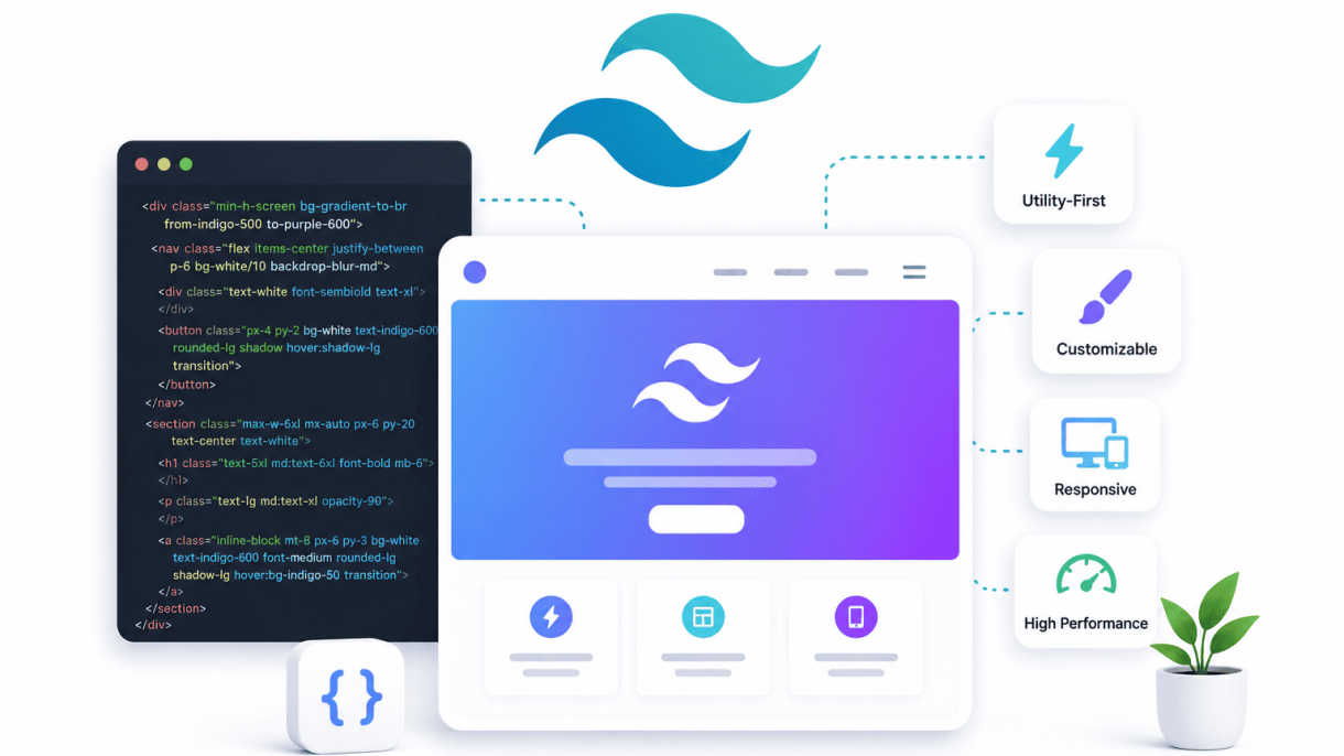

Introduction: The Rise of Utility-First CSS
For over a decade, frontend developers relied on monolithic CSS frameworks like Bootstrap and Foundation to style web interfaces. These frameworks offered pre-built components—buttons, modals, grids—that promised consistency and speed. Yet as projects grew in complexity, the limitations became clear: bloated stylesheets, rigid design systems, and the constant battle against specificity. Enter Tailwind CSS, a utility-first framework that flips the traditional model on its head. Instead of providing ready-made components, Tailwind offers thousands of low-level utility classes that let developers compose custom designs directly in HTML. This shift is not merely about syntax; it represents a fundamental change in how frontend teams think about styling, maintainability, and developer velocity. Tailwind’s adoption has skyrocketed—it is now used by major companies like OpenAI, GitHub, and Netflix—because it solves real pain points that older frameworks could not address. By embracing constraints and eliminating the context-switching between HTML and CSS, Tailwind has redefined what efficient frontend development looks like.
From Bootstrap to Tailwind: A Shift in Mindset
The journey from Bootstrap to Tailwind is a story of moving from abstraction to composition. Bootstrap taught developers to think in components: a .btn-primary class meant a blue button with predefined padding, border-radius, and hover state. This worked well for rapid prototyping but created a disconnect between design intent and implementation. Customizing a Bootstrap component often required overriding styles with !important or digging into Sass variables—a fragile process. Tailwind, by contrast, provides no pre-built buttons. Instead, it offers atomic classes like bg-blue-500, px-4, py-2, and rounded-md. Developers assemble these classes to create a button that matches exactly what the design specifies. This shift from “I use a button component” to “I build a button from utilities” encourages a deeper understanding of CSS properties and eliminates the overhead of maintaining custom class names. The result is a codebase where styling decisions are explicit, not hidden in a distant stylesheet.
What Utility-First Actually Means in Practice
Utility-first CSS means every style rule is a single-purpose class. Instead of writing this:
<div class="card">
  <h2 class="card-title">Hello</h2>
  <p class="card-text">World</p>
</div>
…and then defining .card { background: white; padding: 1rem; border-radius: 8px; } in a separate file, Tailwind developers write:
<div class="bg-white p-4 rounded-lg shadow-md">
  <h2 class="text-xl font-bold text-gray-800">Hello</h2>
  <p class="text-base text-gray-600">World</p>
</div>
Every class directly maps to a single CSS declaration. This approach yields several concrete benefits:
- No naming conventions: No need to invent BEM or SMACSS class names.
- Zero specificity battles: All classes have equal specificity (0,1,0), so overrides are predictable.
- Instant visual feedback: Changes are visible without switching files or recompiling.
- Consistent design tokens: Tailwind’s predefined scale for spacing, colors, and typography ensures design coherence.
In practice, this means developers spend less time writing CSS and more time building interfaces. A typical Bootstrap project might require 30% of the codebase dedicated to custom CSS overrides; Tailwind projects often reduce that to near zero.
The Developer Experience That Drives Adoption
Tailwind’s developer experience is the primary reason for its rapid adoption. The framework integrates deeply with modern build tools through its CLI, PostCSS plugin, or bundler integrations like Vite and Webpack. Key features include:
- Just-in-Time (JIT) engine: Generates only the classes you use, resulting in output CSS as small as 10 KB (gzipped) for production.
- IntelliSense in editors: VS Code and other editors provide autocomplete, hover previews, and linting for Tailwind classes.
- Customization via config: The
tailwind.config.jsfile lets teams extend or override every design token—colors, spacing, breakpoints—without forking the framework. - Responsive and state variants: Prefixes like
md:,hover:, anddark:apply styles conditionally, eliminating media query spaghetti.
This ecosystem reduces cognitive load. A developer can look at any HTML file and immediately understand the visual outcome because every class is self-documenting. The framework also encourages reusable patterns through @apply directives or component abstractions in frameworks like React and Vue. By removing the friction between design and code, Tailwind has made frontend development faster, more predictable, and more enjoyable—a combination that explains why it is revolutionizing the field.
How Tailwind Eliminates Context Switching
One of the biggest productivity killers in frontend development is the constant mental juggling between HTML and CSS files. Every time you need to adjust a button’s padding, change a heading’s color, or tweak a layout’s spacing, the typical workflow demands: locate the HTML element, find its class or ID, open the corresponding CSS file, scroll to the right selector, write the rule, save, and switch back to the browser. This context switching fragments concentration and slows down iteration. Tailwind CSS solves this by bringing styles directly into the markup, allowing developers to stay in one file and one mental space. The result is faster cycles, fewer errors, and a flow state that traditional CSS rarely permits.
Writing Styles Directly in Markup
Tailwind uses utility classes—small, single-purpose CSS rules—that you apply directly to HTML elements. Instead of writing a separate CSS rule for a blue, bold heading with margin, you simply write <h1 class="text-blue-500 font-bold mb-4">Hello</h1>. This inline approach means every style decision happens exactly where it is used. You no longer need to remember what a custom class like .card-title does or hunt through a stylesheet to confirm its properties. The markup becomes the single source of truth for presentation. This is especially powerful in component-based frameworks like React or Vue, where each component’s template and styling coexist in the same file, reinforcing cohesion.
No More Naming Classes or IDs
Naming things is one of the hardest tasks in programming. In traditional CSS, every new element often requires a thoughtful, unique class or ID name—and then consistent usage across the project. This leads to bloated stylesheets, naming collisions, and the dreaded “classitis.” Tailwind eliminates this entirely. You never invent a name like .hero-banner-wrapper-inner again. Instead, you compose behavior from existing utilities. The table below contrasts the traditional approach with Tailwind’s:
| Traditional CSS | Tailwind CSS |
|---|---|
| Write HTML with class=”card” | Write HTML with class=”bg-white p-6 rounded shadow” |
| Open card.css, write .card { background: white; padding: 1.5rem; border-radius: 0.5rem; box-shadow: … } | No CSS file needed |
| Debug by searching for .card in multiple files | Debug by inspecting the element’s classes directly |
This shift removes the cognitive load of naming and reduces the chance of style leakage or specificity wars. Your CSS file size shrinks dramatically, often to just a few lines of custom configuration.
Faster Prototyping with Immediate Visual Feedback
Tailwind’s utility-first approach makes prototyping incredibly fast. You can build a complex layout in minutes by stacking classes like flex justify-between items-center p-4 bg-gray-100. Because every utility maps to a single CSS property, you see the effect instantly without leaving your editor or browser DevTools. Changes are applied the moment you save. This immediacy encourages experimentation: want to test a different spacing? Replace p-4 with p-6. Need a darker background? Swap bg-gray-100 for bg-gray-200. There is no build step, no recompilation of Sass, and no waiting for a CSS cascade to resolve. The feedback loop shrinks from minutes to seconds. For designers who code or developers under tight deadlines, this speed is transformative. A practical example: to create a responsive card component, you might write:
<div class="max-w-sm mx-auto bg-white rounded-xl shadow-md overflow-hidden md:max-w-2xl">
  <div class="md:flex">
    <div class="md:shrink-0">
      <img class="h-48 w-full object-cover md:h-full md:w-48" src="/img.jpg" alt="">
    </div>
    <div class="p-8">
      <p class="text-sm text-indigo-500">Category</p>
      <h3 class="text-lg font-semibold">Title</h3>
    </div>
  </div>
</div>
This single block of markup handles layout, spacing, typography, colors, and responsiveness without a single line of external CSS. Tailwind’s design system ensures consistency, while the lack of context switching lets you iterate freely.
Why Tailwind CSS is Revolutionizing Frontend Development
In the world of frontend development, maintaining design consistency across large teams and sprawling projects has historically been a significant challenge. Traditional CSS methodologies like BEM or SMACSS often rely on developer discipline and manual oversight, which can lead to drift as projects evolve. Tailwind CSS addresses this head-on by enforcing a rigorous, centralized design system. Through its configuration file, every spacing unit, color value, typography scale, and breakpoint is defined once and applied uniformly. This approach transforms design tokens from abstract guidelines into enforceable constraints, making consistency not just a goal but a default behavior.
Centralized Design Tokens in tailwind.config.js
The heart of Tailwind’s consistency lies in its tailwind.config.js file. This single source of truth houses all design tokens—the raw values that define your visual language. Instead of scattering #3B82F6 or 16px across dozens of CSS files, you centralize them:
- Spacing scale: Define
spacing: { 4: '1rem', 8: '2rem' }to ensure every margin and padding uses the same increments. - Color palette: Set
colors: { primary: '#2563EB', secondary: '#7C3AED' }to eliminate hex-value guesswork. - Typography: Declare
fontSize: { base: '1rem', lg: '1.25rem' }for consistent text hierarchy.
Any developer on the team can open this file and instantly understand the design system. Changes propagate globally, reducing the risk of one-off deviations.
Customizable Breakpoints and Color Palettes
Tailwind’s configuration allows teams to extend or override defaults without writing custom CSS. For example, you can add a 2xl breakpoint at 1536px or a dark-blue-900 shade. This flexibility ensures the framework adapts to your brand, not the other way around. The result is a palette and responsive grid that every component shares, preventing the common pitfall of inconsistent responsive behavior or mismatched hues.
Preventing Style Drift Across Components
Style drift—where components gradually adopt slightly different colors, spacing, or sizes—plagues projects with multiple contributors. Tailwind mitigates this through utility classes tied directly to the config. A button using bg-primary and p-4 will always match another button using the same classes, even if built months apart. To illustrate the practical impact, consider the following comparison between traditional CSS and Tailwind CSS for a typical team project:
| Factor | Traditional CSS (e.g., BEM) | Tailwind CSS |
|---|---|---|
| Color value usage | Developers manually type hex codes or use variables (if set up). | Enforced via tailwind.config.js; all colors come from a single palette. |
| Spacing consistency | Relies on predefined variables or developer memory; prone to 4px vs. 5px discrepancies. | Uses a fixed scale (e.g., p-4 always equals 1rem); no deviation possible. |
| Responsive breakpoints | Often duplicated or redefined per component; can lead to mismatched thresholds. | Centralized in config; md: prefix applies the same breakpoint everywhere. |
| Onboarding new developers | Requires learning custom naming conventions and variable usage. | New devs learn the config file and utility classes; consistency is built-in. |
By enforcing these constraints, Tailwind ensures that every component—from a button to a complex card—adheres to the same visual language. Design consistency at scale becomes a mechanical outcome rather than a manual effort, freeing developers to focus on functionality and user experience. This is why Tailwind CSS is revolutionizing frontend development for teams that prioritize maintainability and cohesion.
Performance and Small Bundle Sizes
One of the most persistent misconceptions about utility-first CSS frameworks is that they inevitably bloat stylesheets with hundreds of repetitive classes. Tailwind CSS turns this assumption on its head. Through aggressive production optimization, Tailwind frequently generates CSS files that are significantly smaller than those produced by hand-crafted custom CSS or monolithic frameworks like Bootstrap. This lean output directly improves page load times, reduces bandwidth consumption, and enhances overall user experience—a critical advantage in an era where performance directly impacts conversion rates and search rankings.
How PurgeCSS Works Automatically with Tailwind
Tailwind integrates PurgeCSS at the build level, scanning your project’s template files for class names and removing any unused CSS from the final output. This process is configured in the tailwind.config.js file by specifying the content paths. During a production build, Tailwind identifies every utility class present in your HTML, JavaScript, Vue, or React files, and strips away everything else. The result is a stylesheet containing only the exact styles your application uses.
Example configuration:
// tailwind.config.js
module.exports = {
  content: [
    './pages/**/*.{html,js}',
    './components/**/*.{js,jsx}',
    './layouts/**/*.html',
  ],
  theme: {
    extend: {},
  },
  plugins: [],
}
This automatic purging means you can safely use Tailwind’s full utility set during development without worrying about shipping unused CSS. The framework handles optimization transparently, so developers focus on design rather than manual style cleanup.
Comparing Bundle Sizes: Tailwind vs. Bootstrap vs. Custom CSS
Real-world comparisons reveal Tailwind’s efficiency. A typical Bootstrap 5 minified CSS file weighs approximately 180 KB, even after removing unused components. Custom CSS, depending on the project’s complexity, often ranges from 50 KB to 150 KB. In contrast, a production-purged Tailwind stylesheet for a moderately complex dashboard or marketing site frequently lands between 10 KB and 30 KB.
| Approach | Typical Minified CSS Size (Production) | Notes |
|---|---|---|
| Bootstrap 5 | 150–180 KB | Includes all components unless manually purged |
| Custom CSS (hand-written) | 50–150 KB | Varies widely; often includes redundant declarations |
| Tailwind CSS (purged) | 10–30 KB | Only utilities used in templates survive |
This dramatic reduction stems from Tailwind’s design philosophy: instead of shipping a large library of pre-built components, it provides hundreds of small, composable utilities that combine to create any design. When purged, only the combinations actually used remain.
Tree-Shaking and the Impact on Lighthouse Scores
Tree-shaking is the process of eliminating dead code, and Tailwind achieves this at the CSS level through its purge mechanism. Unlike JavaScript tree-shaking, which removes unused functions, Tailwind’s approach removes unused CSS declarations entirely. The result is a stylesheet that contains zero extraneous bytes. This directly influences Lighthouse performance metrics, particularly the “Total Blocking Time” and “Time to Interactive” scores. Smaller CSS files reduce the critical rendering path, allowing browsers to parse and apply styles faster. Pages built with purged Tailwind routinely score higher on mobile and desktop Lighthouse audits compared to equivalent pages using heavier frameworks, because the CSS is smaller, loads quicker, and delays the first paint less. For developers targeting a perfect Lighthouse score of 100, Tailwind’s small bundle size removes one of the most common obstacles.
The Power of Responsive and State Variants
Tailwind CSS fundamentally changes how developers approach responsive and interactive design by embedding state and breakpoint handling directly into utility classes. Instead of switching contexts between HTML and a separate CSS file filled with media queries and pseudo-class rules, you apply variants like md:, hover:, or focus: directly to elements. This approach drastically reduces mental overhead, eliminates selector specificity battles, and makes responsive, state-driven design as natural as writing inline styles—but with the full power of a design system. The result is faster prototyping, cleaner codebases, and a mobile-first workflow that feels intuitive rather than cumbersome.
Responsive Design with md:, lg:, and xl: Prefixes
Tailwind’s responsive prefixes—sm:, md:, lg:, xl:, and 2xl:—allow you to apply different utility classes at specific breakpoints without ever writing a @media query. The framework uses a mobile-first approach: unprefixed utilities apply to all screen sizes, and prefixed variants override them from that breakpoint upward. For example, a two-column layout on desktop that stacks on mobile becomes trivially simple:
- Base (mobile):
grid grid-cols-1 - Tablet and up:
md:grid-cols-2 - Desktop and up:
lg:grid-cols-3
This system eliminates the need to name and maintain custom breakpoints, prevents accidental overlap, and keeps all responsive logic visible within the markup. You can also combine responsive prefixes with other variants, such as hover:md:bg-blue-500, to change a background color on hover only at medium screens and above. The result is that complex responsive grids, typography scaling, and spacing adjustments become declarative and predictable.
Handling Hover, Focus, and Other Pseudo-Classes
Tailwind provides state variants for virtually every interactive pseudo-class, including hover:, focus:, active:, disabled:, visited:, and even group-hover: for parent-child interactions. These variants work identically to responsive prefixes—you attach them to any utility class to apply that style only when the state is active. For instance, a button that changes background on hover and outline on focus can be built as:
<button class="bg-blue-500 hover:bg-blue-700 focus:outline-none focus:ring-2 focus:ring-blue-400">
  Click Me
</button>
This approach eliminates the need for separate CSS rules or JavaScript event listeners for simple visual feedback. More advanced interactions, like showing a dropdown on hover, use the group and group-hover: pattern:
- Parent:
class="group" - Child:
class="hidden group-hover:block"
These state variants are also fully composable with responsive prefixes, enabling conditional interactivity across breakpoints. The result is that complex UI behaviors—tooltips, dropdowns, form validation states—become entirely markup-driven, reducing the need for custom CSS and JavaScript.
Dark Mode and Other Theming Variants
Tailwind’s theming variants extend the same prefix logic to global design preferences. The dark: variant applies utilities only when dark mode is active, either based on the prefers-color-scheme media query or a class-based toggle on a parent element. This makes implementing a full dark theme as simple as adding dark:bg-gray-900 dark:text-white to your base elements. For example, a card component that adapts to both themes might look like:
<div class="bg-white dark:bg-gray-800 text-black dark:text-white p-4 rounded-lg">
  Content
</div>
Beyond dark mode, Tailwind allows custom variants for other theming scenarios, such as print: for print styles or motion-safe: and motion-reduce: for accessibility. You can also create arbitrary variants using the data- or aria- prefixes to match custom attributes. This system unifies all conditional styling under one consistent syntax—whether the condition is screen size, user interaction, or system preference. The key benefit is that developers no longer juggle multiple CSS files, custom properties, or preprocessor logic; everything lives in the HTML, making themes predictable and easy to maintain across a project.
Why Tailwind CSS is Revolutionizing Frontend Development
Tailwind CSS challenges traditional CSS methodologies by promoting utility-first design, yet its true power emerges when combined with component-based frameworks. Rather than writing custom CSS classes for every design variation, developers compose interfaces directly in markup using atomic utilities. This approach aligns perfectly with modern JavaScript frameworks, where components encapsulate both structure and style. By avoiding CSS abstractions, Tailwind reduces context-switching and makes UI code more predictable. The result is a development workflow that prioritizes speed, consistency, and maintainability—qualities that define why Tailwind CSS is revolutionizing frontend development.
Creating Button and Card Components with @apply
The @apply directive allows developers to extract repeated utility patterns into custom CSS while retaining Tailwind’s design system. This is especially useful for base components like buttons and cards that need consistent styling across a project.
For example, a primary button can be defined in a CSS file:
.btn-primary {
  @apply bg-blue-500 text-white font-semibold py-2 px-4 rounded-md hover:bg-blue-600 focus:ring-2 focus:ring-blue-300 transition-all;
}
Similarly, a card component might look like:
.card {
  @apply bg-white shadow-md rounded-lg p-6 border border-gray-200;
}
These classes can then be used in any framework template:
- React:
<button className="btn-primary">Click Me</button> - Vue:
<button class="btn-primary">Click Me</button> - Svelte:
<button class="btn-primary">Click Me</button>
This approach preserves the visual consistency of Tailwind while reducing markup repetition. However, use @apply sparingly—overuse can reintroduce the maintenance burdens Tailwind avoids.
Using Props to Override Tailwind Classes Dynamically
Component-based frameworks excel at dynamic styling through props. Tailwind’s utility classes can be conditionally applied using JavaScript logic, enabling fine-grained control without bloated CSS.
Consider a React button component that accepts a variant prop:
function Button({ variant = 'primary', children, className }) {
  const baseClasses = 'font-semibold py-2 px-4 rounded-md transition-all';
  const variants = {
    primary: 'bg-blue-500 text-white hover:bg-blue-600',
    secondary: 'bg-gray-200 text-gray-800 hover:bg-gray-300',
    danger: 'bg-red-500 text-white hover:bg-red-600',
  };
  return (
    <button className={`${baseClasses} ${variants[variant]} ${className}`}>
      {children}
    </button>
  );
}
This pattern allows consumers to override any style by passing a className prop. The same technique works in Vue with computed classes:
<template>
  <button :class="[base, variants[variant], $attrs.class]">
    <slot />
  </button>
</template>
Key benefits of this approach:
| Benefit | Explanation |
|---|---|
| Composability | Components remain flexible without CSS overrides |
| Maintainability | Style logic lives in one place per component |
| Performance | No runtime CSS injection—only class toggling |
Extracting Shared Patterns with Component Libraries
For larger projects, teams often build custom component libraries on top of Tailwind. This strategy combines the speed of utility classes with the reusability of design systems. Popular libraries like Headless UI, Radix UI, and shadcn/ui demonstrate this pattern—they provide unstyled, accessible components that you style entirely with Tailwind utilities.
When creating your own library, focus on:
- Atomic components: Buttons, inputs, badges—these use
@applyminimally and rely on props for variation. - Composite components: Modals, dropdowns, accordions—these combine multiple atomic components with shared styling.
- Theme tokens: Define colors, spacing, and typography in
tailwind.config.jsto ensure consistency across all components.
For instance, a shared button library might export a BaseButton with core styling, then extend it for specific use cases:
// components/BaseButton.jsx
export function BaseButton({ children, ...props }) {
  return (
    <button
      className="inline-flex items-center justify-center rounded-md text-sm font-medium transition-colors focus-visible:outline-none focus-visible:ring-2 focus-visible:ring-offset-2 disabled:pointer-events-none disabled:opacity-50"
      {...props}
    >
      {children}
    </button>
  );
}
This layered architecture lets teams maintain a single source of truth for design decisions while allowing individual projects to customize components through props and Tailwind’s configuration. The result is a scalable frontend ecosystem where reusability and consistency coexist without the overhead of traditional CSS class abstractions.
Customization Without the Override Hell
Traditional CSS frameworks such as Bootstrap or Foundation have long relied on a cascade of predefined classes and deeply nested Sass or Less files. When developers need a design that diverges from the framework’s defaults, they often resort to !important overrides, verbose specificity wars, or custom stylesheets that become brittle maintenance burdens. Tailwind CSS sidesteps this entire problem through a configuration-first philosophy. Instead of fighting a framework’s opinionated defaults, you extend or replace them cleanly in a single JavaScript or TypeScript configuration file. This approach eliminates the “override hell” that plagues many large projects, allowing teams to maintain a consistent, scalable design system without wrestling with specificity.
Extending the Default Theme via Configuration
Tailwind provides a sensible default theme out of the box, but real-world projects almost always require deviations. The tailwind.config.js file offers a structured way to extend these defaults without modifying the framework’s core. By using the extend key, you can add new values to existing categories—such as colors, spacing, or breakpoints—while preserving all original settings. For example:
module.exports = {
  theme: {
    extend: {
      colors: {
        brand: {
          50: '#f0f9ff',
          500: '#3b82f6',
          900: '#1e3a5f',
        },
      },
      spacing: {
        '18': '4.5rem',
        '22': '5.5rem',
      },
    },
  },
};
This approach keeps your customizations isolated and predictable. When you later update Tailwind, your extensions remain intact because they are additive, not overriding. The result is a theme that merges seamlessly with the framework’s utility classes, reducing the need for custom CSS files.
Adding Custom Colors, Fonts, and Spacing
Beyond extending existing categories, you can fully replace or introduce entirely new design tokens. For instance, if your brand uses a unique color palette that doesn’t align with Tailwind’s defaults, you can define a complete set under the colors key:
| Token | Configuration | Usage Example |
|---|---|---|
| Custom color | colors: { 'primary': '#ff6347' } |
bg-primary |
| Custom font | fontFamily: { 'display': ['Inter', 'sans'] } |
font-display |
| Custom spacing | spacing: { '72': '18rem' } |
p-72 |
Similarly, you can add custom font families by importing Google Fonts or self-hosted typefaces and referencing them in the config. Spacing values—margins, padding, widths—can be tailored to your design grid. This granular control means that every utility class you use is aligned with your brand’s specifications, not a generic preset. The configuration file becomes a single source of truth for your design system, making updates across large codebases straightforward and auditable.
Using Arbitrary Values for One-Off Styles
Even with a well-planned configuration, you will occasionally need a unique value—such as a specific pixel width or a color that appears only once. Tailwind supports arbitrary values via square bracket notation, bypassing the configuration entirely. For example:
w-[237px]sets a width of 237 pixels.bg-[#daa520]applies a goldenrod background.mt-[3.5rem]adds a top margin of 3.5 rem.text-[clamp(1rem,2vw,2rem)]uses a CSS clamp function.
These arbitrary values are resolved at build time and generate no extra CSS bloat. They are ideal for prototyping, responsive tweaks, or elements that truly do not fit within your theme. However, if the same arbitrary value appears in multiple places, it is a signal to add it to your configuration file for consistency. This balance between pre-defined tokens and ad-hoc flexibility ensures that your codebase remains DRY without forcing every design decision into a rigid system.
Strong Community and Ecosystem Growth
When a tool gains traction, its ecosystem often determines whether it becomes a passing trend or a lasting standard. Tailwind CSS has achieved the latter, thanks to a vibrant community that has built an extensive network of plugins, component libraries, and educational materials. This ecosystem accelerates development by providing ready-made solutions for common problems, while also pushing the framework forward through constant feedback and innovation. Developers no longer need to reinvent the wheel for every project; they can leverage community contributions to maintain consistency and speed.
Official Plugins: Forms, Typography, and Line-Clamp
The Tailwind team maintains a set of official plugins that address recurring design needs without bloating the core framework. These plugins are rigorously tested and documented, ensuring seamless integration.
- Forms plugin: Resets default browser styles for form elements, providing a consistent baseline across all browsers. It includes modifiers for input, select, textarea, and checkbox states.
- Typography plugin: Adds prose classes that apply sensible typographic defaults to long-form content, such as blog posts or articles. It handles headings, lists, blockquotes, and code blocks with minimal configuration.
- Line-Clamp plugin: Enables truncation of text to a specified number of lines using the
line-clamp-{n}utility, which is especially useful for card layouts and preview snippets.
These plugins are lightweight and can be installed individually, keeping the final CSS bundle lean while offering precise control over common patterns.
Popular Third-Party Libraries: Headless UI, DaisyUI, and Flowbite
The third-party ecosystem has produced libraries that range from fully styled component kits to unstyled, accessible primitives. The table below compares three widely used options.
| Library | Type | Styling Approach | Key Feature | Best For |
|---|---|---|---|---|
| Headless UI | Unstyled primitives | No default styles; uses Tailwind classes | Full accessibility compliance | Custom designs with complete control |
| DaisyUI | Styled component library | Pre-built themes and components | Themeable via CSS variables | Rapid prototyping and consistent UIs |
| Flowbite | Styled component library | Tailwind classes with interactive JS | Extensive documentation and Figma kit | Complex dashboards and admin panels |
Headless UI focuses on behavior (e.g., dropdowns, modals, transitions) without imposing visual design, making it ideal for teams that want to maintain a unique brand. DaisyUI offers dozens of prebuilt components with multiple color themes, reducing the need to write custom CSS. Flowbite provides a comprehensive set of interactive components like charts, navigation bars, and form elements, often paired with a design system in Figma for seamless designer-developer collaboration.
Learning Resources and the Tailwind Playground
The community has produced a wealth of learning materials that lower the barrier to entry. Official resources include the Tailwind CSS documentation, which is widely praised for its clarity and interactive examples. The Tailwind Playground is a browser-based editor that lets developers experiment with utility classes in real time, share code snippets, and test responsive breakpoints without setting up a local environment.
Beyond official channels, community-driven resources include:
- YouTube tutorials and courses from creators like Adam Wathan (Tailwind’s creator) and independent educators covering everything from basics to advanced patterns.
- GitHub repositories with open-source component collections, such as Tailwind UI kits and starter templates for frameworks like Next.js and Laravel.
- Blog posts and newsletters that share tips on optimization, custom configurations, and real-world case studies.
- Discord and Reddit communities where developers ask questions, share workarounds, and contribute to plugin development.
This robust ecosystem ensures that developers of all skill levels can find support, reduce development time, and stay updated with best practices. As the community continues to grow, Tailwind CSS evolves not just through its core maintainers, but through the collective creativity of its users.
Integration with Modern Build Tools and Frameworks
Tailwind CSS has redefined how developers approach styling by aligning perfectly with the modern JavaScript ecosystem. Its utility-first methodology thrives in environments that prioritize speed, modularity, and developer experience. The framework’s design—relying on a single configuration file and a build step—makes it a natural fit for tools like Vite, Next.js, Nuxt, and Laravel. When paired with these platforms, Tailwind eliminates global CSS conflicts, reduces bundle sizes through tree-shaking, and enables rapid prototyping without sacrificing performance. This section explores how Tailwind integrates with key build tools and frameworks, offering practical setup strategies and highlighting its synergy with server-side rendering (SSR) and static site generation (SSG).
Setting Up Tailwind with Vite and PostCSS
Vite, known for its instant server start and fast hot module replacement (HMR), pairs exceptionally well with Tailwind CSS. The setup is straightforward and leverages PostCSS for processing. Begin by installing Tailwind and its PostCSS dependencies:
npm install -D tailwindcss @tailwindcss/postcss postcss
Create a postcss.config.js file in your project root:
export default {
  plugins: {
    '@tailwindcss/postcss': {},
  },
};
Generate your tailwind.config.js file (if not already present) and define content paths to scan for class usage. For a Vite project, this typically includes ./src/**/*.{js,jsx,ts,tsx,vue}. Finally, import Tailwind’s base styles in your main CSS file:
@import "tailwindcss";
This configuration enables automatic purging of unused styles during production builds, keeping your CSS minimal. Best practices include:
- Use the
@tailwindcss/viteplugin (available in Tailwind v4+) for tighter Vite integration, which improves HMR performance. - Enable JIT mode (default in v3.0+) to generate styles on-demand, reducing build times.
- Leverage PostCSS nesting alongside Tailwind for component-specific overrides without leaving the utility-first paradigm.
Tailwind in Next.js: App Router and SSR Considerations
Next.js, with its App Router and support for React Server Components, presents unique opportunities for Tailwind. The framework’s build process automatically scans your components for class names, making setup simple. Install Tailwind and configure tailwind.config.js to include ./app/**/*.{js,ts,jsx,tsx} for the App Router. Then add @import "tailwindcss"; to your global CSS file.
For SSR and SSG, Tailwind’s static extraction ensures that only the styles used during rendering are included in the final output. This aligns perfectly with Next.js’s incremental static regeneration (ISR) and server-side rendering. Key considerations:
- Avoid dynamic class construction in server components—use conditional rendering or template literals with complete class strings to ensure Tailwind’s JIT engine captures all variants.
- Use the
clsxortailwind-mergelibraries to manage conditional classes without breaking purge detection. - Leverage the
@layerdirective to organize custom styles within Tailwind’s base, components, or utilities layers, maintaining predictable specificity.
Tailwind’s design also simplifies responsive design in Next.js by using breakpoint prefixes (sm:, md:, lg:) directly in JSX, reducing the need for media queries in separate files.
Using Tailwind with Laravel and Inertia.js
Laravel, a PHP framework, and Inertia.js, which bridges server-side routing with client-side rendering, create a modern full-stack environment that benefits from Tailwind’s utility classes. Laravel ships with Tailwind pre-configured in recent versions (via Laravel Breeze or Jetstream), simplifying initial setup. To integrate Tailwind with Inertia.js:
- Install Tailwind via Laravel’s built-in scaffolding or manually with
npm install -D tailwindcss @tailwindcss/postcss postcss. - Configure
vite.config.jsto use thelaravel-vite-pluginand ensure Tailwind’s PostCSS plugin is active. - Define content paths in
tailwind.config.jsto include./resources/**/*.blade.phpand./resources/js/**/*.vue(for Inertia Vue components).
Inertia.js renders pages on the server and hydrates them on the client, making Tailwind’s static extraction efficient. Best practices include:
- Use Blade components with Tailwind classes for server-rendered layouts, ensuring consistent styling across SSR and client-side navigation.
- Apply utility classes directly in Vue or React components for Inertia pages, as Tailwind’s JIT mode handles dynamic class detection.
- Leverage Laravel’s mix or Vite to purge unused CSS in production, keeping asset sizes small for faster page loads.
This integration allows developers to maintain a single styling paradigm across both server-rendered HTML and client-side interactive components, reducing cognitive overhead and improving development velocity.
Conclusion: Is Tailwind Right for Your Team?
Tailwind CSS is revolutionizing frontend development by shifting the paradigm from semantic, component-based styles to utility-first, composable design. For teams seeking speed, consistency, and design system enforcement, the benefits are tangible. However, this revolution demands a thoughtful evaluation of trade-offs. The decision hinges on your project’s scale, your team’s appetite for learning, and the nature of your design requirements. Below, we break down the key considerations to help you determine if Tailwind is the right fit.
When to Choose Tailwind Over Traditional CSS
Tailwind excels in scenarios where rapid prototyping, strict design system adherence, and maintainable codebases are priorities. Consider it when:
- Your team values speed over custom styles: Utility classes eliminate context-switching between HTML and CSS files, allowing developers to iterate quickly.
- You need consistent design tokens: Tailwind’s predefined spacing, color, and typography scales enforce a unified visual language across large teams.
- You are building a design system: Tailwind’s configuration file makes it trivial to extend or override defaults, creating a custom design system without writing custom CSS.
- You want to avoid naming conventions: No more BEM, SMACSS, or OOCSS debates. Utilities reduce cognitive load by removing the need for class naming.
- You are working with component-based frameworks: React, Vue, and Svelte benefit from Tailwind’s colocation of styles with markup, making components self-contained.
Potential Downsides: Verbose Markup and Team Onboarding
Despite its strengths, Tailwind introduces clear challenges that can hinder adoption:
- Verbose HTML: A single element may contain 10–15 utility classes, making markup harder to scan. Example:
<div class="flex items-center justify-between p-4 bg-white shadow-md rounded-lg">versus a single.cardclass. - Steep learning curve: New team members must memorize dozens of utility class names and breakpoints, which can slow onboarding compared to standard CSS.
- Debugging complexity: Isolating style conflicts requires inspecting multiple utility classes, and browser DevTools become cluttered with long class lists.
- Team resistance: Developers accustomed to semantic CSS may find utility-first approaches counterintuitive, leading to friction during adoption.
- Abstraction overhead: While Tailwind reduces CSS file size, it can increase HTML file size, potentially impacting performance in very large projects if not optimized with purging.
To mitigate these issues, teams should invest in documentation, use component extraction via @apply or custom components, and start with a pilot project to gauge comfort.
The Future of Tailwind and Utility-First CSS
Tailwind’s trajectory suggests it is more than a trend. The framework’s evolution points to deeper integration with modern tooling:
- AI-assisted development: Tools like GitHub Copilot already generate Tailwind classes, reducing the memorization burden and speeding up adoption.
- Design tool interoperability: Plugins for Figma and Sketch allow designers to export Tailwind-compatible configurations, bridging the gap between design and code.
- Performance improvements: Version 4.0 introduces a Rust-based engine for faster build times and smaller output files, addressing early concerns about bloat.
- Community expansion: Utility-first principles are influencing other frameworks, such as Windi CSS and UnoCSS, creating an ecosystem of lightweight alternatives.
Ultimately, Tailwind’s revolution lies not in replacing CSS, but in rethinking how developers apply it. For teams that prioritize speed, consistency, and component isolation, the investment pays off. For those with complex custom designs, small teams, or strong CSS expertise, traditional approaches may still be superior. Evaluate your workflow, experiment with a small project, and let the results guide your choice.
Frequently Asked Questions
What is Tailwind CSS?
Tailwind CSS is a utility-first CSS framework that provides low-level utility classes to build custom designs directly in your HTML. Unlike traditional frameworks like Bootstrap, it doesn't come with pre-built components. Instead, you compose styles by combining utility classes such as flex, pt-4, text-center, and rotate-90. This approach gives you complete control over the look and feel of your site without writing custom CSS. Tailwind is highly customizable via a configuration file, making it adaptable to any design system.
How does Tailwind CSS improve development speed?
Tailwind CSS accelerates development by allowing you to style elements directly in your HTML using utility classes, eliminating the need to switch between HTML and CSS files. This reduces context switching and speeds up prototyping. The framework's pre-defined design system ensures consistency, and features like responsive prefixes (e.g., sm:, md:, lg:) let you handle breakpoints inline. Additionally, Tailwind's JIT (Just-In-Time) engine generates only the CSS you use, keeping file sizes small and build times fast.
Is Tailwind CSS suitable for large projects?
Yes, Tailwind CSS is well-suited for large projects due to its scalability and maintainability. Its utility-first approach encourages a consistent design system by centralizing design tokens like colors, spacing, and typography in a config file. For large teams, this ensures everyone uses the same set of classes, reducing style duplication. Tailwind also integrates with component-based frameworks like React and Vue, allowing you to create reusable components with scoped styles. Its purge feature removes unused CSS in production, keeping file sizes optimal.
What are the main differences between Tailwind CSS and Bootstrap?
Tailwind CSS is utility-first, meaning you build custom designs by combining small utility classes, while Bootstrap provides pre-built components like buttons, navbars, and modals. Tailwind offers more flexibility and customization but requires more initial setup, whereas Bootstrap is easier for beginners but can lead to generic-looking sites. Tailwind's file size is smaller because it generates only used CSS, while Bootstrap includes all components by default. Tailwind is also more compatible with modern JavaScript frameworks due to its component-friendly approach.
Does Tailwind CSS work with React?
Yes, Tailwind CSS works seamlessly with React and is actually one of its most popular use cases. You can use Tailwind classes directly in JSX to style components, which aligns well with React's component-based architecture. Tailwind's utility classes make it easy to apply conditional styles, handle state-based styling, and create responsive layouts. There are also community tools like Twin and Headless UI that integrate Tailwind with React for building accessible, styled components without writing custom CSS.
How does Tailwind CSS handle responsive design?
Tailwind CSS handles responsive design using breakpoint prefixes that you apply directly to utility classes. For example, w-full md:w-1/2 lg:w-1/3 makes an element full width on small screens, half width on medium, and one-third on large. Tailwind's default breakpoints are sm (640px), md (768px), lg (1024px), xl (1280px), and 2xl (1536px), but you can customize them in the config. This approach keeps responsive styles inline with your HTML, making it easy to see and manage all breakpoints for a given element.
What is the Tailwind CSS JIT engine?
The Tailwind CSS JIT (Just-In-Time) engine is a compiler that generates CSS on-demand as you write your HTML. Instead of pre-generating a massive stylesheet, the JIT engine scans your template files for class names and produces only the CSS you need. This results in faster build times, smaller file sizes, and the ability to use arbitrary values like top-[117px] without configuration. The JIT engine is the default in Tailwind CSS v3 and above, and it also enables features like variant stacking and dynamic class generation.
Can Tailwind CSS be customized?
Yes, Tailwind CSS is highly customizable through its configuration file (tailwind.config.js). You can override default design tokens like colors, fonts, spacing, and breakpoints, or extend them with new values. You can also add custom utility classes, plugins, and even integrate with design tokens from design tools like Figma. Tailwind's customization is one of its strongest features, allowing you to create a unique design system that matches your brand guidelines while still using the framework's utility classes.
Sources and further reading
- Tailwind CSS Official Documentation
- Tailwind CSS GitHub Repository
- State of CSS 2023 Survey – Tailwind CSS Usage
- W3C CSS Validation Service
- Tailwind CSS Blog: Introducing Tailwind CSS v3.0
- Frontend Masters: Tailwind CSS Course
- Stack Overflow: Tailwind CSS Questions
- GitHub: Tailwind CSS Issues and Discussions
- MDN Web Docs: CSS Grid Layout
- W3C: CSS Flexible Box Layout Module Level 1
Need help with this topic?
Send us your details and we will contact you.