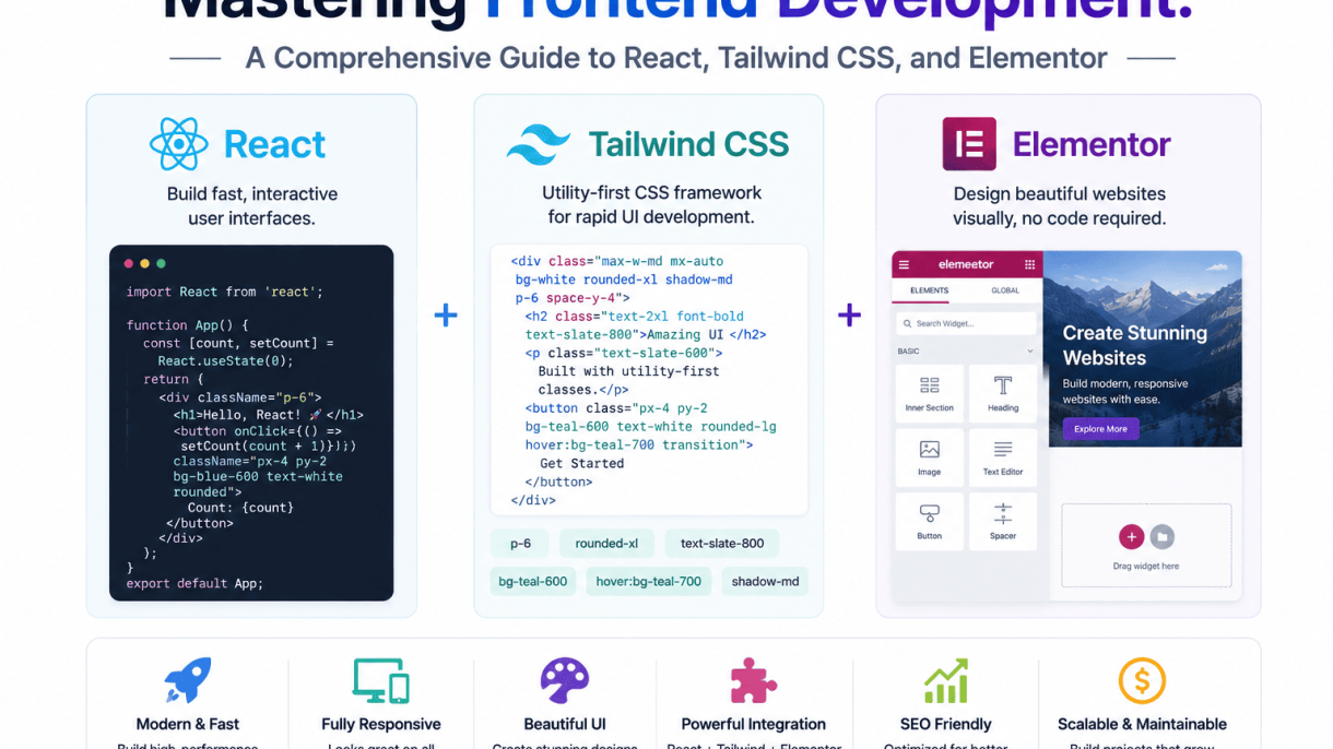

Introduction to Modern Frontend Development
The frontend development landscape has transformed dramatically over the past decade, shifting from static HTML pages to dynamic, component-driven architectures that prioritize user experience and performance. Today, developers face a vast ecosystem of tools, libraries, and frameworks, each promising speed, scalability, or simplicity. Among these, three tools have emerged as cornerstones for building modern interfaces: React for interactive UI logic, Tailwind CSS for utility-first styling, and Elementor for visual WordPress design. Understanding how these technologies fit into the broader frontend workflow is essential for any developer aiming to deliver responsive, maintainable, and visually compelling digital products.
The Evolution of Frontend Technologies
Frontend development has evolved from server-rendered pages with minimal interactivity to rich client-side applications powered by JavaScript frameworks. Early solutions like jQuery simplified DOM manipulation but lacked structure for complex apps. The rise of single-page applications (SPAs) introduced frameworks such as Angular and React, enabling state-driven UIs. Concurrently, CSS methodologies like BEM and SMACSS aimed to organize styles, but often led to verbose codebases. Tailwind CSS disrupted this by offering a utility-first approach, reducing the need for custom CSS. Meanwhile, content management systems (CMS) like WordPress democratized web creation, but their frontend flexibility lagged until visual builders like Elementor bridged the gap, allowing non-developers to design responsive layouts without code. This evolution reflects a broader trend: tools are becoming more specialized, yet increasingly interoperable.
Why React, Tailwind, and Elementor Are Dominant Choices
Each of these tools dominates its niche for distinct reasons:
- React: Backed by Facebook, React’s component-based architecture, virtual DOM, and vast ecosystem (e.g., Next.js, React Router) make it the go-to for building scalable, interactive UIs. Its declarative syntax simplifies state management and reusability, powering everything from dashboards to e-commerce platforms.
- Tailwind CSS: Unlike traditional frameworks (Bootstrap, Foundation), Tailwind provides low-level utility classes that enable rapid, consistent styling without naming conventions. Its design system encourages responsive, customizable interfaces that reduce CSS bloat, and its JIT compiler ensures small production bundles.
- Elementor: As the leading WordPress page builder, Elementor offers a drag-and-drop interface with live editing, extensive widgets, and theme-building capabilities. It empowers marketers and designers to create pixel-perfect, responsive sites without writing code, while still allowing developers to extend functionality via custom CSS and hooks.
These tools dominate because they solve core pain points: React handles complexity, Tailwind accelerates styling, and Elementor democratizes design.
How These Tools Complement Each Other in Workflows
While React, Tailwind, and Elementor serve different audiences, they can be integrated to create powerful hybrid workflows. For example:
| Tool | Primary Role | Integration Example |
|---|---|---|
| React | Dynamic UI logic | Building a custom widget (e.g., a real-time stock ticker) for an Elementor-powered WordPress site |
| Tailwind CSS | Utility-first styling | Using Tailwind classes within React components to ensure consistent, responsive design across a web app |
| Elementor | Visual page building | Creating landing pages in WordPress that embed React components via shortcodes or custom blocks |
In practice, a developer might use React and Tailwind to build a custom interactive module (e.g., a product configurator), then embed it into an Elementor-designed WordPress page using a plugin like “React for WordPress.” Conversely, Elementor’s global styles can be overridden with Tailwind-like utility classes for fine-grained control. This synergy allows teams to leverage the strengths of each tool: React for logic-heavy components, Tailwind for rapid UI iteration, and Elementor for content-driven layouts. The result is a flexible, efficient frontend stack that scales from simple blogs to complex web applications.
Getting Started with React: Core Concepts and Setup
React is a declarative, component-based library for building user interfaces. Its core philosophy centers on creating reusable, self-contained pieces of UI that manage their own state and render efficiently. For any frontend development project, whether a simple landing page or a complex dashboard, React provides the structure to scale code without sacrificing performance. This section covers the essential first steps: establishing a development environment, understanding the syntax that powers React components, and mastering the flow of data through state and props.
Setting Up a React Development Environment
The fastest way to begin is with a build tool that handles module bundling, transpilation, and hot reloading. Two popular options are Create React App (CRA) and Vite. Vite is generally faster for both development and builds, making it the recommended choice for new projects.
To create a new React project using Vite, open your terminal and run the following command:
npm create vite@latest my-react-app -- --template react
After the command completes, navigate into the project folder and install dependencies:
cd my-react-app
npm install
npm run dev
This starts a local development server, typically at http://localhost:5173. The project structure includes a src directory where you will write your components. Key files include App.jsx (the root component) and main.jsx (the entry point that renders the app into the DOM).
| Feature | Create React App (CRA) | Vite |
|---|---|---|
| Initial setup speed | Slow | Fast |
| Hot module replacement | Reliable but slower | Instant |
| Production build size | Larger bundles | Smaller, optimized |
| Configuration complexity | Hidden but rigid | Minimal with flexibility |
Understanding JSX and Component Composition
JSX is a syntax extension for JavaScript that looks similar to HTML. It allows you to write markup directly inside your JavaScript logic. Under the hood, JSX is transpiled into React.createElement calls, which produce lightweight JavaScript objects representing the UI.
A component is a function that returns JSX. Components can be nested to build complex interfaces. For example, a Header component can contain a Logo and a Navigation component. This composition pattern promotes reusability and clear separation of concerns.
Key rules for JSX:
- Always return a single root element (use a fragment
<></>to avoid extra DOM nodes). - Use
classNameinstead ofclassfor CSS classes. - Close every tag, including self-closing ones like
<img />. - Embed JavaScript expressions inside curly braces
{}.
Managing State and Props in React Applications
Data flows in React through two primary mechanisms: props and state. Props are read-only data passed from a parent component to a child. They allow components to be configured and reused with different values. State, on the other hand, is mutable data managed within a component itself. When state changes, React re-renders the component and its children efficiently.
To add state to a functional component, use the useState hook. This hook returns an array with two elements: the current state value and a function to update it. Here is a practical example of a simple counter component:
import { useState } from 'react';

function Counter() {
  const [count, setCount] = useState(0);

  return (
    <div>
      <p>You clicked {count} times</p>
      <button onClick={() => setCount(count + 1)}>
        Click me
      </button>
    </div>
  );
}
Important principles for state management:
- Keep state as local as possible—lift it only when multiple components need to share it.
- Never mutate state directly; always use the setter function.
- For complex state logic (multiple sub-values or side effects), consider
useReduceror a state management library.
Props are passed like HTML attributes: <Greeting name="Alice" />. Inside the receiving component, they are accessed as the first argument to the function. This unidirectional data flow keeps the application predictable and easier to debug.
Building Responsive UIs with Tailwind CSS
Tailwind CSS revolutionizes frontend development by providing a utility-first approach that eliminates the need for custom CSS for most styling tasks. Instead of writing separate stylesheets, you compose interfaces directly in your HTML using pre-built utility classes. This method accelerates prototyping and ensures consistency across components, especially when paired with a robust framework like React. Tailwind’s design system is built on a configurable foundation, allowing you to extend or override default values to match your brand guidelines. For developers transitioning from traditional CSS, the initial learning curve is offset by the speed of iteration and the elimination of naming conventions and specificity wars. When combined with Elementor for WordPress-based projects, Tailwind offers a complementary, code-first alternative for custom frontend work.
Getting Started with Tailwind CSS Installation and Configuration
To integrate Tailwind CSS into your project, begin with a Node.js environment. The recommended method is via npm or yarn. Run the installation command, then generate the configuration file using the Tailwind CLI. This file, tailwind.config.js, is the control center for your design system. Here is a typical installation sequence:
- Install Tailwind:
npm install -D tailwindcss - Initialize config:
npx tailwindcss init - Configure content paths: In
tailwind.config.js, set thecontentarray to scan your template files (e.g.,"./src/**/*.{js,jsx,ts,tsx}"for React). - Add directives: Include
@tailwind base; @tailwind components; @tailwind utilities;in your main CSS file. - Build for production: Use the CLI with
--minifyto purge unused styles and reduce file size.
Customization is achieved by extending the theme object in the config file. You can add custom colors, fonts, spacing scales, and breakpoints without altering the core framework. For example, adding a brand color under theme.extend.colors makes it available as bg-brand or text-brand.
Using Utility Classes for Layout, Typography, and Colors
Tailwind’s utility classes are atomic and descriptive. For layout, the flex and grid systems are fully supported. Use flex, flex-row, items-center, and justify-between for common alignment patterns. Typography classes like text-lg, font-bold, and leading-relaxed control size, weight, and line height. Color utilities follow a consistent naming pattern: text-gray-700 or bg-blue-500. The 0–900 scale provides fine-grained control. To see how Tailwind compares to traditional CSS approaches, consider the following table:
| Feature | Traditional CSS (BEM/Classes) | Tailwind CSS (Utility-First) |
|---|---|---|
| Styling method | Separate .css files with custom selectors | Inline utility classes in HTML/JSX |
| Development speed | Slower due to context switching | Faster, direct visual feedback |
| File size (production) | Depends on manual optimization | Purged to include only used classes |
| Customization | Requires overriding or writing new CSS | Extend config, no new CSS needed |
| Responsive design | Separate media queries in CSS | Prefixes like md: directly in classes |
| Learning curve | Familiar to traditional developers | Initial memorization of utility names |
Creating Responsive Designs with Breakpoints and Media Queries
Responsive design in Tailwind is handled through breakpoint prefixes. The default breakpoints are sm (640px), md (768px), lg (1024px), xl (1280px), and 2xl (1536px). To apply a style only at a specific breakpoint, prefix the utility class with the breakpoint and a colon. For example, text-center md:text-left centers text on small screens and left-aligns it on medium screens and above. You can also modify the breakpoints in tailwind.config.js under theme.screens. For more complex responsive behavior, combine multiple prefixes: grid-cols-1 sm:grid-cols-2 lg:grid-cols-3 creates a single-column layout on mobile, two columns on small screens, and three on large screens. Media queries for specific ranges (e.g., between 768px and 1024px) are not directly supported by default, but you can achieve this using custom variants or by nesting utilities within container queries via plugins. This approach ensures that your UI adapts fluidly without writing a single media query manually, speeding up frontend development for React, Tailwind, and Elementor projects alike.
Integrating Tailwind CSS with React Projects
Combining Tailwind CSS with React creates a powerful, utility-first workflow for building modern user interfaces. Tailwind’s atomic classes map directly to React’s component-based architecture, enabling rapid styling without leaving your JSX. This section provides step-by-step instructions for setup, practical styling patterns, and strategies for maintaining consistency across large codebases.
Installing Tailwind CSS in a React Application
Begin with a fresh or existing React project created via Create React App, Vite, or Next.js. For a standard Create React App setup, follow these steps:
- Install Tailwind CSS and its dependencies via npm:
npm install -D tailwindcss postcss autoprefixer - Generate the configuration files:
npx tailwindcss init -p - Configure the
tailwind.config.jsfile to scan your React component files. Replace thecontentarray with:
module.exports = { content: [ "./src/**/*.{js,jsx,ts,tsx}", ], theme: { extend: {}, }, plugins: [], } - Add the Tailwind directives to your main CSS file (e.g.,
src/index.css):
@tailwind base; @tailwind components; @tailwind utilities; - Restart your development server. Tailwind classes are now available throughout your React components.
For Vite-based projects, the process is identical but ensure your postcss.config.js is present. Next.js users can follow the official Tailwind installation guide for framework-specific optimizations.
Styling React Components with Tailwind Classes
With Tailwind installed, style React components by applying utility classes directly to JSX elements. This approach eliminates context-switching between files and keeps styles colocated with logic.
- Inline utility classes: Use classes like
bg-blue-500 text-white px-4 py-2 roundeddirectly on a button element. For dynamic styling, conditionally apply classes using template literals or theclsxlibrary. - Reusable component patterns: Create a
Buttoncomponent that accepts avariantprop. Map variants to predefined class combinations, ensuring consistency across the application. - Responsive and state variants: Tailwind’s breakpoint prefixes (
sm:,md:,lg:) and state modifiers (hover:,focus:,active:) work seamlessly in React. For example:className="md:flex hover:bg-gray-100". - Custom component abstractions: For complex styling, extract repeated class groups into a reusable
classNamestring or a custom hook that returns computed classes.
A practical example: styling a card component that changes background on hover.
function Card({ title, children }) {
  return (
    <div className="bg-white shadow-md rounded-lg p-6 hover:bg-gray-50 transition-colors">
      <h3 className="text-lg font-semibold mb-2">{title}</h3>
      <p className="text-gray-600">{children}</p>
    </div>
  );
}
Organizing Tailwind Styles in Large React Projects
As projects grow, unmanaged utility classes can become unwieldy. Implement these organizational best practices to maintain a scalable design system:
| Strategy | Description | Example |
|---|---|---|
| Component-level abstraction | Encapsulate styles within individual components; avoid global CSS overrides. | Create a Button component rather than styling <button> elements directly. |
Design tokens via tailwind.config.js |
Extend the default theme with custom colors, spacing, and typography that match your brand. | theme.extend.colors.brand: '#1a365d' |
| Custom utility classes | Use @apply in a CSS file to combine frequently used utilities into a single class (e.g., .btn-primary). |
.btn-primary { @apply bg-blue-500 text-white px-4 py-2 rounded; } |
| Folder structure by feature | Group components and their styles (or related utility classes) by feature or page. | src/components/Dashboard/Card.jsx |
| Consistent naming conventions | Use BEM-like naming for custom classes or rely entirely on Tailwind utilities for predictability. | Prefer card-header over header-card when using @apply. |
Additionally, adopt linting tools like eslint-plugin-tailwindcss to enforce class ordering and prevent duplicates. For truly large projects, consider splitting your Tailwind configuration into a separate design system package that can be shared across multiple React applications. This approach ensures that your frontend development remains consistent, maintainable, and aligned with the principles of utility-first CSS within a component-driven framework.
Introduction to Elementor for WordPress Frontend Design
Elementor is a powerful drag-and-drop page builder that revolutionizes frontend development for WordPress sites. Unlike traditional coding approaches, Elementor provides a visual, real-time editing interface that allows developers and designers to craft complex layouts without writing CSS or JavaScript from scratch. It bridges the gap between design and development, enabling rapid prototyping and iterative refinement directly in the browser. For frontend developers, Elementor serves as a complementary tool that accelerates workflow, especially for content-heavy or client-driven projects where visual feedback is critical.
What Is Elementor and How It Works
Elementor functions as a plugin that integrates seamlessly with WordPress, replacing the default editor with a live canvas. Key aspects include:
- Drag-and-drop interface: Users can add, move, and resize elements—such as text, images, buttons, and forms—by dragging them into place on the page.
- Visual editing: Changes appear instantly in the frontend view, eliminating the need to toggle between backend and preview modes.
- Widget library: A comprehensive set of prebuilt widgets (e.g., headings, galleries, sliders, accordions) that can be customized via inline controls.
- Theme builder: Extends Elementor to design headers, footers, single post templates, and archive pages, giving full control over site-wide structure.
- Global settings: Allows defining site-wide colors, fonts, and spacing, ensuring consistency across all pages.
Elementor operates on a container-based system, where sections, columns, and widgets stack to form layouts. This modular approach simplifies responsive design and content organization.
Creating Custom Layouts with Elementor’s Widgets and Templates
Elementor excels at enabling custom layouts without code. Developers can:
- Use pre-designed template kits: Access hundreds of professionally designed page templates (e.g., landing pages, portfolios, e-commerce shops) that can be imported and customized.
- Build from scratch: Combine widgets like the image carousel, testimonial, pricing table, and progress bar to create unique sections.
- Leverage dynamic content: Connect widgets to WordPress custom fields, post metadata, or ACF fields for data-driven layouts (e.g., team member listings, event schedules).
- Save and reuse: Create custom blocks (e.g., call-to-action sections) and save them as global widgets or templates for reuse across multiple pages.
- Advanced positioning: Use absolute positioning, z-index, and custom CSS classes for granular control over element placement.
A typical workflow involves starting with a blank canvas, adding a section with columns, then populating each column with widgets. For example, a hero section might include a background image, heading, paragraph, and button widget, all styled visually.
Responsive Design and Performance Considerations in Elementor
Responsive design is built into Elementor, but performance requires deliberate attention. Key points include:
- Responsive controls: Each widget and section has separate settings for desktop, tablet, and mobile breakpoints. Developers can hide elements, adjust padding, or change column stacking per device.
- Performance optimization: Elementor generates inline CSS and adds JavaScript for animations and interactions. To mitigate load time, developers should:
| Action | Benefit |
|---|---|
| Minimize widget usage | Reduces DOM size and CSS complexity |
| Enable lazy loading | Defers off-screen images and videos |
| Use lightweight fonts | Decreases HTTP requests |
| Cache pages | Improves repeat visit speed |
| Avoid excessive animations | Reduces CPU usage on mobile |
- Testing tools: Use Elementor’s built-in responsive preview and external tools like Google PageSpeed Insights to verify mobile performance.
- Best practices: Set max-widths for containers, use relative units (%, em, rem) for spacing, and compress images before uploading. Elementor also supports CSS Grid and Flexbox for modern, efficient layouts.
By combining Elementor’s visual flexibility with performance-conscious decisions, frontend developers can deliver fast, adaptable WordPress sites that meet both client expectations and technical standards.
Extending Elementor with Custom Code and React
Integrating React directly into Elementor-built pages unlocks a new level of interactivity for WordPress sites. While Elementor excels at static layouts, embedding React components allows you to add dynamic features like real-time dashboards, interactive forms, or live data feeds without leaving the visual builder. This section explores practical methods for merging React’s component-based architecture with Elementor’s drag-and-drop environment, from custom widget creation to data synchronization and performance tuning.
Building Custom Elementor Widgets with React
To embed React inside Elementor, you create custom widgets that render React components. This process involves registering a widget in your theme or plugin, enqueuing React scripts, and mounting a component on the front end. Follow these steps:
- Register the widget: Use Elementor’s
elementor/widgets/widgets_registeredhook to add a new widget class that extendsElementorWidget_Base. - Define controls: Add settings like text fields, dropdowns, or color pickers that users can adjust in the Elementor editor.
- Render the React component: In the
render()method, output a container<div>with a unique ID, then enqueue a JavaScript file that mounts your React component usingReactDOM.render().
Here is a practical code example for enqueuing React in a custom Elementor widget’s render method:
// In your Elementor widget class
public function render() {
    $settings = $this->get_settings_for_display();
    $widget_id = $this->get_id();
    echo '<div id="react-widget-' . esc_attr($widget_id) . '"></div>';
    wp_enqueue_script('my-react-widget', plugin_dir_url(__FILE__) . 'assets/js/react-widget.js', array('wp-element'), '1.0.0', true);
    wp_localize_script('my-react-widget', 'reactWidgetData', array(
        'title' => $settings['title'],
        'apiEndpoint' => rest_url('my-plugin/v1/data')
    ));
}
In your separate React file, mount the component to that div using document.getElementById('react-widget-' + widgetId). This approach keeps your React code modular and reusable across different Elementor pages.
Passing Data Between React and Elementor
Data flow between Elementor’s server-side PHP and client-side React components is essential for dynamic behavior. Use these techniques to synchronize state:
- Widget settings via wp_localize_script: Pass Elementor control values (e.g., titles, numbers, or selected options) as a JavaScript object when enqueuing your React script.
- WordPress REST API: Fetch or send data to custom endpoints from within React using
fetch()oraxios. For example, retrieve user input from an Elementor form and post it to a React-managed database. - Custom events: Use
window.dispatchEventin Elementor’s JavaScript (e.g., after a form submission) and listen for it in your React component to trigger updates.
| Method | Use Case | Implementation |
|---|---|---|
| wp_localize_script | Pass static settings (colors, text) | Add data array to enqueue call |
| REST API | Fetch live data (posts, users) | Use fetch(rest_url) in React |
| Custom events | React to Elementor actions | window.addEventListener |
For two-way binding, consider using a global state manager like Redux or React Context that listens to both Elementor’s editor changes and user interactions. This ensures your React component reflects the latest Elementor settings without page reloads.
Optimizing Performance When Combining React and Elementor
Blending React with Elementor can introduce performance bottlenecks if not handled carefully. Apply these optimizations to maintain fast load times and smooth interactions:
- Lazy load React components: Use
React.lazy()andSuspenseto defer loading non-critical widgets until they enter the viewport. - Minimize re-renders: Wrap your React components in
React.memo()and useuseCallbackfor event handlers to avoid unnecessary updates when Elementor’s global styles change. - Cache API responses: Store fetched data in a lightweight cache (e.g.,
localStorageor a simple state object) to reduce redundant network requests during page navigation. - Reduce script size: Build your React bundle with tree-shaking enabled and exclude unused libraries. Use a tool like
wp-scriptsto produce a minified production build.
Additionally, avoid mounting multiple React roots on the same page if possible. Instead, create a single root component that manages all React widgets within an Elementor layout, sharing a common context for props and state. This reduces DOM overhead and improves the perceived performance of your interactive frontend.
State Management in React: Context API and Redux
Effective state management is a cornerstone of scalable frontend development with React. While React’s built-in useState and useReducer hooks handle local state well, global or shared state—such as user authentication, theme preferences, or shopping cart data—requires a more structured approach. Two primary solutions dominate the ecosystem: the Context API for simpler applications and Redux for complex state requirements. Choosing between them depends on your project’s scale, team size, and performance needs.
Using React Context for Global State
React’s Context API provides a lightweight mechanism for sharing state across a component tree without prop drilling. It is ideal for small to medium-sized applications where state changes are infrequent and the data flow is straightforward. To implement it, you create a context using React.createContext(), wrap a provider around the component tree, and consume the context with the useContext hook.
Key considerations when using Context:
- Simplicity: No additional libraries or boilerplate code are required, making it easy to set up and maintain.
- Performance: Every consumer re-renders when the context value changes, which can lead to unnecessary re-renders in large applications. Mitigate this by splitting contexts for unrelated state slices.
- Scalability: Best suited for apps with fewer than 10 shared state values. For more complex state, consider Redux or a state management library.
Example use cases:
- Theme toggling (light/dark mode)
- User authentication status
- Language or locale preferences
Implementing Redux in a React-Tailwind Project
Redux offers a predictable state container with a centralized store, making it suitable for large-scale applications with complex state interactions, such as real-time data synchronization or multi-step form workflows. Integrating Redux with a React-Tailwind project involves installing @reduxjs/toolkit and react-redux, then defining slices for each domain of state.
Typical Redux setup steps:
- Create a Redux store using
configureStore()from Redux Toolkit. - Define slices with
createSlice(), specifying initial state, reducers, and actions. - Wrap the application with
Providerfrom react-redux and pass the store. - Use
useSelectorto read state anduseDispatchto dispatch actions in components.
Comparison: Context API vs. Redux
| Aspect | Context API | Redux (with Toolkit) |
|---|---|---|
| Setup complexity | Low (no dependencies) | Moderate (requires packages) |
| Performance | Can cause re-renders | Optimized with selectors and memoization |
| Debugging | Limited (no devtools) | Rich with Redux DevTools |
| Middleware support | None | Built-in (e.g., thunks, sagas) |
| Best for | Small apps, few state values | Large apps, complex state logic |
Best Practices for State Management in Scalable Applications
To maintain a maintainable and performant codebase as your application grows, follow these guidelines:
- Keep state localized when possible: Use local state (
useState) for component-specific data. Only lift state to a global context or Redux when multiple components need access. - Normalize complex state: In Redux, store data in a flat, normalized structure to avoid deeply nested objects. Use
createEntityAdapterfor efficient CRUD operations. - Use selectors for derived data: In Redux, create memoized selectors with
createSelectorto compute derived state and prevent unnecessary re-renders. - Combine Context with hooks: For medium-sized apps, create custom hooks that wrap Context logic, making it reusable and testable.
- Monitor performance: Profile your application using React DevTools or Redux DevTools to identify bottlenecks. Use
React.memooruseMemowhere appropriate.
By aligning your state management strategy with your application’s complexity, you can build a robust frontend that scales gracefully, whether you choose the simplicity of Context API or the power of Redux.
Performance Optimization Across React, Tailwind, and Elementor
Performance optimization is critical in frontend development, directly impacting user experience, search engine rankings, and conversion rates. In a modern stack combining React, Tailwind CSS, and Elementor, developers must address distinct bottlenecks: React’s runtime rendering, Tailwind’s generated CSS volume, and Elementor’s server-side asset delivery. This section outlines targeted strategies to reduce load times, eliminate unnecessary code, and improve runtime efficiency across all three tools.
Optimizing React Components with Memoization and Virtualization
React applications often suffer from unnecessary re-renders, especially in complex component trees. Memoization prevents redundant computations by caching component outputs when props and state remain unchanged. Use React.memo for functional components and useMemo/useCallback hooks for expensive calculations and callback functions. For lists with hundreds or thousands of items, virtualization libraries like react-window or react-virtuoso render only visible rows, drastically reducing DOM nodes and memory usage. Additionally, implement code splitting with React.lazy and Suspense to defer loading of non-critical components until needed, cutting initial bundle size by up to 40% in data-heavy dashboards.
Reducing Tailwind CSS Bundle Size with PurgeCSS
Tailwind CSS generates thousands of utility classes by default, but most projects use only a fraction. PurgeCSS, integrated via Tailwind’s configuration, scans your source files for class names and removes unused CSS during build. Configure the content array in tailwind.config.js to include all template paths (e.g., ./src/**/*.{js,jsx,ts,tsx}). For dynamic class construction, use complete class strings or safelist patterns. A typical production build with PurgeCSS reduces Tailwind’s output from 3–4 MB to 10–20 KB. Avoid using arbitrary values or string concatenation that may bypass PurgeCSS detection. Combine this with CSS minification (via PostCSS or build tools) to further compress output.
Enhancing Elementor Performance with Caching and Asset Optimization
Elementor pages often load excessive CSS and JavaScript from widgets, even unused ones. Enable Elementor’s “Improved CSS Loading” and “Improved Asset Loading” under settings to load assets conditionally. Use a caching plugin (e.g., WP Rocket or W3 Total Cache) to serve static HTML copies and defer JavaScript. Minify combined CSS/JS files and leverage browser caching with far-future expiry headers. For Elementor’s dynamic content, implement lazy loading for images and iframes via the “Lazy Load” toggle in widget settings. Disable unused Elementor widgets (e.g., Google Maps, Price List) to reduce CSS payload. A well-optimized Elementor site can achieve a 70+ PageSpeed score, compared to 30–40 with default settings.
| Optimization Strategy | React | Tailwind CSS | Elementor |
|---|---|---|---|
| Primary Technique | Memoization + virtualization | PurgeCSS + minification | Caching + conditional asset loading |
| Typical Performance Gain | 30–50% fewer re-renders | 95%+ CSS size reduction | 40–60% faster load times |
| Common Pitfall | Overusing memoization on simple components | Missing dynamic class patterns | Enabling all Elementor features globally |
| Implementation Effort | Medium (requires code review) | Low (mostly config-based) | Medium (requires plugin setup) |
By applying these targeted optimizations, frontend developers can ensure their React, Tailwind CSS, and Elementor projects remain fast, responsive, and scalable under real-world conditions.
Testing and Debugging Frontend Applications
Testing and debugging are critical phases in the frontend development lifecycle, ensuring that React components function correctly, Tailwind CSS styles render as intended, and Elementor-built pages remain consistent across devices and browsers. This section covers essential tools and techniques to streamline these processes, from unit testing to cross-browser validation.
Unit Testing React Components with Jest and React Testing Library
Jest, combined with React Testing Library, provides a robust framework for testing React components in isolation. Jest offers a test runner, assertion library, and mocking capabilities, while React Testing Library encourages testing user interactions rather than implementation details. Key practices include:
- Testing component rendering with
render()and querying elements via accessibility roles (getByRole,findByText). - Simulating user events using
fireEventoruserEventfrom@testing-library/user-event. - Mocking external dependencies (e.g., API calls) with
jest.mock()to isolate component logic. - Verifying state changes and conditional rendering with
expect()matchers like.toBeInTheDocument()and.toHaveTextContent().
Example of a basic unit test for a button component:
import { render, screen, fireEvent } from '@testing-library/react';
import Button from './Button';

test('calls onClick handler when button is clicked', () => {
  const handleClick = jest.fn();
  render(<Button onClick={handleClick}>Click Me</Button>);
  fireEvent.click(screen.getByRole('button', { name: /click me/i }));
  expect(handleClick).toHaveBeenCalledTimes(1);
});
Debugging Tailwind CSS Issues in Developer Tools
Tailwind CSS relies on utility classes, which can sometimes lead to specificity conflicts or unexpected styling. Use browser developer tools to inspect and debug issues effectively:
| Tool/Technique | Purpose | Example Usage |
|---|---|---|
| Computed Styles Panel | View final applied CSS and identify overridden rules | Check background-color for a bg-blue-500 class |
| Elements Panel | Inspect HTML and verify Tailwind classes are present | Confirm class="text-center lg:text-left" exists |
| Network Tab | Ensure Tailwind CSS file loads correctly | Verify Content-Type: text/css for the build |
| Console Warnings | Detect missing @tailwind directives or purge errors |
Look for “Unknown at rule @tailwind” messages |
Common debugging steps include toggling classes in the Elements panel to isolate issues, using !important sparingly (and instead adjusting specificity via @layer), and verifying the tailwind.config.js purge paths to avoid missing styles in production.
Cross-Browser and Responsive Testing for Elementor Pages
Elementor pages must render consistently across browsers (Chrome, Firefox, Safari, Edge) and devices (desktop, tablet, mobile). Effective testing approaches include:
- Browser DevTools Emulation: Use responsive design mode in Chrome DevTools (Ctrl+Shift+M) to simulate various viewports and test breakpoints set in Elementor’s responsive controls.
- Third-Party Tools: Services like BrowserStack or LambdaTest allow real device testing without physical hardware, covering older browser versions.
- Elementor’s Built-in Preview: Leverage the responsive preview icons (desktop, tablet, mobile) within the Elementor editor to adjust margins, padding, and visibility per device.
- CSS Validation: Run Elementor-generated CSS through W3C Validator to catch syntax errors that may break rendering in specific browsers.
For responsive issues, check Elementor’s “Hide on Desktop/Tablet/Mobile” settings and ensure custom CSS (if added) uses valid media queries. Cross-browser inconsistencies often stem from vendor prefixes—use Autoprefixer in your build pipeline to automatically add them.
Future Trends and Career Paths in Frontend Development
The frontend landscape evolves rapidly, driven by performance demands, user expectations, and new tooling paradigms. For developers skilled in React, Tailwind CSS, and Elementor, understanding these shifts is crucial to staying relevant and unlocking advanced career opportunities. Three key trends—server-side rendering, AI-assisted design, and portfolio-driven specialization—are reshaping how frontend work is done and valued.
The Rise of Server-Side Rendering and Static Site Generators
Server-side rendering (SSR) and static site generators (SSGs) have moved from niche to mainstream, primarily because they improve initial load times and SEO. React’s ecosystem now includes frameworks like Next.js and Remix that embrace SSR and SSG natively. For a developer proficient in React, learning these patterns means building faster, more discoverable applications. Tailwind CSS complements this by enabling utility-first styling that compiles to minimal CSS, reducing bundle sizes. Elementor, while primarily a WordPress page builder, also benefits from static generation via plugins like Elementor Pro with dynamic conditions and caching. Career paths that leverage these skills include:
- Performance Engineer: Optimizing React apps with SSR/SSG for Core Web Vitals.
- Full-Stack WordPress Developer: Combining Elementor with headless WordPress and static generation for blazing-fast sites.
- Jamstack Specialist: Using React, Tailwind, and SSGs to build decoupled architectures.
AI Tools for Frontend Design and Development
Artificial intelligence is increasingly embedded in frontend workflows, from code generation to design-to-code conversion. Tools like GitHub Copilot, Figma’s AI features, and platforms that generate React components from prompts are becoming standard. A developer who masters React, Tailwind, and Elementor can use AI to accelerate repetitive tasks—such as generating responsive layouts or translating mockups into Tailwind classes—while focusing on architecture and user experience. This trend creates demand for:
- Prompt Engineer for UI: Crafting inputs that produce production-ready React components with Tailwind styling.
- Design Systems Architect: Integrating AI-generated patterns into consistent, maintainable codebases.
- AI-Enhanced Content Builder: Using Elementor’s dynamic capabilities with AI content generation for personalized pages.
To stay competitive, frontend developers should learn how to evaluate AI output, customize generated code, and ensure accessibility—skills that remain deeply human.
Building a Portfolio with React, Tailwind, and Elementor Projects
A strong portfolio is the most direct path to career advancement. Showcasing projects that combine React, Tailwind, and Elementor demonstrates versatility across different platforms and problem domains. Below is a table of project ideas that highlight these technologies in action:
| Project Type | React & Tailwind Focus | Elementor Focus |
|---|---|---|
| E-commerce site | Dynamic product filtering, cart state management, responsive grid layouts | Custom product templates, dynamic conditions, A/B testing of landing pages |
| Portfolio site | Animated transitions, dark mode toggle, reusable component library | Drag-and-drop layout, popup builders, global styling for brand consistency |
| Blog platform | Server-side rendering for posts, Tailwind typography plugin, search functionality | Category templates, dynamic content widgets, SEO optimization |
When building these projects, document your process: how you used React hooks, Tailwind’s utility classes for responsive design, and Elementor’s dynamic tags for content management. Employers value evidence of problem-solving across these tools. Career roles that specifically reward this combination include:
- Frontend Developer (React Specialist): Building complex UIs with Tailwind for speed and consistency.
- WordPress Developer (Elementor Expert): Creating custom themes and plugins with React-powered elements.
- UI/UX Engineer: Bridging design and code using Tailwind’s design tokens and Elementor’s visual builder.
By staying current with SSR/SSG, embracing AI tools, and curating a targeted portfolio, frontend developers can secure roles that are both technically rewarding and future-proof.
Frequently Asked Questions
What is React and why is it used for frontend development?
React is an open-source JavaScript library developed by Facebook for building user interfaces, particularly single-page applications. It uses a component-based architecture, allowing developers to create reusable UI components that manage their own state. React's virtual DOM efficiently updates and renders components when data changes, resulting in fast performance. It is widely used because of its flexibility, strong community support, and ecosystem of tools like React Router and Redux. React is ideal for dynamic, data-driven interfaces and is often paired with other libraries for routing, state management, and styling.
How does Tailwind CSS differ from traditional CSS frameworks like Bootstrap?
Tailwind CSS is a utility-first CSS framework that provides low-level utility classes to build custom designs directly in HTML, rather than pre-designed components. Unlike Bootstrap, which offers opinionated components like buttons and navbars, Tailwind gives developers complete control over layout, spacing, typography, and colors using classes like `flex`, `pt-4`, `text-center`, and `bg-blue-500`. This approach reduces CSS bloat, encourages consistency, and makes responsive design easier with built-in breakpoints. Tailwind is highly customizable via a configuration file, allowing you to define your design system.
What is Elementor and how does it integrate with WordPress?
Elementor is a drag-and-drop page builder plugin for WordPress that allows users to create custom layouts and pages without coding. It features a live front-end editor, a library of widgets (like headings, images, forms, and sliders), and theme builder capabilities for headers, footers, and single post templates. Elementor integrates seamlessly with WordPress by adding custom post types, dynamic content tags, and support for popular plugins like WooCommerce. It is known for its intuitive interface, responsive editing controls, and extensive third-party add-ons that extend functionality.
Can React and Elementor be used together in a WordPress site?
Yes, React and Elementor can be used together in a WordPress site, though they serve different purposes. Elementor handles the visual page building and layout design via its drag-and-drop interface, while React can be integrated for interactive components like custom forms, dynamic calculators, or real-time data displays. Developers often embed React apps in WordPress using shortcodes or custom blocks, and Elementor can include those via HTML widgets or custom code. However, careful planning is needed to avoid conflicts with scripts and styles, and to ensure performance optimization.
What are the key benefits of using Tailwind CSS with React?
Using Tailwind CSS with React offers several benefits: rapid prototyping with utility classes, consistent design through a configurable design system, and smaller CSS bundles via purging unused styles. Tailwind's responsive utilities (like `md:flex`) work well with React's conditional rendering, and its component-based approach aligns with React's modular architecture. Developers can create highly customized UIs without writing custom CSS, and Tailwind's JIT mode generates styles on demand, improving build times. This combination is popular for building modern, responsive web applications efficiently.
How do I optimize performance when using React, Tailwind, and Elementor together?
To optimize performance when combining these tools: use React's lazy loading and code splitting for components, configure Tailwind to purge unused CSS in production, and minimize Elementor's use of heavy widgets and animations. Leverage WordPress caching plugins (like W3 Total Cache), optimize images, and use a CDN. For Elementor, avoid excessive global widgets and use the default theme builder sparingly. Ensure React scripts are loaded only where needed, and consider using a lightweight theme like GeneratePress or Astra. Regular performance audits with tools like Lighthouse help identify bottlenecks.
What are the best practices for structuring a React project with Tailwind CSS?
Best practices include: organizing components into folders by feature (e.g., `components/Header`, `components/Footer`), using Tailwind's configuration to define custom colors, fonts, and spacing, and applying utility classes directly in JSX. Avoid inline styles and use Tailwind's `@apply` directive sparingly for repeated patterns. Implement a consistent naming convention for custom components, and use React hooks for state management. For larger projects, consider using a state management library like Zustand or Redux Toolkit. Also, set up PurgeCSS (built into Tailwind) to remove unused styles in production.
Is Elementor suitable for building custom themes from scratch?
Elementor is not a full theme framework but can be used to build custom themes via its Theme Builder feature, which allows you to design headers, footers, single post templates, archive pages, and more. You can start with a lightweight theme like Hello Elementor (designed for Elementor) and then customize every part of the site visually. However, for complex custom functionality, you may still need PHP or JavaScript coding. Elementor is ideal for users who want visual control without deep coding, but developers often combine it with custom code for advanced needs.
Sources and further reading
- React – A JavaScript library for building user interfaces
- Tailwind CSS Documentation
- Elementor – WordPress Page Builder
- MDN Web Docs: Front-end web development
- W3C – Web Design and Applications
- Google Web Fundamentals – Performance
- React – Optimizing Performance
- Tailwind CSS – Optimizing for Production
- Elementor – Theme Builder Documentation
- CSS-Tricks – A Complete Guide to Grid
Need help with this topic?
Send us your details and we will contact you.