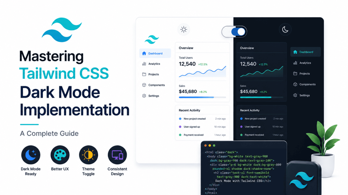

Introduction to Tailwind CSS Dark Mode
Dark mode has evolved from a niche preference into a standard expectation across modern web applications. Users increasingly seek interfaces that reduce eye strain, conserve battery life on OLED screens, and provide a visually soothing alternative to bright white backgrounds. Implementing dark mode traditionally required extensive CSS overrides, JavaScript toggles, and careful management of color variables, often leading to bloated stylesheets and maintenance headaches. Tailwind CSS simplifies this process dramatically by offering utility-first classes and a flexible configuration system that lets you define dark mode variants with minimal effort. This guide explores how Tailwind CSS dark mode implementation works, why it matters, and how you can leverage it to create seamless, user-friendly themes.
What Is Dark Mode and Why It Matters
Dark mode refers to a color scheme that uses light text, UI elements, and icons on a dark background, typically near-black or dark gray. Its popularity has surged due to several practical benefits. First, it reduces blue light emission, which can disrupt circadian rhythms and cause eye fatigue during nighttime use. Second, on OLED and AMOLED screens, dark pixels consume significantly less power, extending device battery life. Third, many users simply find dark mode more aesthetically pleasing or easier to read in low-light environments. From a design perspective, dark mode also offers a way to create visual hierarchy and emphasize content without relying on harsh contrasts. Implementing it well requires thoughtful color pairing, accessibility checks for contrast ratios, and consistent application across components.
Tailwind CSS Philosophy for Theming
Tailwind CSS approaches theming through its utility-first paradigm, where styling is applied directly in HTML using small, composable classes rather than custom CSS. For dark mode, this means you can add a dark: prefix to any utility class to specify its appearance when dark mode is active. For example, bg-white dark:bg-gray-800 sets a white background by default and a dark gray background in dark mode. This approach eliminates the need for separate stylesheets or complex media queries. Tailwind’s configuration file (tailwind.config.js) allows you to choose between two strategies: media, which respects the user’s operating system preference via the prefers-color-scheme media query, or class, which toggles dark mode based on a CSS class (typically dark) added to a parent element like <html>. The class strategy gives you programmatic control, enabling user-driven toggles, persistence via local storage, or integration with third-party libraries.
How Dark Mode Differs from Light Mode in Tailwind
In Tailwind CSS, light mode is the default, and dark mode is treated as a variant. This means you write your base styles for light mode and then override only the properties that need to change for dark mode using the dark: prefix. The key difference lies in how these variants are applied:
- Default behavior: Without a
dark:prefix, utilities apply to all color schemes. For instance,text-blackremains black regardless of dark mode activation. - Variant specificity: The
dark:variant has higher specificity than base utilities, so it overrides the light mode value when the dark mode condition is met. - Responsiveness: You can combine
dark:with responsive prefixes likemd:dark:bg-gray-700to apply dark mode styles only on medium screens and above. - State variants: Dark mode works seamlessly with hover, focus, and active states, such as
dark:hover:bg-gray-600.
Below is a comparison table illustrating how common properties are handled in light vs. dark mode using Tailwind classes:
| Property | Light Mode Class | Dark Mode Class |
|---|---|---|
| Background | bg-white |
dark:bg-gray-900 |
| Text color | text-gray-900 |
dark:text-gray-100 |
| Border | border-gray-200 |
dark:border-gray-700 |
| Shadow | shadow-sm |
dark:shadow-dark-sm (custom) |
This granular control, combined with Tailwind’s design system utilities, makes dark mode implementation both efficient and maintainable. By understanding these foundational differences, you can confidently build interfaces that adapt gracefully to user preferences without duplicating code or sacrificing performance.
Prerequisites and Setup
Before diving into Tailwind CSS Dark Mode Implementation, you need a solid foundation. This section covers the essential requirements and configuration steps to ensure your project is ready for dark mode. Without proper setup, even the best dark mode strategies will fail to render correctly across browsers and devices.
Installing Tailwind CSS via npm or CDN
Tailwind CSS can be installed in two primary ways. The recommended approach for production projects is via npm, which gives you full control over configuration and build processes. For quick prototypes or static sites, a CDN link works but limits customization.
npm installation (preferred):
npm install -D tailwindcss postcss autoprefixer
npx tailwindcss init -p
This creates a tailwind.config.js and postcss.config.js file. The -p flag also generates a PostCSS configuration automatically.
CDN installation (quick start):
Add the following to your HTML <head>:
<link href="https://cdn.jsdelivr.net/npm/tailwindcss@2.2.19/dist/tailwind.min.css" rel="stylesheet">
CDN usage is simpler but lacks the ability to customize dark mode variants or purge unused styles. For serious projects, always use npm.
Creating or Updating tailwind.config.js
The tailwind.config.js file is where you enable dark mode and define its strategy. Tailwind CSS Dark Mode Implementation relies on this file to determine how dark class variants are applied.
Open or create tailwind.config.js and add the darkMode property. The two strategies are:
media(default): Uses the user’s OS-level preference (prefers-color-scheme). No manual toggling.class: Requires you to add adarkclass to a parent element (usually<html>or<body>). This allows manual or JavaScript-based toggling.
Example configuration for the class strategy:
module.exports = {
  darkMode: 'class',
  content: ['./src/**/*.{html,js}'],
  theme: {
    extend: {},
  },
  plugins: [],
}
If you choose media, simply set darkMode: 'media'. The content array must point to all template files where Tailwind classes are used, so the compiler can generate the correct CSS.
Setting Up PostCSS and Build Tools
Tailwind CSS is a PostCSS plugin, so you need a build pipeline. The postcss.config.js file should include tailwindcss and autoprefixer as plugins.
Example postcss.config.js:
module.exports = {
  plugins: {
    tailwindcss: {},
    autoprefixer: {},
  },
}
For build tools, you have several options:
| Tool | Use Case | Command Example |
|---|---|---|
| PostCSS CLI | Simple command-line builds | postcss src/style.css -o dist/style.css |
| Webpack | Complex JavaScript bundling | Use postcss-loader in webpack config |
| Vite | Fast development server | Built-in PostCSS support; just install tailwind |
| Gulp | Task runner for multiple processes | Use gulp-postcss plugin |
To verify everything works, create a src/style.css file with:
@tailwind base;
@tailwind components;
@tailwind utilities;
Then run your build command. If no errors appear, your Tailwind CSS Dark Mode Implementation environment is ready. Remember to include the generated CSS file in your HTML.
With these prerequisites in place, you can proceed to implement dark mode classes and toggle functionality. The next sections will cover practical usage of dark: variants and JavaScript-driven theme switching.
Configuring Dark Mode in tailwind.config.js
Enabling dark mode in Tailwind CSS begins with a single configuration key: darkMode. This setting determines how your project detects and applies dark mode styles. Tailwind offers two primary strategies: media and class. The choice between them depends on whether you want automatic system-based switching or manual user control. Below, we walk through each option step by step.
Understanding the darkMode Configuration Key
The darkMode key lives inside your tailwind.config.js file, typically under the module.exports object. By default, this key is set to false, meaning dark mode is disabled. To activate it, you set darkMode to either 'media' or 'class'. This key tells Tailwind how to interpret the dark: variant prefix (e.g., dark:bg-gray-900) that you use in your HTML templates. Without this configuration, the dark variant will not function. Here is a basic example of the configuration structure:
module.exports = {
  darkMode: 'media', // or 'class'
  // ... other Tailwind config
}
Once set, you can apply dark mode styles anywhere in your markup using the dark: prefix, and Tailwind will handle the rest based on your chosen strategy.
Using the ‘media’ Strategy for System Preference
The media strategy leverages the CSS prefers-color-scheme media query. When you set darkMode: 'media', Tailwind automatically applies dark mode styles when the user’s operating system or browser is set to a dark theme. This approach requires no JavaScript or manual toggling—it is fully automatic and respects the user’s system-level preference. To implement it:
- Open your
tailwind.config.jsfile. - Set
darkMode: 'media'. - Use the
dark:variant in your HTML, for example:<div class="bg-white dark:bg-gray-800">. - Test by changing your system’s appearance settings (e.g., on macOS, toggle between Light and Dark mode in System Preferences).
This strategy is ideal for projects where you want a seamless, zero-intervention experience. However, it does not allow users to override the system setting within your app—dark mode is either on or off based on their OS.
Using the ‘class’ Strategy for Manual Toggle
The class strategy gives you full control by toggling a CSS class (typically dark) on a parent element, usually the <html> tag. When you set darkMode: 'class', Tailwind applies dark mode styles only when the dark class is present. This is perfect for websites or apps that offer a manual toggle (e.g., a sun/moon icon) or need to persist the user’s preference across sessions. Steps to set it up:
- In
tailwind.config.js, setdarkMode: 'class'. - Add a
darkclass to your<html>element (e.g., via JavaScript:document.documentElement.classList.add('dark')). - Use the
dark:variant in your HTML as before. - Implement a toggle button that adds or removes the
darkclass, and optionally save the preference tolocalStorage.
This approach is more flexible and user-centric, but it requires additional code for toggling and persistence.
Comparison Table: media vs. class Strategies
| Feature | media Strategy | class Strategy |
|---|---|---|
| Detection Method | Uses prefers-color-scheme media query |
Uses a CSS class on a parent element |
| User Control | Automatic, based on system setting | Manual toggle via JavaScript |
| Implementation Complexity | Low (no extra code) | Moderate (requires toggle logic) |
| Persistence | Not applicable (system-driven) | Can be saved to localStorage |
| Best For | Sites that follow OS preference | Apps with user-facing dark mode toggle |
| Browser Support | Modern browsers (IE11 not supported) | All browsers (class-based) |
Both strategies are valid; choose based on your project’s needs for automation versus user choice.
Applying Dark Mode with Utility Classes
Tailwind CSS Dark Mode Implementation becomes intuitive once you understand the dark: prefix. This utility-first variant allows you to conditionally apply styles based on the user’s system preference or a manual class toggle, all directly within your HTML templates. Instead of writing separate CSS rules or JavaScript logic, you simply prepend dark: to any existing Tailwind utility class. When the dark mode condition is met (for example, when the class="dark" is added to the <html> element or the OS theme is set to dark), those prefixed styles activate, overriding the default light-mode styles.
Dark: Prefix Syntax and Examples
The syntax is straightforward: dark:{utility-class}. You can apply it to any Tailwind utility, from background colors to typography. For example, to create a card that switches between light and dark backgrounds:
<div class="bg-white dark:bg-gray-800 p-6 rounded-lg shadow-md">
  <p class="text-gray-700 dark:text-gray-200">This text adapts to dark mode.</p>
</div>
In this example:
- Background:
bg-whiteapplies in light mode;dark:bg-gray-800overrides it in dark mode. - Text:
text-gray-700is for light mode;dark:text-gray-200ensures readability on the dark background. - Borders and shadows: You can similarly use
dark:border-gray-600ordark:shadow-lgto adjust depth and contrast.
This pattern works for any utility class that accepts a value, including spacing, sizing, opacity, and even custom properties defined in your tailwind.config.js. The key is that dark: always appears after the base utility, and both are applied to the same element.
Combining Dark Mode with Other Variants (hover, focus)
Tailwind’s variant system allows you to stack multiple conditions, such as dark:hover: or dark:focus:. This is essential for interactive elements like buttons, links, or form inputs. For instance, to style a button that changes background on hover in both modes:
<button class="bg-blue-500 hover:bg-blue-600 dark:bg-blue-700 dark:hover:bg-blue-800 text-white px-4 py-2 rounded">
  Submit
</button>
Here, the dark:hover:bg-blue-800 variant ensures that when dark mode is active, hovering over the button triggers the darker blue shade. The order of variants matters: dark:hover: means “apply this style when both dark mode and hover state are true.” You can also combine with focus:, active:, disabled:, or even responsive prefixes like md:dark:hover:. This stacking gives you granular control without bloating your CSS.
Applying Dark Mode to Background, Text, and Borders
The most common use cases for Tailwind CSS Dark Mode Implementation involve adjusting visual properties for readability and aesthetics. Below is a quick reference table for typical patterns:
| Element | Light Mode Utility | Dark Mode Utility |
|---|---|---|
| Page background | bg-gray-50 |
dark:bg-gray-900 |
| Card background | bg-white |
dark:bg-gray-800 |
| Primary text | text-gray-900 |
dark:text-gray-100 |
| Secondary text | text-gray-600 |
dark:text-gray-400 |
| Border | border-gray-200 |
dark:border-gray-700 |
| Input background | bg-white |
dark:bg-gray-700 |
When applying these, remember to always provide a light-mode fallback. The dark: prefix only overrides the base utility when dark mode is active; if you omit the light-mode utility, the element will inherit default browser styles (often white backgrounds and black text), which may break your design. For borders, consider using dark:border-opacity-50 to reduce harshness, and for backgrounds, pair with dark:text-* to maintain contrast. This approach ensures your interface remains accessible and visually consistent across all themes.
Building a Dark Mode Toggle Component
A user-controlled toggle is the most robust method for implementing Tailwind CSS dark mode. By adding or removing the dark class on the <html> element, you give visitors direct agency over their viewing experience. This approach works seamlessly with Tailwind’s class strategy and avoids conflicts with system-level preferences. The toggle can be a button, a switch, or any interactive element that triggers a JavaScript function to flip the class state.
JavaScript Logic for Toggling the Dark Class
The core logic involves selecting the <html> element and toggling the dark class each time the toggle is activated. Here is a clean, reusable implementation:
const htmlElement = document.documentElement;
const toggleButton = document.getElementById('dark-mode-toggle');

toggleButton.addEventListener('click', () => {
  htmlElement.classList.toggle('dark');
});
This code assumes your toggle has an id="dark-mode-toggle". When clicked, it adds the dark class if absent, or removes it if present. For initial page load, you may want to check the user’s system preference using window.matchMedia('(prefers-color-scheme: dark)') and apply the class accordingly. However, once the user manually toggles, their choice should override system settings for the session.
Key considerations for the JavaScript logic:
- Always use
document.documentElementto target the root<html>element. - Store the toggle element reference outside the event listener to avoid repeated DOM queries.
- Consider debouncing the listener if the toggle triggers additional animations or transitions.
- Test for
classListsupport; modern browsers all support it, but legacy polyfills may be needed for very old environments.
Persisting User Preference with localStorage
Without persistence, the dark mode resets on every page reload, frustrating users. localStorage provides a simple, synchronous solution to remember the user’s choice across sessions. Integrate it into the toggle logic as follows:
const htmlElement = document.documentElement;
const toggleButton = document.getElementById('dark-mode-toggle');
const storedPreference = localStorage.getItem('darkMode');

if (storedPreference === 'enabled') {
  htmlElement.classList.add('dark');
}

toggleButton.addEventListener('click', () => {
  htmlElement.classList.toggle('dark');
  const isDark = htmlElement.classList.contains('dark');
  localStorage.setItem('darkMode', isDark ? 'enabled' : 'disabled');
});
This approach stores a string 'enabled' or 'disabled' in localStorage under the key darkMode. On page load, it reads the stored value and applies the class immediately, preventing a flash of unthemed content. For optimal performance, keep the stored value as a simple string to minimize parsing overhead.
Benefits of using localStorage:
- No server-side storage or authentication required.
- Works offline and across page navigations on the same domain.
- Data persists indefinitely until explicitly cleared by the user or script.
- Minimal code footprint with no external dependencies.
| Storage Method | Persistence Scope | Recommended For |
|---|---|---|
| localStorage | Across sessions, same domain | Most user preference toggles |
| sessionStorage | Only current browser tab | Short-term preferences |
| Cookies | Across sessions, server-accessible | When server needs preference |
Accessibility Considerations for the Toggle
An accessible dark mode toggle ensures all users can control their visual experience. The toggle must be keyboard-operable, screen reader friendly, and visually clear. Implement these best practices:
- Use a
<button>element for the toggle, which is natively focusable and activatable via keyboard. - Add
aria-label="Toggle dark mode"to describe the action for screen readers. - Include
aria-pressed="true"oraria-pressed="false"to indicate the current state, updated dynamically via JavaScript. - Provide visible focus indicators, such as a high-contrast outline, using Tailwind’s
focus:ringutilities. - Ensure the toggle has sufficient color contrast against both light and dark backgrounds—test with a contrast ratio of at least 4.5:1.
- Announce state changes using a live region (
aria-live="polite") or a visually hidden status text that updates on toggle. - Avoid relying solely on icons or color changes to convey state; include text labels or clear visual cues like a sun/moon icon pair.
By integrating these accessibility features, the toggle becomes usable by people with visual impairments, motor disabilities, or those relying on assistive technology. Always test with keyboard navigation and screen readers like NVDA or VoiceOver to confirm proper behavior.
Handling System Preference with prefers-color-scheme
When implementing dark mode in a Tailwind CSS project, one of the most user-friendly approaches is to respect the operating system’s color scheme preference. The CSS media query prefers-color-scheme allows your application to automatically switch between light and dark themes based on the user’s system settings. Tailwind CSS provides a built-in strategy for this, known as the media strategy, which leverages this media query under the hood. This method ensures that users who have set their OS to dark mode will see your site in dark mode without any manual toggle, creating a seamless and intuitive experience. The primary advantage here is zero configuration for the end user—the system preference is honored immediately upon page load.
Using the ‘media’ Strategy for Automatic Detection
To enable the media strategy in Tailwind CSS, you need to set the darkMode option in your tailwind.config.js file to "media". This tells Tailwind to use the prefers-color-scheme media query for all dark mode variants. Once configured, you can apply dark mode styles using the dark: prefix in your HTML classes. For example, class="bg-white dark:bg-gray-900 text-gray-900 dark:text-gray-100" will automatically switch background and text colors based on the user’s OS setting.
Here is a practical code example demonstrating the configuration and usage:
// tailwind.config.js
module.exports = {
  darkMode: 'media', // or 'class' for manual toggle
  content: ['./src/**/*.{html,js}'],
  theme: {
    extend: {},
  },
  plugins: [],
}
In your HTML, you would then write:
<div class="p-6 bg-white dark:bg-gray-800">
  <h1 class="text-gray-900 dark:text-white">Automatic Dark Mode</h1>
  <p class="text-gray-600 dark:text-gray-300">This content adapts to your system theme.</p>
</div>
This approach is ideal for websites where the dark mode is purely cosmetic and does not require user overrides. It works across all major browsers and respects accessibility preferences set at the OS level.
Fallback Behavior When No Preference Is Set
It is important to consider users who have not set a specific color scheme preference in their operating system. In such cases, the prefers-color-scheme media query evaluates to no-preference. Tailwind CSS’s media strategy handles this gracefully: when no preference is detected, the default (light) theme is applied. This means your base styles—those without the dark: prefix—will be used. To ensure a consistent experience, always define a complete light theme as your baseline. You can also explicitly test for no-preference using custom CSS if needed, but for most implementations, the default behavior is sufficient. If you want to offer both automatic detection and a manual override, consider using the class strategy instead, which gives you more control.
Testing System Preference in Development
Testing your dark mode implementation during development is straightforward with browser developer tools. All major browsers allow you to simulate the prefers-color-scheme media query. Here is how to test in common browsers:
- Chrome DevTools: Open DevTools (F12), click the three-dot menu, select “More tools” > “Rendering”, then find “Emulate CSS media feature prefers-color-scheme” and choose
prefers-color-scheme: darkorlight. - Firefox Developer Tools: Open DevTools (F12), go to the “Inspector” tab, click the “Settings” gear icon, then under “Advanced settings”, enable “Emulate prefers-color-scheme: dark”.
- Safari Web Inspector: Open Web Inspector (Option+Command+I), go to the “Elements” tab, click the “Development” menu in the menu bar, and select “Experimental Features” > “CSS prefers-color-scheme”.
You can also change your entire operating system’s theme to test the behavior globally. On macOS, go to System Preferences > General > Appearance and toggle between Light, Dark, and Auto. On Windows, go to Settings > Personalization > Colors and choose your color mode. For a more programmatic approach during development, you can use a browser extension that toggles the media query or write a small JavaScript snippet to override the preference for testing purposes.
By following these practices, you can ensure your Tailwind CSS dark mode implementation using system preferences is robust, testable, and user-friendly from the start.
Customizing Dark Mode Colors and Themes
While Tailwind CSS provides a robust default dark mode palette, real-world projects often require custom colors to maintain brand consistency across themes. Extending Tailwind’s configuration allows you to define precise hues for dark mode, ensuring your design system remains cohesive. This section explores three essential techniques: adding custom dark mode colors, leveraging CSS custom properties for dynamic theming, and creating a full dark theme with variants.
Adding Custom Dark Mode Colors in tailwind.config.js
To add custom colors specifically for dark mode, you extend the darkMode configuration in your tailwind.config.js. Start by enabling dark mode via the 'class' or 'media' strategy. Then, define your custom colors under the theme.extend.colors object, using the dark variant prefix.
- Step 1: Set
darkMode: 'class'in the config to toggle dark mode via a CSS class. - Step 2: Add custom colors like
brand-primaryandbrand-secondaryundertheme.extend.colors. - Step 3: Use the
dark:variant in your HTML:class="bg-brand-primary dark:bg-dark-brand-primary".
Example configuration snippet:
// tailwind.config.js
module.exports = {
  darkMode: 'class',
  theme: {
    extend: {
      colors: {
        'brand-primary': '#1a73e8',
        'dark-brand-primary': '#0d47a1',
        'surface': '#ffffff',
        'dark-surface': '#1e1e1e',
      },
    },
  },
};
This approach gives you full control over every shade, ensuring your dark mode colors align with your brand guidelines without overriding Tailwind’s defaults.
Using CSS Custom Properties for Dynamic Theming
CSS custom properties (variables) introduce dynamic theming flexibility, allowing you to change colors at runtime without recompiling. Combine them with Tailwind by defining custom properties in your global CSS and referencing them in the config.
- Define variables: In your
styles.css, set:root { --color-primary: #1a73e8; }and.dark { --color-primary: #0d47a1; }. - Reference in config: Use
theme.extend.colors.primary: 'var(--color-primary)'intailwind.config.js. - Apply in HTML: Use
class="bg-primary"— Tailwind will automatically respect the current dark mode state.
This method is especially useful for user-customizable themes or when you need to sync with design tokens from a design system. It also reduces the number of dark: variants needed in your markup.
Creating a Full Dark Theme with Variants
For a comprehensive dark mode implementation, build a complete dark theme by mapping every critical color to its dark counterpart. Use Tailwind’s variant system to apply styles conditionally.
| Element | Light Mode Color | Dark Mode Color | Tailwind Class |
|---|---|---|---|
| Background | #ffffff |
#121212 |
bg-white dark:bg-gray-900 |
| Text | #1f2937 |
#f9fafb |
text-gray-800 dark:text-gray-100 |
| Primary button | #1a73e8 |
#4a90d9 |
bg-blue-600 dark:bg-blue-400 |
| Border | #e5e7eb |
#374151 |
border-gray-200 dark:border-gray-700 |
To streamline this, create a utility class in your config using theme.extend:
// tailwind.config.js
theme: {
  extend: {
    colors: {
      'theme-bg': 'var(--color-bg)',
      'theme-text': 'var(--color-text)',
    },
  },
},
Then define CSS variables for both themes:
:root { --color-bg: #ffffff; --color-text: #1f2937; }
.dark { --color-bg: #121212; --color-text: #f9fafb; }
Apply with class="bg-theme-bg text-theme-text". This reduces repetitive dark: prefixes and ensures consistency across your entire application.
Integrating Dark Mode with Frameworks (React, Vue, Next.js)
Implementing a Tailwind CSS dark mode across modern JavaScript frameworks requires more than just toggling a class on the <html> element—it demands a reactive, persistent, and framework-idiomatic approach. Each framework offers its own patterns for state management and lifecycle hooks, which directly influence how you store and apply the user’s theme preference. Below are practical, production-ready implementations for React, Vue, and Next.js, each leveraging the class strategy (i.e., adding dark to the root element) and the prefers-color-scheme media query for initial detection.
Dark Mode in React with useState and useEffect
In a standard React application (created with Vite or Create React App), the most straightforward approach uses the useState hook to manage the theme and useEffect to synchronize the DOM with the state and persist the choice to localStorage.
- Initialization: Read
localStoragefor a saved preference. If none exists, querywindow.matchMedia('(prefers-color-scheme: dark)')to detect the system theme. - State Management: Create a boolean state variable, e.g.,
const [isDark, setIsDark] = useState(initialValue). - DOM Update: Inside a
useEffectwithisDarkas a dependency, usedocument.documentElement.classList.toggle('dark', isDark)to apply or remove the class. - Persistence: In the same
useEffect, writelocalStorage.setItem('theme', isDark ? 'dark' : 'light'). - Toggle Function: Pass a handler like
() => setIsDark(prev => !prev)to a button or switch component.
This pattern ensures the theme is applied before the first paint (if using a synchronous initial read) and remains reactive to user interaction.
Dark Mode in Vue with reactive Data and v-bind
Vue 3’s Composition API simplifies dark mode through ref (or reactive) and the v-bind directive. The core logic mirrors React but leverages Vue’s reactivity system and lifecycle hooks.
- Setup: In your root component’s
<script setup>, create aconst isDark = ref(false). UseonMountedto initialize the value fromlocalStorageor theprefers-color-schememedia query. - Reactive Application: Use a
watchfunction onisDarkto update thedocument.documentElement.classListwhenever the value changes. Alternatively, usev-bind:classon the root<div>if you prefer scoped classes, but applying to<html>is more reliable for Tailwind. - Template Integration: Bind a toggle button’s
@clickevent toisDark.value = !isDark.value. Thev-binddirective can also dynamically apply thedarkclass to specific elements if needed.
Vue’s v-bind:class and the Composition API’s watch make the theme transition seamless, especially when combined with Tailwind’s transition-colors utility.
Dark Mode in Next.js with getInitialProps or App Router
Next.js introduces challenges due to server-side rendering (SSR) and hydration. The window and localStorage objects are unavailable during server-side execution, requiring a strategy to avoid hydration mismatches.
Pages Router (getInitialProps): Use a custom _app.js or _document.js to inject a <script> block that reads localStorage and applies the dark class before React hydrates. This “flash-free” technique is known as the “no-flash” pattern. The theme state is then managed client-side with useState and useEffect, similar to React, but the initial class is already set.
App Router (Server Components): The App Router uses React Server Components, which cannot use hooks or browser APIs. The recommended approach is to create a ThemeProvider client component (marked with 'use client') that wraps your layout. This provider uses useEffect to manage the class and localStorage, while a script tag in the root layout runs before hydration to apply the saved theme. Next.js 13+ also supports the next-themes library, which abstracts this pattern.
| Feature | React (Vite/CRA) | Vue 3 (Composition API) | Next.js (Pages Router) | Next.js (App Router) |
|---|---|---|---|---|
| State Management | useState + useEffect | ref + watch | useState + useEffect (client) | useState + useEffect (client component) |
| Initial Theme Detection | matchMedia in useEffect | matchMedia in onMounted | Script in _document.js | Script in layout.js (before hydration) |
| Persistence | localStorage in useEffect | localStorage in watch | localStorage in useEffect | localStorage in useEffect (client) |
| Hydration Risk | Low (client-only) | Low (client-only) | Low (script runs first) | Medium (requires script) |
| Recommended Library | None needed | None needed | None needed | next-themes |
Each framework requires careful handling of the initial render to avoid a flash of unstyled content or a hydration mismatch. The common thread is using a synchronous script or a server-friendly initial value to ensure the correct theme is applied before the user sees the page.
Testing and Debugging Dark Mode Styles
Implementing dark mode with Tailwind CSS requires rigorous testing to ensure styles render correctly across browsers, devices, and edge cases. The following practices help you catch issues early and maintain a consistent user experience.
Using Browser DevTools to Simulate Dark Mode
Modern browser DevTools allow you to toggle dark mode without changing system settings, speeding up debugging. In Chrome, open DevTools (F12), click the More tools menu, and select Rendering. Under the Emulate CSS media feature prefers-color-scheme option, choose prefers-color-scheme: dark. Firefox offers similar functionality in the Responsive Design Mode (Ctrl+Shift+M) by clicking the color scheme icon. This approach lets you test dark: variants instantly, inspect applied styles in the Elements panel, and verify that no light-mode-only styles bleed into the dark theme.
Common Pitfalls: Specificity and Missing Variants
Two frequent issues break dark mode implementations: specificity conflicts and omitted variants. When a base utility class and its dark: variant target the same property, ensure the variant has equal or higher specificity. For example, bg-white dark:bg-gray-800 works because both use single-class utilities. However, if you add a custom class like .card { background: white; }, it overrides dark:bg-gray-800 unless you use !important or increase specificity. Always prefer Tailwind utilities over custom CSS for color properties. Additionally, remember to apply dark: variants to every relevant element—missing a variant on a border, shadow, or text color creates visual inconsistencies. Use the following checklist to audit your components:
- Backgrounds: All
bg-*classes have correspondingdark:bg-*variants. - Text colors:
text-*classes includedark:text-*where needed. - Borders and rings:
border-*andring-*classes are covered. - Shadows:
shadow-*classes usedark:shadow-*(e.g.,dark:shadow-dark-md). - Placeholder and focus states: Variants like
dark:placeholder-gray-400anddark:focus:ring-blue-500.
Automated Testing with Playwright or Cypress
Automated visual regression tests catch dark mode bugs before they reach users. Both Playwright and Cypress support emulating prefers-color-scheme programmatically. Below is a Playwright example that toggles dark mode and captures a screenshot for comparison:
import { test, expect } from '@playwright/test';

test('verify dark mode renders correctly', async ({ page }) => {
  // Emulate dark mode
  await page.emulateMedia({ colorScheme: 'dark' });
  await page.goto('https://example.com');

  // Wait for dark mode styles to apply
  await page.waitForSelector('.dark\:bg-gray-900');

  // Take a screenshot for visual diffing
  await page.screenshot({ path: 'dark-mode-homepage.png' });

  // Assert a dark-mode-specific element exists
  const headerBg = await page.evaluate(() => {
    return getComputedStyle(document.querySelector('header')).backgroundColor;
  });
  expect(headerBg).toBe('rgb(17, 24, 39)'); // Tailwind gray-900
});
For Cypress, use cy.visit() with the prefers-color-scheme option in the onBeforeLoad callback or use the cy.emulateMedia() command if supported. Integrate these tests into your CI pipeline to validate every pull request. Additionally, test across browsers (Chrome, Firefox, Safari) and devices (mobile, tablet, desktop) because dark mode rendering can vary—especially for form controls and scrollbars. Use browserstack or similar services to expand coverage without local hardware.
By combining manual DevTools inspection with automated tests, you ensure your Tailwind CSS dark mode implementation remains robust, accessible, and visually consistent for all users.
Performance and Best Practices
Optimizing a Tailwind CSS dark mode implementation requires balancing runtime performance with developer experience. When dark mode variants proliferate across utility classes, build sizes can balloon unless you enforce strict tree-shaking, eliminate rendering delays, and maintain clear documentation for team collaboration. The following best practices address the three critical areas that determine whether your dark mode setup remains fast, reliable, and maintainable as your project scales.
Tree-Shaking Unused Dark Mode Variants with PurgeCSS
Tailwind CSS relies on PurgeCSS (via the content configuration) to remove unused classes from production builds. Dark mode variants—those prefixed with dark:—are especially prone to bloat because developers often write defensive utilities that never appear in the final markup. To maximize tree-shaking effectiveness:
- Define your
darkModestrategy explicitly intailwind.config.js. Using'class'or'selector'instead of'media'gives PurgeCSS a predictable class pattern to scan. - Audit your template files for orphaned
dark:classes. A common mistake is applying bothdark:bg-gray-800anddark:bg-gray-900on the same element; only one will be used. - Use Tailwind’s
safelistsparingly. Only preserve classes that are constructed dynamically (e.g., from a CMS or API) and cannot be detected by PurgeCSS. - Run
npx tailwindcss -i input.css -o output.css --minifyand inspect the output. Compare file sizes before and after removing unused dark mode variants—a reduction of 30–50% is common in large projects.
For teams using multiple dark mode themes (e.g., “dark-blue” and “dark-red”), consider generating separate CSS files per theme to further isolate unused variants.
Minimizing Flash of Unstyled Content (FOUC)
A flash of unstyled content occurs when the browser applies the default (light) theme before JavaScript can toggle the dark mode class. This flicker degrades user experience, especially on slow connections. To prevent FOUC with Tailwind CSS dark mode:
| Technique | Implementation | Effectiveness |
|---|---|---|
Inline script in <head> |
Read localStorage or prefers-color-scheme and apply dark class before any rendering. |
High—blocks rendering until class is set. |
| CSS-only media query fallback | Use @media (prefers-color-scheme: dark) for critical styles, then override with class-based logic. |
Medium—prevents flash only for system preference. |
| Server-side class injection | Read user preference in middleware and inject dark class into the <html> tag server-side. |
Highest—no client-side delay, but requires SSR. |
For the inline script approach, place a minimal script immediately after the opening <head> tag that checks for the stored preference and sets document.documentElement.classList.add('dark') if needed. Avoid relying solely on prefers-color-scheme in media queries because it ignores user overrides stored in localStorage.
Documenting Dark Mode Patterns for Team Collaboration
Without clear documentation, dark mode implementations degrade into inconsistent class usage and theme leaks. Establish a shared convention by documenting the following:
- Color token mapping: Create a table that maps each semantic token (e.g.,
bg-surface,text-primary) to its light and dark values. Reference this table in your component library. - Variant priority: Clarify that
dark:overrides must be applied only on the element that changes, not on parent containers, to avoid specificity conflicts. - Testing checklist: Include a step-by-step process for verifying dark mode in every pull request, covering both system preference and manual toggle scenarios.
- Code review rules: Require that any new
dark:class must have a corresponding light-mode default. Flag orphaned dark variants during review.
Store this documentation in a DARK_MODE.md file in your project root and link to it from your README. Regularly audit your codebase for deviations from the documented patterns, and update the guide whenever your dark mode strategy evolves.
Frequently Asked Questions
How do I enable dark mode in Tailwind CSS?
To enable dark mode in Tailwind CSS, you need to set the `darkMode` option in your `tailwind.config.js` file. The most common approach is using the `class` strategy, which allows you to toggle dark mode by adding a `dark` class to a parent element (usually “ or “). Alternatively, you can use the `media` strategy, which automatically respects the user's system preference via `prefers-color-scheme`. For example: `module.exports = { darkMode: 'class', // or 'media' }`. After configuration, you can use the `dark:` variant in your HTML classes, like “.
What is the difference between 'class' and 'media' dark mode strategies in Tailwind?
The `class` strategy gives you manual control over dark mode by toggling a `dark` class on a container (e.g., “). This is ideal for user-driven theme toggles (e.g., a switch). The `media` strategy automatically applies dark mode based on the user's OS or browser setting using `prefers-color-scheme: dark`. It requires no JavaScript but limits user control. Choose `class` for custom toggles, or `media` for a simpler, system-following approach. You can also combine both with custom JavaScript to respect system preference while allowing overrides.
How do I use the 'dark:' variant in Tailwind CSS?
The `dark:` variant is used to apply styles only when dark mode is active. For example, to change background and text color in dark mode, you write: “. The `dark:` prefix works with any utility class. If you use the `class` strategy, ensure the parent element has the `dark` class. For the `media` strategy, it activates automatically based on system preference. You can also stack variants like `hover:dark:bg-gray-700`.
Can I use Tailwind CSS dark mode with JavaScript frameworks like React or Vue?
Yes, Tailwind CSS dark mode works seamlessly with JavaScript frameworks. For React, you can manage the `dark` class on the “ element using state or context. For example, use `useEffect` to toggle `document.documentElement.classList.toggle('dark')`. In Vue, you can bind a class to the root element. Many frameworks also have libraries like `next-themes` for Next.js or `vue-dark-mode` for Vue. The key is to ensure the `dark` class is added to a parent element that wraps your components.
How do I respect user system preference while allowing manual toggle in Tailwind dark mode?
You can combine both approaches by first checking `window.matchMedia('(prefers-color-scheme: dark)').matches` on page load to set the initial theme. Then, provide a toggle that overrides this by adding/removing the `dark` class and saving the preference in `localStorage`. For example, use JavaScript to listen to system changes with `matchMedia.addEventListener('change', handler)` but only apply if no manual override exists. This gives users the best of both worlds.
What are common pitfalls when implementing dark mode in Tailwind?
Common pitfalls include: forgetting to add the `dark` class to the correct parent element (e.g., “ vs “), not using the `dark:` variant on all necessary elements (leading to incomplete styling), and issues with third-party libraries that don't respect Tailwind's dark mode. Also, ensure your `tailwind.config.js` is set correctly. Another pitfall is not testing on actual devices with system preference changes. Use browser DevTools to simulate dark mode and verify your styles.
How can I test dark mode during development in Tailwind CSS?
You can test dark mode by toggling the `dark` class manually in the browser's DevTools. For example, add `class="dark"` to the “ element in the Elements panel. Alternatively, use the `prefers-color-scheme` simulation in Chrome DevTools under Rendering > Emulate CSS media feature prefers-color-scheme. If you have a toggle button, click it to switch. Also, check on different browsers and OS settings to ensure consistency.
Does Tailwind CSS dark mode work with CSS custom properties?
Yes, Tailwind CSS dark mode works well with CSS custom properties (variables). You can define theme colors as CSS variables and use them in your config. For example, in `tailwind.config.js`, you can extend colors with `colors: { primary: 'var(–color-primary)' }` and then define `–color-primary` in your CSS for light and dark themes. This approach makes it easier to maintain and customize themes. However, note that Tailwind's `dark:` variant still works independently of CSS variables.
Sources and further reading
- Tailwind CSS Dark Mode Documentation
- MDN Web Docs: prefers-color-scheme
- CSS-Tricks: A Complete Guide to Dark Mode on the Web
- Web.dev: prefers-color-scheme and dark mode
- Tailwind CSS Documentation: Configuration
- Tailwind CSS Documentation: Customizing Colors
- Mozilla Developer Network: CSS custom properties (variables)
- W3C: CSS Color Adjustment Module Level 1
- GitHub: Tailwind CSS Repository – Dark Mode Issue/PR
- Next.js Documentation: next-themes
Need help with this topic?
Send us your details and we will contact you.