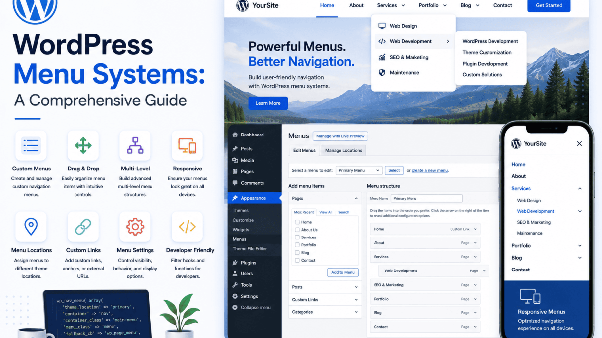

Introduction to WordPress Menu Systems
WordPress menu systems form the backbone of site navigation, allowing you to organize and display links to your most important content. A well-structured menu guides visitors effortlessly through your website, reducing bounce rates and improving overall usability. Mastering these systems is not just a design choice—it is a fundamental practice for enhancing user experience and boosting search engine optimization (SEO). This comprehensive guide explores the components, benefits, and best practices of WordPress menus, equipping you with the knowledge to create intuitive, high-performing navigation.
What Are WordPress Menus?
WordPress menus are customizable navigation elements that appear in designated locations within your theme, such as headers, footers, or sidebars. They consist of links to pages, posts, categories, custom URLs, or other content types. The native WordPress menu system, accessed under Appearance > Menus, allows you to create, edit, and assign multiple menus to different theme locations. Key features include:
- Drag-and-drop interface for reordering items
- Support for nested submenus (dropdowns) up to multiple levels
- Integration with custom link types and taxonomy terms
- Ability to assign menus to specific locations (e.g., primary, secondary, footer)
- Compatibility with third-party plugins for enhanced functionality (e.g., mega menus, sticky navigation)
Each menu item can be customized with a navigation label, title attribute, and CSS classes, offering granular control over appearance and behavior. Themes define available locations, so the number and placement of menus vary depending on your chosen design.
Why Navigation Matters for Your Website
Navigation is the roadmap of your website. Without clear, logical menus, users struggle to find information, leading to frustration and abandonment. Effective navigation serves multiple purposes:
- Usability: Visitors can quickly locate key content, such as product pages, blog posts, or contact forms.
- Accessibility: Properly structured menus support screen readers and keyboard navigation, ensuring inclusivity.
- Brand Trust: A polished, consistent navigation bar signals professionalism and reliability.
- Site Structure: Menus reflect your site’s hierarchy, helping users understand how content relates.
For example, an e-commerce site with a well-organized menu (e.g., “Shop by Category,” “Sales,” “Support”) reduces cognitive load and encourages purchases. Conversely, a cluttered or hidden menu increases bounce rates and diminishes user satisfaction.
How Menus Affect User Experience and Search Rankings
Menus directly influence both user experience (UX) and SEO. From a UX perspective, menus determine how easily users navigate your site. Key considerations include:
| Aspect | Impact on User Experience |
|---|---|
| Clarity | Clear labels reduce confusion and help users find content quickly. |
| Consistency | Menus that remain stable across pages build familiarity and reduce disorientation. |
| Depth | Overly deep menus (many sublevels) can overwhelm users; limit to 2-3 levels. |
| Mobile Responsiveness | Menus must adapt to smaller screens (e.g., hamburger menus) for touch interaction. |
For SEO, menus play a critical role in distributing link equity and defining site architecture. Search engines use menus to discover and index content. Best practices include:
- Link to High-Value Pages: Include your most important pages (e.g., cornerstone content, product categories) in the primary menu.
- Use Descriptive Anchor Text: Avoid generic terms like “click here”; instead, use keywords relevant to the linked page.
- Limit Menu Items: Too many links dilute link authority; aim for 5-7 primary items.
- Ensure Crawlability: Menu links should be standard HTML (not JavaScript-only) to allow bots to follow them.
- Leverage Breadcrumbs: While not a menu, breadcrumbs complement navigation by showing users their location and improving internal linking.
By prioritizing navigation quality, you create a seamless user journey that encourages deeper engagement and signals relevance to search engines, ultimately improving rankings and conversion rates.
Understanding the WordPress Menu Editor
The WordPress Menu Editor is the central interface for creating, managing, and assigning navigation menus on your site. Located within the WordPress Dashboard, this tool provides a visual, drag-and-drop environment that allows you to build custom menu structures without touching any code. Whether you are building a simple blog or a complex business site, mastering the Menu Editor is essential for guiding visitors through your content. This section walks you through accessing the editor, understanding its core components, and applying your menus to theme locations.
Accessing the Menu Editor via the Dashboard
To open the Menu Editor, log in to your WordPress Dashboard and follow these steps:
- Navigate to Appearance in the left-hand admin menu.
- Click on Menus. This opens the Menu Editor page.
If your theme supports multiple menus, you will see an option to create a new menu or edit an existing one. The interface is divided into two main columns: the left column contains available content items (pages, posts, custom links, categories, etc.), and the right column shows the current menu structure where you can arrange items. If you do not see the Menus option under Appearance, ensure your theme supports custom menus—most modern themes do, but some older or minimal themes may require a plugin or theme update.
For advanced customization, you can also access the Menu Editor programmatically. For example, you can register a new menu location in your theme’s functions.php file using the following code:
function register_my_menus() {
    register_nav_menus(
        array(
            'footer-menu' => __( 'Footer Menu' ),
            'social-menu' => __( 'Social Links Menu' )
        )
    );
}
add_action( 'after_setup_theme', 'register_my_menus' );
This code registers two new menu locations, which will then appear in the Menu Editor under “Manage Locations.”
Key Components: Menu Name, Menu Items, and Menu Settings
The Menu Editor is built around three core components that you will interact with every time you build or modify a navigation structure.
- Menu Name: Located at the top of the editor, this is a descriptive label for your menu (e.g., “Main Navigation” or “Footer Links”). It is used internally to identify the menu and is not visible to site visitors. You must assign a name before saving your first menu.
- Menu Items: These are the individual links that appear in your navigation. You add items from the left column by checking the box next to a page, post, custom link, or category, then clicking “Add to Menu.” Once added, you can drag and drop items to reorder them, or nest items under a parent to create dropdown menus. Each item has a small triangle arrow that expands to reveal settings such as Navigation Label, Title Attribute, and CSS Classes (if enabled via Screen Options).
- Menu Settings: Below the menu structure, you will find a “Menu Settings” box. Here, you can enable or disable features like “Automatically add new top-level pages” (which auto-adds any new pages to the menu) and “Display location” (which assigns the menu to a theme-defined area, such as the primary navigation or footer).
To customize what options appear in the Menu Editor, click the “Screen Options” tab at the top right of the page. This lets you show or hide fields such as Link Target, CSS Classes, and Description for each menu item, giving you finer control over your navigation’s behavior and styling.
Saving and Assigning Menus to Locations
Once you have built your menu structure, you must save it and assign it to a theme location for it to appear on your site. Follow these steps:
- Click the Save Menu button at the bottom of the Menu Editor. This stores your current menu configuration.
- Scroll down to the Menu Settings section. Check the box next to the theme location where you want this menu to appear (e.g., “Primary Menu” or “Footer Menu”). If your theme supports multiple locations, you can assign the same menu to several locations or create separate menus for each.
- Click Save Menu again to confirm the assignment.
Alternatively, you can use the Manage Locations tab at the top of the Menu Editor page. This tab provides a table view of all available theme locations and allows you to assign a menu to each location from a dropdown list. This method is useful when you have many menus and need to quickly reassign them without editing each menu’s settings individually.
After assigning a menu, visit your site’s front end to verify it displays correctly. If the menu does not appear, ensure your theme supports the location you selected and that the menu contains at least one item. Some themes also require you to set a “Home” link manually if you want it in the navigation—add a custom link with the URL set to / and the label set to “Home.”
Adding Items to Your WordPress Menu
Once you have created a menu in WordPress, the next step is populating it with the content you want visitors to access. The Menu Editor in the WordPress admin area provides a straightforward interface for adding various types of items, from standard pages to custom external links. This section provides step-by-step instructions for adding different content types to your navigation menus.
Adding Pages and Posts to a Menu
Pages and posts are the most common menu items. To add them:
- Go to Appearance > Menus in your WordPress dashboard.
- Ensure you are editing the correct menu from the dropdown at the top.
- In the left-hand panel, click the Pages or Posts tab to expand it.
- Check the box next to each page or post you want to include. You can also click View All to see all available items, or use the Search field for specific entries.
- Click the Add to Menu button. The selected items will appear in the menu structure on the right.
- Drag and drop items to reorder them. You can also nest items under others by dragging them slightly to the right (indentation) to create dropdown submenus.
- Click Save Menu to apply changes.
Tip: For posts, consider using categories or tags instead of individual posts if you have a blog archive structure. However, adding specific posts (e.g., a featured article) is useful for promotional menus.
Using Custom Links for External or Special URLs
Custom links allow you to add any URL to your menu, including external websites, anchor links, or internal pages not listed in standard content types. Follow these steps:
- In the Appearance > Menus screen, locate the Custom Links section in the left panel.
- Enter the full URL in the URL field. For example,
https://example.comor a relative path like/#contact. - Type a descriptive label in the Link Text field (e.g., “Visit Our Partner Site”).
- Click Add to Menu. The custom link will appear in your menu structure.
- Optionally, drag it to the desired position and set it as a submenu item if needed.
- Click Save Menu.
Use cases:
- Linking to external resources or affiliate sites.
- Adding anchor links to specific sections on the same page (e.g.,
/#features). - Including URLs to third-party tools or social media profiles.
Including Categories, Tags, and Custom Post Types
WordPress menus support taxonomy archives and custom post type archives. Here is how to add them:
For Categories and Tags:
- In the Menu Editor, click the Categories or Tags tab in the left panel.
- Check the boxes for the categories or tags you want to include (e.g., “News,” “Tutorials”).
- Click Add to Menu. Each category or tag will link to its respective archive page.
- Reorder or nest as desired, then save.
For Custom Post Types:
- If your site uses custom post types (e.g., “Portfolio,” “Products”), they will appear as separate tabs in the left panel (e.g., Portfolio or Products).
- Expand the tab, select individual items or use View All.
- Click Add to Menu. Some custom post types may also include archive links under a Custom Post Type Archives meta box if enabled by your theme or plugin.
- Save the menu.
Comparison Table: Menu Item Types and Their Uses
| Item Type | Source | Typical Use Case | Example |
|---|---|---|---|
| Page | Existing WordPress pages | Static content like About, Contact, Services | About Us page |
| Post | Individual blog posts | Highlighting a specific article or news item | Featured blog post |
| Custom Link | Manual URL entry | External websites, anchor links, special URLs | Partner site link |
| Category | Taxonomy archive | Grouping related posts (e.g., blog categories) | News category |
| Tag | Taxonomy archive | Linking to content by specific tag | Video tutorials tag |
| Custom Post Type | Individual custom post type items | Portfolio projects, products, testimonials | Product item |
By understanding these options, you can build menus that effectively guide users through your site’s content hierarchy and external resources. Always test menu links after saving to ensure they lead to the correct destinations.
Organizing Menus with Submenus and Hierarchy
A well-structured navigation system is the backbone of any user-friendly website. Submenus, often called dropdowns, allow you to nest related pages under primary menu items, creating a logical hierarchy that guides visitors efficiently. In WordPress, building these nested structures is intuitive, but thoughtful planning is required to avoid overwhelming users or breaking accessibility. This section covers how to create submenus, best practices for depth, and tips for managing order and indentation.
Creating Submenus via Drag-and-Drop
WordPress provides a simple drag-and-drop interface in the Menu editor (found under Appearance > Menus). To create a submenu:
- Ensure you have at least two menu items added to your structure.
- Hover your cursor over the left edge of the item you want to become a sub-item (the child).
- Click and drag it slightly to the right, under the parent item. A gray indentation line will appear, indicating the child level.
- Release the mouse button. The child item will now be indented under its parent.
- Repeat for additional children, or drag multiple items to the same parent level.
To remove a submenu, simply drag the child item back to the left until it aligns with the top-level items. The Menu editor also supports keyboard navigation for accessibility: use the Tab key to move between items, and the Arrow Up/Down keys to reorder, though indentation typically requires mouse or touch input.
Practical example: If your primary menu item is “Services,” you can drag “Web Design,” “SEO,” and “Consulting” under it as sub-items. The front-end will display them as a dropdown when a user hovers or clicks on “Services.”
Best Practices for Menu Depth and Structure
While WordPress allows unlimited nesting, usability research suggests limiting depth to two or three levels. Deep hierarchies (four or more levels) cause dropdowns to become unwieldy, especially on mobile devices where hover interactions are replaced by taps. Follow these guidelines:
- Two levels maximum for most sites: Top-level items with one layer of submenus. This keeps navigation scannable and reduces cognitive load.
- Three levels only for complex content: Use sparingly, such as for large e-commerce catalogs or educational portals. Test on mobile to ensure dropdowns remain usable.
- Group related items: Submenus should contain logically connected pages. For example, under “About Us,” place “Team,” “History,” and “Careers,” not unrelated topics.
- Avoid orphan submenus: Every child item should have a clear parent that makes sense without the dropdown. Users should not need to guess what a parent item leads to.
- Use descriptive labels: Submenu text should be concise yet specific, such as “Pricing” rather than “Info.”
A common mistake is creating a menu that mirrors the site’s internal taxonomy without considering user goals. Instead, organize around user tasks: what do visitors most often seek? Group those tasks under logical parent headings.
Managing Menu Order and Indentation
Once submenus are created, ordering items within each level is crucial for logical flow. In the Menu editor, each item displays a drag handle (a grid of dots) on its left. To reorder:
- Top-level items: Drag them vertically to change their sequence. For example, move “Home” to the first position.
- Submenu items: Drag within their indented group to reorder children. The parent item remains fixed, but children can be rearranged independently.
- Indentation control: If an item becomes misaligned (e.g., a child appears at the same level as its parent), drag it slightly right or left to correct its depth. The visual indentation in the editor mirrors the front-end hierarchy.
For precise control without dragging, you can use the Screen Options tab at the top of the Menu editor. Enable the “CSS Classes” field to add custom classes for styling, though this does not affect hierarchy. A practical code example for customizing submenu display in your theme’s CSS:
/* Target submenu containers */
.sub-menu {
    background-color: #f9f9f9;
    border: 1px solid #ddd;
    padding: 10px 0;
}
/* Style submenu items */
.sub-menu li a {
    padding: 8px 15px;
    display: block;
    color: #333;
}
.sub-menu li a:hover {
    background-color: #007cba;
    color: #fff;
}
Always test your menu order on multiple devices. Use the Customize panel (Appearance > Customize) to preview how indentation and hierarchy appear in your theme, as some themes may have fixed depths or require additional plugin support for advanced dropdown behaviors.
Exploring Menu Locations and Theme Integration
In a WordPress menu system, the menu locations are the predefined areas within a theme where you can display navigation menus. These locations are defined by the theme developer and are typically found in the header, footer, or sidebar. Assigning a menu to a location ensures that the navigation appears consistently across your site. Understanding how themes define these locations and how to integrate them is essential for controlling your site’s user experience. This section covers the most common menu locations, how to register custom ones, and how to troubleshoot issues when menus do not display as expected.
Common Menu Locations: Primary, Secondary, Footer
WordPress themes typically support several standard menu locations. The most common include:
- Primary Menu – Usually located in the site header, often as the main horizontal navigation bar. This is the most prominent menu location and is used for primary site navigation (e.g., Home, About, Services, Contact).
- Secondary Menu – A supplementary navigation area, often placed below the primary menu or in a separate header region. It may hold utility links like login, search, or language switcher.
- Footer Menu – Located in the site footer, this menu typically contains secondary or legal links such as Privacy Policy, Terms of Service, or Sitemap. It is less prominent but important for overall site structure.
Some themes also include locations like Top Bar, Mobile Menu, or Sidebar Menu. The availability of these locations depends entirely on the theme. You can view and assign menus to these locations from the WordPress admin under Appearance > Menus > Manage Locations.
Below is a table summarizing typical menu locations and their common uses:
| Menu Location | Typical Placement | Common Use |
|---|---|---|
| Primary | Header (top) | Main site navigation |
| Secondary | Below header or top bar | Utility links, secondary pages |
| Footer | Footer area | Legal links, sitemap |
| Sidebar | Sidebar widget area | Category or archive navigation |
Registering Custom Menu Locations in Your Theme
If you are developing a custom theme or need a menu location not provided by your current theme, you can register custom menu locations using the register_nav_menus() function in your theme’s functions.php file. This function accepts an array of location identifiers and their labels. Here is the standard approach:
- Open your theme’s
functions.phpfile. - Add the following code inside a function hooked to
after_setup_theme:
function mytheme_register_menus() {
    register_nav_menus( array(
        'primary'   => __( 'Primary Menu', 'mytheme' ),
        'secondary' => __( 'Secondary Menu', 'mytheme' ),
        'footer'    => __( 'Footer Menu', 'mytheme' ),
    ) );
}
add_action( 'after_setup_theme', 'mytheme_register_menus' );
After registering, you must display the menu in your template files using wp_nav_menu() with the corresponding theme location parameter. For example:
wp_nav_menu( array( 'theme_location' => 'primary' ) );
This makes the menu location available under Appearance > Menus > Manage Locations. You can register as many locations as needed, but keep performance and user experience in mind—excessive locations can confuse site editors.
Troubleshooting Menu Location Issues
Even with proper registration, menu location problems can arise. Common issues include menus not displaying, appearing in the wrong area, or not being selectable. Here are troubleshooting steps:
- Check theme support: Verify that your theme actually supports the menu location. Some themes only support a limited set. Look in the theme’s
functions.phpor documentation for registered locations. - Verify location assignment: Go to Appearance > Menus > Manage Locations and ensure a menu is assigned to the desired location. If no menu is assigned, the location will not display.
- Inspect template files: If a menu location is registered but not appearing on the front end, confirm that the template file (e.g.,
header.phporfooter.php) includes the correctwp_nav_menu()call with the matchingtheme_locationparameter. - Check for conflicts: Plugins (especially caching or customizer plugins) can interfere with menu location rendering. Temporarily deactivate plugins to test.
- Clear cache: Browser, plugin, or server cache may prevent updated menus from displaying. Clear all caches and reload the site.
- Use fallback parameters: In your
wp_nav_menu()call, include afallback_cbparameter to display a default list of pages if no menu is assigned. This prevents blank areas.
If issues persist, review the theme’s documentation or check the WordPress support forums for location-specific guidance. Properly integrated menu locations are critical for user navigation and site usability.
Advanced Menu Features: CSS Classes and Custom Attributes
Beyond basic navigation, WordPress menus offer powerful advanced options that enable precise styling, improved SEO, and enhanced functionality. By leveraging CSS classes, link relationships, and custom attributes, you can tailor menu items to interact with themes, scripts, and analytics tools without modifying core files. This section explores how to unlock these features for professional-grade navigation.
Adding Custom CSS Classes to Menu Items
WordPress allows you to assign custom CSS classes to individual menu items, giving you granular control over their appearance and behavior. This is particularly useful for highlighting specific links, applying unique hover effects, or integrating with design frameworks like Bootstrap or Tailwind.
To add a custom class:
- Go to Appearance > Menus in your WordPress dashboard.
- Click Screen Options at the top of the page and check CSS Classes.
- Select a menu item to expand its settings, then enter your class name (e.g., “highlight-link” or “cta-button”) in the CSS Classes (optional) field.
- Save the menu.
These classes are applied to the <li> element wrapping the link. For example, a menu item with the class “special-item” renders as:
<li id="menu-item-123" class="menu-item special-item"><a href="#">About Us</a></li>
You can then style it in your theme’s CSS file:
.special-item a {
  color: #ff6600;
  font-weight: bold;
  text-decoration: underline;
}
Common use cases include adding icons via pseudo-elements, creating distinct styles for login/logout links, or applying different background colors to primary and secondary navigation items.
Using Link Relationships (Rel) for SEO and Accessibility
The rel attribute defines the relationship between the current page and the linked page. In WordPress menus, you can assign these values to improve SEO, security, and user experience. To enable this feature, ensure Link Relationship (XFN) is checked under Screen Options in the Menu editor.
Key rel values and their purposes:
| Value | Purpose |
|---|---|
nofollow |
Instructs search engines not to pass link equity to the linked page. Ideal for affiliate links or user-generated content. |
sponsored |
Indicates paid or sponsored links, aligning with Google’s guidelines for link attribution. |
ugc |
Designates user-generated content links (e.g., forum posts or comments). |
noopener |
Prevents the new page from accessing the window.opener property, enhancing security for external links opened in a new tab. |
noreferrer |
Hides the referring URL from the destination page, useful for privacy-sensitive links. |
To apply, expand a menu item and enter the desired value in the Link Relationship (XFN) field. For multiple values, separate them with spaces (e.g., “nofollow noopener”). This approach helps avoid penalties from search engines for unnatural linking patterns while protecting users from potential cross-origin vulnerabilities.
Applying Custom Attributes for JavaScript or Analytics
Custom attributes, such as data-* attributes, allow you to embed additional information into menu links for JavaScript interactions or analytics tracking. WordPress supports this through the Custom Attributes field, which must be enabled via Screen Options.
Practical examples include:
- Analytics tracking: Add a
data-eventattribute to track clicks in Google Analytics 4 or Matomo. - Modal triggers: Use
data-toggle="modal"anddata-target="#contactModal"for Bootstrap modals. - AJAX loading: Set
data-ajax="true"to load content dynamically without page refresh.
To implement, expand a menu item and fill in the Custom Attributes fields:
- Attribute Name: Enter the attribute (e.g.,
data-analytics). - Value: Enter the value (e.g.,
nav-cta-click).
The resulting HTML will look like:
<a href="/contact" data-analytics="nav-cta-click">Contact Us</a>
You can then use JavaScript to capture this data:
document.querySelectorAll('[data-analytics]').forEach(link => {
  link.addEventListener('click', function() {
    console.log('Tracked event:', this.dataset.analytics);
  });
});
This method keeps your tracking logic separate from theme templates and allows non-developers to assign attributes through the WordPress interface. Always test custom attributes with your specific JavaScript framework to ensure compatibility and avoid conflicts with existing scripts.
Creating Mega Menus and Multi-Column Layouts
Mega menus and multi-column layouts transform standard navigation into a powerful tool for organizing large amounts of content. Unlike simple dropdowns, mega menus display multiple columns, images, links, or even search fields in a single expanded panel. They are especially valuable for e-commerce sites, news portals, or any website with extensive categories, as they reduce clicks and help users find exactly what they need faster. This section explores what mega menus are, how to build them using plugins or custom code, and essential techniques for making them responsive on mobile devices.
What Are Mega Menus and When to Use Them
A mega menu is an extended dropdown that presents navigation options in a grid-like layout, often with multiple columns, icons, or rich content blocks. Unlike conventional dropdowns that show a single vertical list, mega menus can display subcategories, featured products, promotional banners, or even short descriptions. They are best used when:
- Your site has more than 5–7 top-level categories, each with many subcategories.
- You need to showcase visual elements like product images or icons alongside links.
- User research shows visitors often browse across categories rather than searching directly.
- Your content is hierarchical and benefits from a “department store” style layout, common in e-commerce, education, or large corporate sites.
When implemented correctly, mega menus improve discoverability and reduce bounce rates. However, they can overwhelm users if too cluttered, so always prioritize clarity over quantity.
Building Mega Menus with Plugins or Custom Code
You can create mega menus using either plugins (for ease) or custom code (for full control). Below is a comparison of common approaches:
| Method | Pros | Cons |
|---|---|---|
| Plugin (e.g., Max Mega Menu, UberMenu) | No coding required; drag-and-drop builder; built-in responsive settings | May add bloat; limited design flexibility; potential conflicts with theme |
| Custom code (HTML/CSS/JavaScript) | Lightweight; unlimited customization; better performance | Requires development skills; more time to implement; manual maintenance |
Using a plugin: Install and activate a mega menu plugin, then assign it to your primary menu location. Most plugins let you add columns, widgets, or custom HTML inside menu items. For example, you can insert a shortcode for a featured product carousel or a list of recent posts. Always test the plugin with your theme to ensure compatibility.
Using custom code: Start by structuring your menu in WordPress as a standard custom menu. Then, use CSS to style the dropdown as a multi-column grid. For instance, add a CSS class like .mega-menu to the parent menu item and use display: grid; grid-template-columns: repeat(4, 1fr); on the sub-menu. Use JavaScript to control hover or click behavior. Example CSS snippet:
.menu-item.mega-menu > .sub-menu {
  display: grid;
  grid-template-columns: repeat(4, 1fr);
  width: 100%;
  padding: 20px;
  background: #ffffff;
  box-shadow: 0 4px 8px rgba(0,0,0,0.1);
}
For richer content, use WordPress custom walker functions to output HTML (e.g., images or buttons) inside menu items. This approach gives you complete control but requires careful testing across browsers.
Designing Responsive Mega Menus for Mobile Devices
Mega menus that work well on desktop often fail on mobile due to limited screen space. To ensure usability on all devices, follow these guidelines:
- Collapse into a hamburger or accordion: On screens narrower than 768px, hide the mega menu behind a toggle button. When opened, display menu items as a vertical list or accordion, with subcategories nested under parent items.
- Use touch-friendly targets: Ensure each link or button is at least 44×44 pixels. Avoid hover-only interactions; rely on taps or clicks instead.
- Simplify content: On mobile, remove images or extra blocks from mega menus. Show only essential links and use icons sparingly. Consider a “View all” link to a category page instead of listing every subcategory.
- Test with real devices: Use browser DevTools to simulate mobile widths, but also test on actual phones to verify touch behavior and scrolling.
Example responsive CSS using media queries:
@media (max-width: 768px) {
  .menu-item.mega-menu > .sub-menu {
    grid-template-columns: 1fr;
    width: 100%;
    box-shadow: none;
  }
  .menu-item.mega-menu > .sub-menu li {
    padding: 10px 0;
    border-bottom: 1px solid #eee;
  }
}
Always provide a fallback: if JavaScript fails, ensure the menu still works as a basic dropdown. By prioritizing mobile-first design, your mega menu will remain accessible and efficient for all users.
Using Plugins to Extend WordPress Menu Capabilities
WordPress core provides a robust menu system through the Appearance > Menus screen, allowing users to create navigation structures from pages, posts, custom links, and categories. However, many modern websites require advanced functionality such as conditional visibility based on user roles, sticky headers that remain fixed during scrolling, or the addition of icons to menu items. Fortunately, the WordPress plugin ecosystem offers a wide range of solutions to extend menu capabilities without requiring custom code. This section explores the most effective plugins for enhancing your WordPress menus, categorized by their primary function.
Top Plugins for Menu Customization and Icons
Adding visual flair and organizational clarity to menu items often involves incorporating icons or custom styling. Several plugins excel in this area, offering both simplicity and depth.
- Menu Icons by ThemeIsle: A widely trusted plugin that integrates seamlessly with the WordPress menu builder. It allows you to assign icons from popular libraries such as Dashicons, Font Awesome, and Genericons to any menu item. The plugin adds a simple dropdown selector within each menu item’s settings, making it accessible for beginners. It is lightweight and does not require additional third-party services.
- Max Mega Menu: A powerful plugin that transforms standard WordPress menus into advanced, multi-column mega menus. It includes built-in support for Font Awesome icons, custom CSS classes, and widget areas within menu items. This plugin is ideal for sites with complex navigation structures, such as e-commerce stores or large content directories. It also provides a drag-and-drop builder for creating rich, icon-enhanced layouts.
- WP Menu Icons: A focused plugin that adds icon selection to menu items using the WordPress Customizer. It supports multiple icon sets including Dashicons, Font Awesome 4 and 5, and Material Icons. The plugin is designed to be performance-friendly, loading only the necessary CSS and SVG files when icons are used.
For users who need a straightforward icon solution without altering overall menu structure, Menu Icons by ThemeIsle is the most direct choice. For those seeking a complete menu overhaul with icons and columns, Max Mega Menu offers the most comprehensive feature set.
Conditional Menus for User Roles or Page-Specific Navigation
Not all visitors to your site require the same navigation. Conditional menu plugins allow you to display different menus based on user roles, page types, or other conditions, enhancing user experience and security.
- Conditional Menus: A dedicated plugin that lets you assign specific menus to different user roles (e.g., logged-in users, subscribers, administrators) or to individual pages, posts, or categories. It works by adding visibility rules to each menu location. For example, you can show a “Dashboard” menu only to logged-in users or hide certain links from search engine crawlers.
- Nav Menu Roles: A lightweight plugin that adds a checkbox for each menu item, allowing you to restrict visibility based on user roles. While less granular than Conditional Menus for page-specific rules, it is ideal for hiding specific links from unauthorized users without creating entirely separate menus.
- If Menu: A versatile plugin that uses conditional logic (similar to shortcodes) within menu items. You can show or hide menu items based on user roles, post types, taxonomies, or even custom fields. It integrates directly into the menu item settings, making it easy to apply conditions without leaving the menu editor.
For most sites, Conditional Menus offers the best balance of power and usability, allowing you to create distinct navigation experiences for different audience segments without duplicating menu management efforts.
Sticky and Mobile-Friendly Menu Plugins
A sticky (or fixed) menu remains visible at the top of the browser window as the user scrolls down, improving navigation accessibility. Mobile-friendly plugins ensure menus adapt to smaller screens with touch-friendly interactions.
| Plugin Name | Primary Feature | Mobile Responsiveness | Customization Options |
|---|---|---|---|
| Sticky Menu (or Anything!) on Scroll | Makes any element (including menus) sticky when scrolling past a set point. | Yes, can be disabled on mobile devices. | Custom z-index, offset, and breakpoints. |
| Superfly | Creates a full-screen or slide-in mobile menu with sticky header support. | Excellent, with dedicated mobile toggle and animation. | Custom colors, icons, social links, and widget areas. |
| Responsive Menu | Replaces the default menu with a toggleable hamburger menu on mobile. | Excellent, with many animation styles and breakpoints. | Custom fonts, colors, and integration with third-party plugins. |
For a simple sticky menu that does not alter your existing navigation structure, Sticky Menu (or Anything!) on Scroll is the most reliable and lightweight option. If you require a fully redesigned mobile navigation experience, Superfly or Responsive Menu provide extensive control over appearance and behavior, though they may require more initial setup. Each of these plugins can be configured to work harmoniously with the conditional and icon plugins mentioned above, allowing you to build a complete, customized navigation system for your WordPress site.
Optimizing WordPress Menus for SEO and Accessibility
An optimized WordPress menu does more than guide visitors; it signals relevance to search engines and ensures all users, including those relying on assistive technologies, can navigate effectively. Poorly structured menus can hurt rankings and exclude users with disabilities. This section covers best practices to make your menus both search-engine friendly and universally accessible, focusing on anchor text, ARIA implementation, and thorough testing.
Using Descriptive Anchor Text for Better SEO
Anchor text—the clickable words in a menu link—directly influences how search engines interpret page content and relevance. Generic phrases like “click here” or “read more” provide zero contextual value. Instead, use concise, keyword-relevant descriptions that accurately reflect the destination page.
- Be specific: Replace “Services” with “Web Design Services” or “SEO Audit Services” when appropriate, without keyword stuffing.
- Match page titles: Align anchor text with the H1 or title tag of the linked page to reinforce topical consistency.
- Avoid over-optimization: Using the same exact-match anchor text for every internal link can trigger spam filters. Vary phrasing naturally (e.g., “our portfolio” vs. “client work examples”).
- Keep it brief: Ideal anchor text is 2–5 words. Longer phrases dilute relevance and reduce scannability.
Search engines use anchor text as a ranking signal for the target page. Well-crafted menu anchors help Google understand site structure and content hierarchy, improving crawl efficiency and click-through rates in search results.
Implementing ARIA Labels and Keyboard Navigation
Accessible menus rely on ARIA (Accessible Rich Internet Applications) attributes to convey structure and state to screen readers. Without these, users with visual impairments may miss submenu content or navigation cues. Additionally, keyboard-only users must be able to open, close, and navigate menus without a mouse.
Key ARIA attributes for WordPress menus:
| Attribute | Purpose | Example |
|---|---|---|
aria-label |
Provides a clear name for the navigation region, e.g., “Main Navigation” | aria-label="Primary Menu" |
aria-expanded |
Indicates whether a submenu is currently open (true) or closed (false) |
aria-expanded="false" |
aria-haspopup |
Signals that a menu item triggers a submenu (usually set to true) |
aria-haspopup="true" |
role="navigation" |
Defines the landmark region for screen readers (often redundant if <nav> is used) |
role="navigation" |
Keyboard navigation best practices:
- Ensure all menu items are focusable via the Tab key in logical order.
- Submenus should open on Enter or Space when the parent item is focused.
- Use Escape to close an open submenu and return focus to the parent item.
- Avoid
tabindex="-1"on menu items unless they are intentionally hidden or off-screen.
Many WordPress themes include basic keyboard support, but custom menus often require manual ARIA injection. A practical example using a filter to add aria-label to a primary menu in your theme’s functions.php file:
add_filter('wp_nav_menu_args', function($args) {
    if ($args['theme_location'] == 'primary') {
        $args['menu_id'] = 'primary-menu';
        $args['menu_class'] = 'menu';
        $args['container'] = 'nav';
        $args['container_aria_label'] = 'Main Navigation';
    }
    return $args;
});
This code ensures the <nav> container receives an aria-label of “Main Navigation”, improving screen reader identification. For dynamic aria-expanded states, JavaScript is typically required to toggle the attribute on click or focus events.
Testing Menus with Screen Readers and SEO Tools
Optimization is incomplete without validation. Both accessibility and SEO testing should be performed regularly, especially after menu changes or theme updates.
Screen reader testing:
- Use free tools like NVDA (Windows) or VoiceOver (macOS) to navigate menus using only the keyboard.
- Verify that submenus are announced correctly with their expanded/collapsed state.
- Check that all menu items are reachable and that focus order follows visual layout.
- Listen for redundant or missing ARIA labels (e.g., “navigation” repeated unnecessarily).
SEO testing:
- Run a crawl with Screaming Frog SEO Spider or Sitebulb to identify broken menu links, redirect chains, or orphaned pages.
- Analyze anchor text distribution in menus to ensure no over-optimization or thin content.
- Use Google Search Console to check if menu links are being indexed and if any are blocked by robots.txt or noindex tags.
- Validate structured data (e.g., SiteNavigationElement schema) using Google’s Rich Results Test.
Combining these tests ensures your menus serve both search engines and human users. A menu that fails keyboard navigation or lacks descriptive anchors undermines site usability and can degrade search performance over time. Regular audits—at least quarterly—keep your navigation inclusive and competitive.
Troubleshooting Common WordPress Menu Issues
Even the most carefully built WordPress menu can encounter problems, from items vanishing after an update to dropdowns that refuse to open. These issues often stem from theme conflicts, plugin interactions, or cache problems. Below, we address the most frequent menu failures and provide clear, actionable solutions to restore full navigation functionality.
Fixing Menu Display Problems After Theme or Plugin Updates
After updating a theme or plugin, your menu might appear broken—items may be misaligned, missing, or styled incorrectly. This typically happens because the update changed CSS classes, HTML structure, or JavaScript dependencies that your menu relied on.
Step-by-step solutions:
- Clear all caches: Flush your browser cache, then clear any caching plugin (e.g., W3 Total Cache, WP Super Cache) and server-side cache (like Varnish or CDN). Often, stale CSS is the culprit.
- Regenerate menu locations: Go to Appearance > Menus. At the top of the page, ensure your menu is assigned to the correct theme location (e.g., Primary Menu, Footer Menu). If the location is missing, the update may have renamed it. Reassign the menu and save.
- Check for deprecated CSS: If your theme uses custom CSS for menus, inspect the site with browser developer tools (F12). Look for missing classes like
.menu-itemor.sub-menu. Contact the theme developer for updated CSS snippets. - Roll back the update: If the problem persists, use a plugin like WP Rollback to revert the theme or plugin to its previous version. Test the menu again.
- Switch to a default theme temporarily: Activate a WordPress default theme (e.g., Twenty Twenty-Four). If the menu works, the issue is theme-specific. Notify the theme developer.
Resolving JavaScript Conflicts That Break Dropdowns
Dropdown menus that fail to open on click or hover are often caused by JavaScript conflicts. Plugins or themes may load incompatible versions of jQuery or override menu functions.
Diagnosis and fixes:
| Symptom | Probable Cause | Solution |
|---|---|---|
| Dropdown opens only on desktop, not mobile | Touch event conflict | Disable any “hover” scripts in the theme customizer; use a plugin like “Max Mega Menu” for consistent touch support. |
| Dropdown flashes open then closes | Multiple mouseenter listeners |
Deactivate all plugins except the theme’s required ones. Reactivate one by one to isolate the conflict. |
| No dropdown works at all | jQuery error in console | Open browser console (F12). Look for red errors. Common fixes: update jQuery via a plugin, or exclude the conflicting plugin from loading on menu pages. |
Quick checklist:
- Use a plugin like “Health Check & Troubleshooting” to disable all plugins for a test session without affecting live visitors.
- Ensure your theme and plugins are updated to their latest versions.
- If using a custom script, wrap it in
jQuery(document).ready(function($) { ... });to avoid conflicts.
Restoring Missing Menu Items from Backups
Menu items can disappear due to a failed database query during a plugin update, accidental deletion, or a migration error. Restoring from a backup is often the fastest recovery path.
How to restore menu items:
- Identify the backup source: Use a reliable backup plugin like UpdraftPlus, Jetpack VaultPress, or your hosting provider’s backup system. Ensure you have a backup taken before the issue occurred.
- Restore only the menu-related data: Most backup plugins allow partial restoration. Look for options to restore the
wp_postsandwp_postmetatables (where menu items and their metadata are stored). Do not restore the entire database unless necessary. - Use the “Recreate Menu” method: If a full restore isn’t possible, manually recreate the menu from scratch. Open Appearance > Menus, create a new menu name, and add items using the same structure. Use a screenshot of the old menu as a reference.
- Import menu from a staging site: If you have a staging environment with the correct menu, export its menu via a plugin like “WordPress Menu Export Import”. Then import it on the live site.
- Check the trash: In Appearance > Menus, click “Screen Options” and enable “Show deleted items.” If items are in the trash, you can restore them individually.
Preventive measures:
- Schedule automated daily backups of your database.
- Use a child theme for customizations to avoid losing menu settings during theme updates.
- Keep a plain-text copy of your menu structure (page IDs and custom links) in a secure document.
Frequently Asked Questions
What are WordPress menu systems?
WordPress menu systems allow you to create and manage navigation menus for your website. They are built into the WordPress core and accessible via Appearance > Menus in the admin dashboard. You can add pages, posts, custom links, categories, and other content types to your menus. Menus can be assigned to specific theme locations (e.g., primary, footer) and can be customized with sub-items, CSS classes, and descriptions. The system supports drag-and-drop reordering, making it easy to structure your site navigation.
How do I create a custom menu in WordPress?
To create a custom menu, go to Appearance > Menus in your WordPress admin. Click 'Create a new menu', give it a name, and click 'Create Menu'. Then, from the left panel, select items (pages, posts, custom links, categories) to add. Check the boxes and click 'Add to Menu'. Drag items to reorder or nest them as sub-items. Finally, assign the menu to a display location (like Primary Menu) under 'Menu Settings' and click 'Save Menu'. You can also use the Customizer (Appearance > Customize > Menus) for a live preview.
What are the different menu locations in WordPress themes?
Menu locations are predefined areas in a WordPress theme where you can display menus. Common locations include Primary (main navigation), Secondary (top bar), Footer, and Mobile. Themes register these locations via register_nav_menus() in functions.php. When you create a menu, you assign it to one of these locations. The actual number and names depend on your theme. Some themes also support additional locations like sidebar or header. Always check your theme documentation for available menu locations.
How can I add a mega menu to WordPress?
Mega menus are large dropdowns that display columns of links, images, or widgets. To add a mega menu, you can use a plugin like Max Mega Menu, UberMenu, or QuadMenu. These plugins extend the default menu system, allowing you to create multi-column layouts, add widgets, and style with CSS. Alternatively, you can code a custom mega menu using WordPress walker functions and custom CSS. Plugins are the easiest method, offering drag-and-drop builders and responsive settings.
Can I style WordPress menus with CSS?
Yes, WordPress menus output CSS classes that you can target. The default menu structure uses classes like .menu, .menu-item, .current-menu-item, and .sub-menu. You can add custom CSS classes to individual menu items via the 'CSS Classes' option (enable it in Screen Options). Then write CSS rules in your theme's style.css or via the Customizer's Additional CSS. For advanced styling, use child themes or custom CSS plugins. Avoid editing theme files directly to prevent losing changes on updates.
What is the best way to organize menu items for SEO?
For SEO, organize menus logically with a clear hierarchy. Use descriptive, keyword-rich anchor text for links. Keep menus simple: limit top-level items to 5-7 to avoid diluting link authority. Use sub-menus for deeper pages. Ensure important pages (like 'About' and 'Services') are linked from the primary menu. Avoid using generic labels like 'Click Here'. Use breadcrumbs and footer menus to supplement navigation. Google uses site structure for crawling; a well-organized menu helps search engines understand your site.
How do I create a responsive mobile menu in WordPress?
Most modern WordPress themes include responsive menus by default. If not, you can use plugins like WP Mobile Menu or Responsive Menu. Alternatively, add custom CSS and JavaScript to toggle the menu on small screens. The WordPress Customizer may offer mobile menu settings. For a DIY approach, wrap your menu in a with a hamburger icon and use media queries to hide/show the menu. Ensure touch-friendly sizes (minimum 48px tap targets). Test on multiple devices for usability.
What are the best plugins for advanced WordPress menus?
Popular plugins for advanced menus include Max Mega Menu (free and pro), UberMenu (premium), QuadMenu (free and pro), and WP Mega Menu. These plugins allow you to create mega menus, add icons, images, widgets, and custom styling. For conditional menus, use Conditional Menus or Nav Menu Roles. For accessibility, consider WP Accessibility or custom code. Always choose well-supported plugins with good ratings and regular updates.
Sources and further reading
- WordPress Navigation Menus Documentation
- WordPress Menu Functions: wp_nav_menu
- WordPress Theme Development: register_nav_menus
- Max Mega Menu Plugin
- Google SEO Starter Guide: Site Structure
- W3C Web Accessibility Initiative: Menu Structure
- CSS-Tricks: Responsive Menu Patterns
- WordPress Plugin: Conditional Menus
- WordPress Plugin: WP Mobile Menu
- WordPress Plugin: Responsive Menu
Need help with this topic?
Send us your details and we will contact you.